| Image |
Comment |
| 06/05/2004 11:23:11 AM |
Cleveland Rocks!by rubyrednailsComment: Even though there are three guitars in the foreground, my eye tends to wander around and notice the other two in the background for a total of five. The people in the background are also distracting. |
| 06/05/2004 11:20:12 AM |
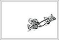
Sleeping at the Wheelby aBriefcaseComment: Very good take on the challenge! Too bad you couldn't use a fill flash if this was, in fact, a real find on the street vs a staged setup. The interior is a bit dark. |
| 06/05/2004 02:08:49 AM |
Trigonometric Hallucinationsby labudsComment: Definitely original! Seems bright to me/overexposed. If it was a bit darker then it might give the feeling that the pattern might appear floating instead. |
| 06/05/2004 02:01:10 AM |
Just Threeby oksamitComment: Both the statue and background look too overprocessed for my tastes. Lighting is bright but fairly even. |
 Photographer found comment helpful. Photographer found comment helpful. |
| 06/03/2004 03:39:31 AM |
Colonyby pitsamanComment: Very nice shot! Love the strong contrast look, one of my favorite styles. Which lens did you use for this image? Can you also post the Exif data? |
| Photographer found comment helpful. |
| 06/03/2004 02:07:05 AM |
Shyby lear202btComment: Very cute photo of squirrels! I see them from time to time around here and they do just that. They love to hide behind things and pretend they can't be seen. Anyway, great shot of these guys with nice details of the fur. Good use of patterned neg space above them. I wish I could see the whole tail of the one on the left and with a bit of cushion space after that. Contrast seems a bit low, too. |
| Photographer found comment helpful. |
| 06/03/2004 02:04:16 AM |
|
| 06/03/2004 02:03:00 AM |
Group Hugby moviemanComment: I like this idea a lot and is very creative. Nice choice using clear push pins, too. Lighting and contrast are excellent. Now, the only thing that is stopping me from giving you a 10 is the border. Personally, I feel it is too thick for a simple composition such as this. If you left it as a simple thin black border (maybe 4 or 5 pixels) I'd probably rate it higher. 8 |
| Photographer found comment helpful. |
| 06/03/2004 01:56:55 AM |
Blue Skiesby garrywhite2Comment: Above the right antenna there is a small dark spot probably due to a dirty lens. I think if the antennae were not there this would make a good landscape picture but I feel the three antennae should be the dominant portion of the photo, not the landscape. Image is also hazy and could use some help with levels adjustment. |
| Photographer found comment helpful. |
| 06/03/2004 01:51:26 AM |
Vicious Triangleby agroikoiComment: Definitely one of the more interesting and original entries. Lots of crisp details (slight oversharpening?) of the paper and the rock but the scissors seem a bit soft and may be due to the lighting. There are two small gray spots (one to the right of the scissors and another to the left of the paper) that should have been cloned out. |
Home -
Challenges -
Community -
League -
Photos -
Cameras -
Lenses -
Learn -
Help -
Terms of Use -
Privacy -
Top ^
DPChallenge, and website content and design, Copyright © 2001-2025 Challenging Technologies, LLC.
All digital photo copyrights belong to the photographers and may not be used without permission.
Current Server Time: 08/22/2025 07:51:18 AM EDT.