| Image |
Comment |
| 08/18/2004 09:47:28 PM |
Time pleaseby UNCLEBROComment: I really like the composition of this photo but the colors seem quite muted and un-neon-like (except for the white inside the clock). I would have cropped the left side a bit more to eliminate that sole white splotch. |
 Photographer found comment helpful. Photographer found comment helpful. |
| 08/18/2004 09:45:20 PM |
|
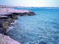
| 08/18/2004 03:21:07 PM |
reflecting cactusby petspicsComment: Very grainy and, perhaps oversharpened. I think this would have looked better if you used a polarizer to cut the reflections and give the cactus a floating appearance. |
| 08/18/2004 01:17:45 AM |
Ferris Wheelby BeeGeeComment: This would be much better if the background were darker instead of filled with sensor noise. Maybe I'm being too picky. I do like the motion blur and how sharp and crisp the lines are. Despite the noise, it's a very good photo and the off-center composition adds to the photo. 6 |
| Photographer found comment helpful. |
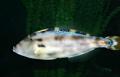
| 08/18/2004 01:13:12 AM |
Gone Fishingby MattBComment: Nice job at fish photography since this is very difficult to do. Aside from that, I don't see a very enticing shot. It's more snapshot-esque and the tail is cut off. |
| Photographer found comment helpful. |
| 08/18/2004 01:10:32 AM |
Dreamcoatby FrostyPawsComment: Took me a while to finally see the "DREAMCOAT CAFE" lettering in the lower right and in tiny lettering on top of that. Also, try to make it easier for the viewer to see the relationship between the title and the photo. I personally find that it makes a difference to me if I struggle to see the correlation between the two. Despite the reflections off the glass, it looks like this place might be called Bridgeman's but I'm guessing. Next time try using a polarizer to eliminate the reflections or try a different angle. |
| 08/18/2004 01:05:28 AM |
Naked Neonby KaDiComment: Excessively grainy. The subject (the sign) goes right up to the edge in the upper left and very close to it in the lower right. I feel that there shou;d be some space between the subject and the edge as this current composition feels cramped. |
| Photographer found comment helpful. |
| 08/18/2004 01:03:26 AM |
All Shook Upby DoylieComment: Interesting idea but I can't read the entire sign. I think if you include a sign and it's a major component of your composition, the viewer should be able to see it all. Maybe focus your attention to the lights at the top of the marquee vs the wording of the establishment. |
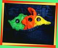
| 08/18/2004 12:58:49 AM |
Finding neon where I can...by ursulasComment: The terry cloth "fish" and "rabbit" and "duck" are very creative. I like the lighting and composition. Very nice overall. But that, um, border has got to go. Way too distracting. |
| Photographer found comment helpful. |
| 08/16/2004 05:58:06 PM |
|
| Photographer found comment helpful. |
Home -
Challenges -
Community -
League -
Photos -
Cameras -
Lenses -
Learn -
Help -
Terms of Use -
Privacy -
Top ^
DPChallenge, and website content and design, Copyright © 2001-2025 Challenging Technologies, LLC.
All digital photo copyrights belong to the photographers and may not be used without permission.
Current Server Time: 08/21/2025 06:02:13 AM EDT.