| Image |
Comment |
| 08/19/2004 01:38:59 AM |
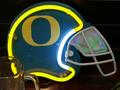
Go Ducks!by curt57Comment: The beer mug and the object in the lower right are distracting. |
| 08/19/2004 01:33:30 AM |
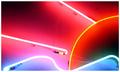
Sunrise on the Seaby dclarkeComment: I know it doesn't appear so but the sun rays and the water look like their tubes are almost the same color. Did you crank the saturation up? It looks like you might have and/or used a very high ISO setting. Maybe some of the pixels are clipping and causing those colors to look identical. I do like the composition with the water on the bottom and the sun in the corner. |
 Photographer found comment helpful. Photographer found comment helpful. |
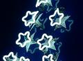
| 08/19/2004 01:28:20 AM |
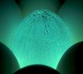
Alien Eggby shoylesComment: Not quite sure if this falls in the neon category although the color sure looks the part. One of the more original entries. |
| 08/19/2004 01:24:04 AM |
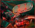
Engine-uityby JarradComment: Nice engine details but I can see noise on the valve covers and on your air intake (?) above the butterflies. Also, the neon light is a bit weak, in my opinion, not making enough of a presence in this photo. |
| Photographer found comment helpful. |
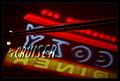
| 08/19/2004 01:21:05 AM |
Cruisin' at the Cozy Dinerby bledfordComment: Love the reflection of the sign in the bodywork of the PT. I don't know if many other people will also see the connection of the '50s-era diner to the retro styling of the PT (assuming the diner is one of those '50s style ones).
Two nit-picky things that I can see:
1. The spots below the I and the S in CRUISER.
2. The badge is not completely in focus and I would have liked to see it all in focus.
Good job overall. 7 |
| Photographer found comment helpful. |
| 08/19/2004 01:17:01 AM |
E.T.by daniellaComment: I know what this is and I'm not sure you can really focus on the electricity as its pattern is always changing. It looks blurry and also it seems to exhibit some noise/grain. |
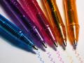
| 08/19/2004 01:15:36 AM |
Neon Pensby GinaRothfelsComment: I really like this idea. Well executed but I'd like to see the other pen strokes extend a bit longer like the blue one and almost touch the tip of the pen. Lighting is fairly direct but it works well here for some reason and I can't explain. Maybe because of the shadow it makes with the blue pen. Lots of little minor details do hurt the score a bit but excellent work. 8 |
| Photographer found comment helpful. |
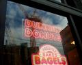
| 08/19/2004 01:04:47 AM |
|
| Photographer found comment helpful. |
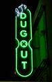
| 08/18/2004 09:49:40 PM |
Sports Bar in Denton, TXby SmittyDFWComment: The bottom of the photo looks quite tilted. I would have eliminated that by cropping it out. The sign is well focused and lacks hot spots and overly bright areas. |
| 08/18/2004 09:48:30 PM |
|
| Photographer found comment helpful. |
Home -
Challenges -
Community -
League -
Photos -
Cameras -
Lenses -
Learn -
Help -
Terms of Use -
Privacy -
Top ^
DPChallenge, and website content and design, Copyright © 2001-2025 Challenging Technologies, LLC.
All digital photo copyrights belong to the photographers and may not be used without permission.
Current Server Time: 08/21/2025 06:01:56 AM EDT.