| Image |
Comment |
| 10/01/2004 01:57:07 PM |
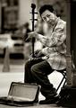
Interludeby PedroComment: Excellent duotone! Great contrast and focus especially on the jacket which looks like a nightmare to expose correctly. I'd crop this shot a bit differently, however. Starting with the upper left corner. Maybe crop the left side a small amount to eliminate that dark triangle. I'm suggesting this since you already cropped part of the case so a little bit more would not hurt the composition. Now for the right side. The dark part of the post needs to go as I feel it draws too much attention away from the man's jacket. If you cropped right up to the gray portion of that post would be perfect. 8 |
 Photographer found comment helpful. Photographer found comment helpful. |
| 10/01/2004 01:47:32 PM |
Breaking Throughby muur88Comment: Technically a very good shot with just the right amount of overexposure on the sunlight but I feel the overall composition is strange and doesn't feel right. If the sunlight was a bit lower on the horizon I think it would be better. Maybe even showing more sky/clouds vs shoreline as I personally feel that the clouds are more interesting than the ground. 6 |
| 10/01/2004 01:43:45 PM |
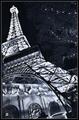
Paris, Las Vegasby Pep VentosaComment: Oh my god! I've taken almost the EXACT same picture with my F717! Except since mine came out a tad blurry, I added some noise and it made it look very nice. But I see you used a faster ISO setting and introduced noise anyway. I think it would look a lot better with some monochromatic noise to give it an old/European feel. Hard to describe but I really liked the way mine turned out although your focusing is better than mine. I would have cropped more off the bottom as the lights on the awnings are a bit distracting. 7 |
| Photographer found comment helpful. |
| 09/29/2004 08:47:23 PM |
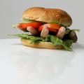
HandBurgerby arnitComment: HAHA very creative! Nicely composed although I think a little more negative space to the left might (or might not) make it feel better. Focus is sharp and colors are excellent. I do question the choice of the hand facing up vs down. In its current form, it looks like the hand is still alive and holding the tomato, lettuce and bun above it. Who wants to eat a live hand? Great job, however and an 8 from me. |
| 09/29/2004 07:40:30 PM |
AT YOUR SERVICEby k9shadow1Comment: Very cute strawberries with their tuxedos. Although that is out of the ordinary, the overall composition and point of view is not. I would have liked to see the entire plate in focus. The foreground desserts are blurry so I tend not to give them much attention. The middle piece has a very annoying spotlight. Overall color balance seems biased towards red. The bottom could also be cropped a bit tighter and maybe even to the inner circle of the plate. I would like to crop the odd shape in the lower left corner. And the background pattern is mildly distracting. |
| 09/29/2004 07:03:25 PM |
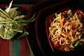
Hot and Spicyby librodoComment: Excellent composition and cropping. Colors are nice and vibrant. I like the feel of this photo as it might go in a culinary review of a restaurant. Having said that, I don't see this as something extraordinary maybe because I live in Los Angeles and see Asian food all the time to in my opinion, it's common. It is a very good photo in its own right, however. |
| Photographer found comment helpful. |
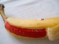
| 09/29/2004 06:59:23 PM |
Bananananaby luckykg862000Comment: I don't quite understand the connection between the red coloring of the banana and the theme of the challenge. If you can help me figure this out and understand better, I'd appreciate it. |
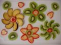
| 09/29/2004 06:52:16 PM |
Fun Fruit Flowersby woodseyComment: Nice arrangement but the directly over the top perspective is a bit boring. Maybe shoot from the side and use shallow DOF to your advantage. Also try various colored backgrounds to minimize disctractions. Also, not sure what these fruit slices are resting on but the border resembles a cabinet door and seems out of place. Contrast and focus (to a lesser degree) need some work as well. |
| Photographer found comment helpful. |
| 09/29/2004 06:50:01 PM |
Not Quite Ham & Eggsby legalstevenComment: Not quite sure what you are trying to portray here with the eggs and apples. Looks like focus is off as the apples are blurry and it's hard to tell with the eggs. The reflections on the table surface are distracting. |
| 09/29/2004 06:34:38 PM |
Snappies - The Cereal That Bites Back!!by GatorguyComment: Nice idea! Although when doing a mockup box, you might want to make sure that all sides of the box are done so that people don't know you just covered a box of Raisin Bran. And I don't know if that's a real baby turtle but aren't those are protected and not allowed near humans? Lighting is a bit bright on the model's face and background is a bit distracting. |
| Photographer found comment helpful. |
Home -
Challenges -
Community -
League -
Photos -
Cameras -
Lenses -
Learn -
Help -
Terms of Use -
Privacy -
Top ^
DPChallenge, and website content and design, Copyright © 2001-2025 Challenging Technologies, LLC.
All digital photo copyrights belong to the photographers and may not be used without permission.
Current Server Time: 08/20/2025 07:30:26 PM EDT.