|
|
|
Showing 311 - 320 of ~1531 |
| Image |
Comment |
| 05/19/2006 12:32:38 AM | Deadly P Clawsby sangeethComment: Greetings from the Critique Club
Hi, well I like the idea of this shot, the silohuette of the bird on a nice sky. Placement of the bird in the composition is good.
This background however strikes me as perhaps more PSed than natural, tho I could be wrong. It is an odd color if it is natural light. I would like to see alittle bit more of the crows head in the outline tho. I also see a slight line below the bird that looks like it could be cloned or heal brushed out.
The shot is close to being really good maybe if you were a little close would of helped too ( or longer lens)
Hope that helps some. Keep shooting!
Lynn |
| 05/18/2006 08:35:13 PM | Doubting Patriotic Convictionsby bvoiComment: Hi Greetings from the Critique Club!
Well, how to critique this without stepping on political toes, as a former american who is not to happy with the USA at the moment I think it is an evocative and interesting photo. From a strictly photographic perspective, I really like the color and the image, it is colorful, the dark ominous figure adds to the drama. I really like the textures in the flag area. I do not know what a scrim is but I think I would love to get one.
I could really see t his image being used as some kind of political comic/satire or used in some kind of advertising campaign. I think it is a creative take and I like it.
My only big critism would be that the guys hat seems a little long, I suspect it is suppose to be a KKK take but it is still a little on the poofy side : )
Well done!
Lynn |  Photographer found comment helpful. Photographer found comment helpful. |
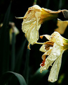
| 05/18/2006 08:28:14 PM | Dying Plants Cryby obsidianComment: Hi Greetings from the Critique Club,
What I think works about your photo is the background, I like the dark green leaves and the blurred DOF, it helps the viewer to focus on your subject.
What I think needs some improving is that there is quite a big patch that is overexposed, perhaps could be fixed with a dodging, or perhaps adjust in shadows and highlights.
Subject choice: I think the hard thing about photographing something, dead or sad, is that even if you do a good job you will disturb your audience. Most humans are not keen to look death and sadness in the face. So if you chose those kinds of things as subjects, beforewarned you are likely to get a poor response.
Would also be good to have a little more detail in the flowers, tho I suspect that is a limitation of your camera. I actually had that camera for a little while.
Keep up the effort.
Lynn | | Photographer found comment helpful. |
| 05/18/2006 06:56:22 PM | Delightful Pacific Creaturesby nsoroma79Comment: Greetings from the CC.
Well, hard for me to know how to comment on this one as I have tried to take aquarium shots and often failed miserably. You however have done a great job. I really like your composition the rocks on the right and the two main and colorful fish swimming in the same direction. I also like that you can feel the movement of the water.
What I do not like is that the rock in the foreground on right is not sharp, and in fact I think the whole image could be slightly sharper. I may have also cropped a tiny bit off the bottom.
Overall a good shot, congrats on your well placed finish,
Lynn |
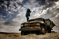
| 05/18/2006 10:08:24 AM | Destroid Petrol Carby TUBORGComment: Greetings from the Critique Club, what I think works here very well is the tones, color mood of the photo, it is sort of dark and moody a little bit on the wild side. The sky helps to add a little bit to the drama of the shot.
I really like the textures of the front bumper and of the grass in the foreground. The compostion of the truck workds very well I like its angle and placement in the photo.
The thing that I do not like is the specific pose of the person, in my opinion had they been turned slightly toward the camera with a little more of their arm outlined it would of made the image even stronger.
Overall a very good shot, so I am sorry cannot be more critical. Congrats on your very good finish! |
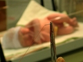
| 05/16/2006 11:28:34 PM | It'll only hurt for a minute!by NowaytotellComment: Greetings from the critique club.
Well, I think this image may make people squeemish a little. Which may not get a good score from people, nor do people generally choose to look at unpleasant things. (Barring medical professionals perhaps) While the baby in the background adds something to the shot, it also makes it more distubing, why are they sewing up a baby? Gives a sense of tragedy. The macro of the needle and thread may have done better on its own, even in the context of the image, it is not such a wow macro in that usually good macros have something intricate or some detail that is usually overlooked.
Anyway just a couple thoughts, you did do a good job of using DOF in your image. Keep shooting! | | Photographer found comment helpful. |
| 05/16/2006 11:21:47 PM | Cold Hands, Warm Heartby meo729Comment: Greetings from the Critique Club.
My first thought is that despite the heart is suppose to be warm, it is a cold material. Plastic does not strike me as something that conveys a feeling of warmth. Conversely, the hards which are suppose to be cool, despite the blue tone, do not feel cold to me.
The compostion is a little bit central I wonder if there would be a way to compose it that would make the image a little bit more dynamic? Just my thoughts, I hope they help.
What I do think works really well is the black background and the it really makes the colors jump out at you. It also really helps the viewer to focus their attn. on the image you are presenting with no distractions.
Congrats on your good finish! |
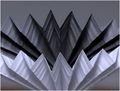
| 05/16/2006 11:11:55 AM | Groovyby jimnessComment: Greetings from the CC, I am really not too sure how to comment on your shot. While nothing strikes me as 'wow' there is not really anything clearly 'wrong' either. I guess depending on the purpose of the shot it lacks a little 'umph'. I like the tones of the lines and I like the curve to it. Perhaps it would of increased the visual image if you left the image higher on the top so that there was more black space creating a 1/3 lines, 2/3 darker area? Just a thought. The more I look at it the more I can see the lines in it relating to 12", I wonder too if taking the image from a different angle may have made it easier to distinguish.
Keep up the efforts! | | Photographer found comment helpful. |
| 05/16/2006 12:21:07 AM | Pushing up daisiesby boyhuntsforblissComment: Hi greetings from the CC, well... what I do not like about this shot is that I would of cropped it more on the left so you could not see the bench, and perhaps more from the bottom to make the in focus part more at the front of the image, tho it does not bother me as much as the left. What I love about this shot is that the guy on the bench (curious if he was intentional in shot or not?) looks like he is mourning, or at least distraught. I think it totally adds to your saying. This shot has going for it strong leading lines.
Nice DOF too. Hope that helps some. Keep shooting. |
| 05/16/2006 12:16:16 AM | ascensionby IreneMComment: Greetings from the CC. Well what an unexpected delight of a shot. It is good to see someone take an ordinary subject and still get a unique take on it, I love the color tones. the abstract feel of it, it is familiar, simple , clear, but somehow really enjoyable to look at still. Nice DOF work too, I am not sure really of what else I could say on how to improve it except I think this would work really well as a series, maybe 8 or 10 similar images with maybe more rounded shape, maybe a white black and gray paper etc. I think it may be really cool all together. Sorry can't be more critical, congrats on you well placed finish! | | Photographer found comment helpful. |
|
Showing 311 - 320 of ~1531 |
Home -
Challenges -
Community -
League -
Photos -
Cameras -
Lenses -
Learn -
Help -
Terms of Use -
Privacy -
Top ^
DPChallenge, and website content and design, Copyright © 2001-2025 Challenging Technologies, LLC.
All digital photo copyrights belong to the photographers and may not be used without permission.
Current Server Time: 08/07/2025 12:51:27 AM EDT.
|