| Image |
Comment |
| 05/25/2007 10:34:43 PM |
hart-plaza-fountain-1.jpgby JewellianComment: hmm kewl fountain but that person walking away from camera ruins it. if he was walking across it or towards camera yeah but only seeing his back , nope. and this one would look great as vertical with a huge sky! |
 Photographer found comment helpful. Photographer found comment helpful. |
| 05/25/2007 10:33:19 PM |
Following Bubblesby LoreneComment: cute shot but i wish that cute kid was looking at me. look at the catch lights in the eyes!! would have been awesome to see them looking at camera! oh, and that white wall is too distracting, it draws your attention away from the child. |
| Photographer found comment helpful. |
| 05/25/2007 10:31:26 PM |
080407002.jpgby michael_pComment: i like this one the best so far. the kids look happy and there is no dead space(cept that white spot over boys head). good job!! |
| Photographer found comment helpful. |
| 05/25/2007 10:30:35 PM |
003r17b.JPGby idratherdirectComment: hmm just a shot of a street corner. nothing of interest to keep your attention for long. i keep looking for whats the main, point of interest and there isnt one. |
| 05/25/2007 10:28:07 PM |
080407065.jpgby michael_pComment: cute shot but id rather their heads closer together and again, plain white background just distracts from the shot. i want texture, patterns, anything there to take away the whiteness. |
| Photographer found comment helpful. |
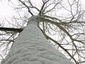
| 05/25/2007 10:25:38 PM |
by xmer21xComment: dunno, it looks neat and boring at the same time. u follow the trunk up to the branches, then u are left hanging from a branch with nothing to hold your attention. think it needs more dark areas and more branches. or less tree trunk. |
| 05/25/2007 10:22:32 PM |
by xmer21xComment: the cup is wayy to bright compared to the reflections. id rather have all reflections with just a hint of the cup, cutting out that bright spot. the shadows on the table look kewl. |
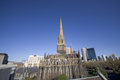
| 05/25/2007 10:21:35 PM |
1.jpgby diablo2097Comment: i like that church in the middle but hate the buildings in the background. they are competing with it. id shoot from a lower vantage point and ony have church and sky. and i love the sky, just deepen the color a bit to really make it stand out. |
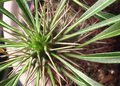
| 05/25/2007 10:20:15 PM |
Spike.JPGby idratherdirectComment: bit too soft and id rather see this vertically with the plant on the top. then the pot could act as a frame. still a kewl plant. try reshoot it again. |
| Photographer found comment helpful. |
| 05/25/2007 10:15:14 PM |
DPP-0003.jpgby efrenComment: something funky about her face like its distorted or blurred. it would be a good shot if u could have fixed it. and have her hands relaxed or something cuz one looks odd.
the dress is a bit blown out cuz shooting white dresses are tuff! |
Home -
Challenges -
Community -
League -
Photos -
Cameras -
Lenses -
Learn -
Help -
Terms of Use -
Privacy -
Top ^
DPChallenge, and website content and design, Copyright © 2001-2025 Challenging Technologies, LLC.
All digital photo copyrights belong to the photographers and may not be used without permission.
Current Server Time: 08/04/2025 08:21:21 AM EDT.