| Image |
Comment |
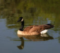
| 05/27/2007 03:39:42 PM |
gooseby Wenders11Comment: pretty shot. just wish had more space in front of the goose and the contrast was raised a bit to separate him from the background.
still a lovely shot. |
 Photographer found comment helpful. Photographer found comment helpful. |
| 05/27/2007 03:37:57 PM |
Walkby Wenders11Comment: oo good shot, i love the colors... that path looks soo peaceful to just walk down...
only improvement? id say darken it a bit in the foreground to draw the viewer down the path. |
| Photographer found comment helpful. |
| 05/27/2007 03:36:09 PM |
Lilypadsby Wenders11Comment: neat shot but the lighting is just too flat. I think it needs more OOMPH to it. id try shooting it at a slight angle so they dont look like circles. And there isnt anything to catch your eye. what leaf are we supposed to be looking at? i keep wanting to see a bug or frog sitting on one. |
| Photographer found comment helpful. |
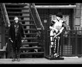
| 05/27/2007 03:33:41 PM |
Tattoos And Body Piercingby skasubaComment: the guy looks way to stiff and id rather him look at the mannequin or somewhere else, not staring at me.
usually these types of shots are shot small aperture so everythings in focus, but this one is soft. if youre gonna go wide to seperate them from background, go WIDE. But if u wanna capture the detail, go small. half way just dont cut it. |
| Photographer found comment helpful. |
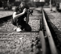
| 05/27/2007 03:31:00 PM |
Eliasby oscarmeyerComment: interesting but I keep wanting to see this as a horizontal shot showing what the cameraman is shooting. I keep looking off to the right looking for something that he/she is soo interested in.
if youre going to tell a story, tell the whole story .... |
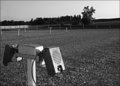
| 05/27/2007 03:29:06 PM |
AtTheDriveIn.jpgby TheStickComment: not enough things in it to make it interesting. too much dead space and since this is the drive in, how bout showing the screen? then you could fill in and give it some depth. |
| Photographer found comment helpful. |
| 05/27/2007 03:25:20 PM |
Airbus A330 - Up Close and Personal!by PhotologistComment: neat shot but ive seen this alot and they were better. But, I cant think of why theirs were better then yours. Maybe tighter cropping and something. I cant put my finger on it but something is missing.... |
| Photographer found comment helpful. |
| 05/27/2007 03:22:57 PM |
darc&deb2.jpgby Shea927Comment: yeah focus on the lady is wayy to soft. And that shadow going across their chest is really distracting. i love the soft brown color tone to the shot tho, really seems to fit this scene. But darn it, just with she was in focus..... |
| Photographer found comment helpful. |
| 05/27/2007 03:21:02 PM |
Redby TuckersmomComment: great shot! i love the colors!! red red red....the blurred background of more reds just adds to the depth. |
| Photographer found comment helpful. |
| 05/27/2007 03:19:39 PM |
Tamara Xmas 5by MakkaComment: cute shot! i love the stockings!! only way i think to improve this is have her look at the camera and wink! And i think it needs more hat to be shown. its lost in her hair. oo oo, i know, put a flash in the box (low low power) and give it that Pulp fiction look! |
| Photographer found comment helpful. |
Home -
Challenges -
Community -
League -
Photos -
Cameras -
Lenses -
Learn -
Help -
Terms of Use -
Privacy -
Top ^
DPChallenge, and website content and design, Copyright © 2001-2025 Challenging Technologies, LLC.
All digital photo copyrights belong to the photographers and may not be used without permission.
Current Server Time: 08/04/2025 06:34:53 AM EDT.