| Image |
Comment |
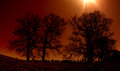
| 05/25/2007 02:41:21 AM |
_MG_7000.jpgby dahkotaComment: creepy feel to it. but, id like either NO sun in shot or all of the sun in the shot. just seeing that small bit distracts from the shot imho. |
 Photographer found comment helpful. Photographer found comment helpful. |
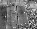
| 05/25/2007 02:34:15 AM |
Along The Boardwalkby rickhd13Comment: think id rather see this in a horizontal shot as rectangle. if not, id cut it off where to boards meet. the joint line is a bit distracting, like 1 pictures joined together. |
| 05/25/2007 02:32:26 AM |
Zabriskie Pointby Ian-AndrewComment: to me it just looks like flat lighting. it needs some depth ie shoot either morning or later in day near sundown. i wanna see some shadows! |
| Photographer found comment helpful. |
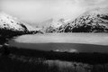
| 05/25/2007 02:26:12 AM |
Portage Glacierby ShutterPugComment: yeah, id like the foreground trees not pure black and id love some "mood" in the sky. some clouds or something instead of stark white. |
| Photographer found comment helpful. |
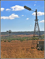
| 05/25/2007 02:25:02 AM |
Old-and-New-Windmill-2325.jpgby Monique64Comment: yeah, id rather have the windmill in the front and this whole picture shot with a longer longer longer lens to try and bring up the size of the back one.
too much of a height difference between the two imho. |
| Photographer found comment helpful. |
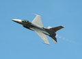
| 05/25/2007 02:18:31 AM |
Burnin'by renegade1966Comment: yeah, i wish had some clouds or more variety in colors to the sky. it looks like a plane against a blue screen.Awesome shot tho. i know how hard it is to get a good picture cuz that plane is zoooooming by fast! |
| Photographer found comment helpful. |
| 05/25/2007 02:15:17 AM |
Michelleby escapetoozComment: think the flash was a bit too much. id go for 1 stop or 2 stops less exposure and try get some directional lighting if can.
and, one more thing, the pose looks too "posed". too much tension on her shoulders. Id bring her hands a bit farther apart and have her not stick her chest out. |
| Photographer found comment helpful. |
| 05/25/2007 02:09:17 AM |
Just Hangin Around.jpgby KronusComment: i think the cross is a bit too bright compared to the side (right side). id love the right with equal lighting as the left.
|
| Photographer found comment helpful. |
| 05/25/2007 02:07:51 AM |
House of Worship.jpgby KronusComment: wow! what a church! look at all the details. look at the high high roof! id love to shoot in there. only negative is that dark area dead center cuz then your eyes are "lost". id rather have the center bright and the sides dark.
awesome shot tho and great exposure. |
| Photographer found comment helpful. |
| 05/25/2007 01:36:22 AM |
|
| Photographer found comment helpful. |
Home -
Challenges -
Community -
League -
Photos -
Cameras -
Lenses -
Learn -
Help -
Terms of Use -
Privacy -
Top ^
DPChallenge, and website content and design, Copyright © 2001-2025 Challenging Technologies, LLC.
All digital photo copyrights belong to the photographers and may not be used without permission.
Current Server Time: 08/04/2025 01:31:57 PM EDT.