|
|
|
Showing 211 - 220 of ~305 |
| Image |
Comment |
| 05/22/2003 09:59:27 AM | Primary Colors in the skyby bcncrazyComment: Critique Club
Hi bcncrazy,
my first impression of this picture was non-committal, I personally do not find much of interest in this image. I does have a certain appeal with the discoloured clouds but overall I think it lacks that something that would make me take a second look.
In terms of meeting the challenge, technically it is within the boundaries set out for primariy colours. I would like to know if this was your inital idea or was it an afterthought?
Technically the image is sharp enough and seems to be within acceptable exposure levels.
Overall I think in a literal sense this image is not strong within the guidelines of the challenge and consequently has been voted down accordingly.
Perhaps it might be worthwhile adding some comments to the Photographers comments field in order to allow us a retrospective view of what you were looking to achieve with your images.
Thanks for sharing and keep shooting. |
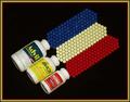
| 05/21/2003 11:15:06 AM | Confusion. Which Shall I Choose?by GolferDDSComment: Critque Club
First impression of this image, well executed. It is well balanced, though I will go into the cropping shortly. And as you have no doubt been told, the border is a bit distracting.
This definately meets the challenge and you have found a unique way to represent the primary colours. It's a shame the yellow pills were not a little more yellow, but they are still clearly yellow. I would say more saturation would bring the yellow out but that would be at the expense of blowing out the yellow on the pill bottles.
I think the thing that could improve your image alot is the composition, I think a tighter crop would have made for a more visually appealing shot. It is often tempting to show the entire subject within the image, but look at alot of the really strong visual images and they give you enough of the image to identify it but not the entire subject. I think this shot would have more impact if you cropped out alot of the pill bottles on one side of the image and spilled the pills out the other side of the image. But still maintained the diagonal, which I think works well.
Technically you have executed this quite well, perhaps it could be a little brighter in order to give it a little more punch. But otherwise it seems technically well done.
Overall I think with a little more work this would be a really strong image and I think it was an excellent idea.
Good luck and keep shooting.
Todd.
|
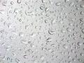
| 05/19/2003 08:49:41 PM | Liquid Glassby deckyonComment: *Critique Club*
FIRST IMPRESSION: I like the effect, but lacks a focal point.
CHALLENGE: There is not alot to indicate that this image is shot through glass, or even on glass. Whilst it does fall within the challenge guidelines it is not easy to ascertain that it is glass.
COMPOSITION: I think this image lacks a focal point. The pattern created by the rain drops is interesting but it lacks that real wow factor, that certain something that holds your attention or makes you take a second and third look.
TECHNICAL: Technically it seems reasonably well focused and executed.
CONCLUSION: Whilst some thought has gone into this image, I think you need to take a little longer to consider what it is about the image that others will find appealing. What is it in this image that I am trying to get across to the viewer and why should they take a second or third look at my image. A reasonable idea which has been shot with a fair level of expertise, but does not have enough impact to hold one's attention.
Keep shooting. |  Photographer found comment helpful. Photographer found comment helpful. |
| 05/15/2003 02:13:48 PM | Gateway to the Westby kaysrivComment: Well, done, I thought this would have finished higher.... still one of my faves.
Cheers,
Todd. |
| 05/15/2003 02:11:17 PM | Torontoby ToddhComment: thanks for the feedback and the support....
Special thanks for all the SARS comments ;) |
| 05/14/2003 05:23:46 PM | lillyby jbruno1397Comment: Hi, I think you were really on the right track here..... but if you had either, moved around the other side of the water or come back when you weren't shooting into the sun this would have been a much, much better shot. Good luck, Todd. |
| 05/14/2003 08:23:49 AM | Round and Round by JackoComment: Jacko, well done!
It's a good pic, it deserved to do well......
Hoping to earn my Team 10D stripes soon.
Cheers,
Todd. | | Photographer found comment helpful. |
| 05/12/2003 10:37:48 AM | Beach Hutsby hughletherenComment: Great effect and good strong imagery... watch your verticals..... i think more saturation would have really made this stand out.... good luck, Todd. | | Photographer found comment helpful. |
| 05/12/2003 10:32:03 AM | |
| 05/12/2003 10:28:51 AM | |
|
Showing 211 - 220 of ~305 |
Home -
Challenges -
Community -
League -
Photos -
Cameras -
Lenses -
Learn -
Help -
Terms of Use -
Privacy -
Top ^
DPChallenge, and website content and design, Copyright © 2001-2025 Challenging Technologies, LLC.
All digital photo copyrights belong to the photographers and may not be used without permission.
Current Server Time: 08/04/2025 06:32:18 AM EDT.
|