| Image |
Comment |
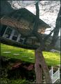
| 06/03/2003 08:43:21 PM |
reTURNing homeby adineComment: This just looks upside down. To add impact I think you could have included more reflection and less of the real thing. |
 Photographer found comment helpful. Photographer found comment helpful. |
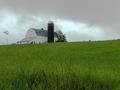
| 06/03/2003 08:40:30 PM |
Home on the Rangeby mullany1957Comment: Exposure seems good and composition on the most part is ok. One thing I might have done would be to take a lower vantage point to fill the frame with more grass and less sky. An alternative would be to have more sky and less grass but I don't think that would have as much impact since the green is so vivd. |
| 06/03/2003 08:38:02 PM |
|
| 06/03/2003 08:34:51 PM |
House Protected by Cosbyby timecreepsbyComment: First rule of composition..... look around the frame before clicking the shutter. Cosby has something growing out of his head. Focus seems a little soft as well. A faster shutter speed would probably have helped with this. Exposure looks good though. |
| 06/03/2003 08:32:02 PM |
|
| Photographer found comment helpful. |
| 06/03/2003 08:24:46 PM |
My Home Townby draney4Comment: Good choice of camera filter for this image though I would have tried to get more of the heron(?) in the center (clear) part of the image or, if such a thing exists, use a camera filter where the clear area is off center. |
| Photographer found comment helpful. |
| 06/03/2003 08:18:20 PM |
Comfortby clues56Comment: For more impact I would have cropped out the tea cup and plates, leaving only the nice shiny toaster and colourful reflection, maybe catch more of the lily and jam jar in the reflection. The flowers in the window are a distraction. |
| Photographer found comment helpful. |
| 06/03/2003 08:06:07 AM |
|
| Photographer found comment helpful. |
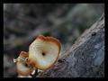
| 06/03/2003 08:05:07 AM |
My two (mush)room apartment.by HavokComment: I don't see how this fits......but
Exposure is good, composition could use a bit more room on the bottom. Lighting is flat. |
| Photographer found comment helpful. |
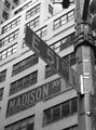
| 06/03/2003 08:00:06 AM |
My Cornerby olegComment: The angle on the street sign is great but the building is distracting. Less DOF would help here I think. |
| Photographer found comment helpful. |
Home -
Challenges -
Community -
League -
Photos -
Cameras -
Lenses -
Learn -
Help -
Terms of Use -
Privacy -
Top ^
DPChallenge, and website content and design, Copyright © 2001-2025 Challenging Technologies, LLC.
All digital photo copyrights belong to the photographers and may not be used without permission.
Current Server Time: 08/04/2025 11:41:04 PM EDT.