| Image |
Comment |
| 07/30/2003 05:45:54 PM |
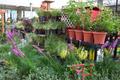
Planning future flower shotsby joannadivaComment: The horizon is straight and there's structure in the line of pots but there's too many center's of interest. One suggestion would be to pick one item to be your main focus but still include the rest and use a shallower DOF to isolate the chosen item. |
 Photographer found comment helpful. Photographer found comment helpful. |
| 07/30/2003 05:43:01 PM |
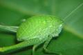
I see you...by Ashnak-AhComment: This is definitely a challenge. You did well to get this close. More DOF would probably give it more impact. Only the side of the bug closest to the camera is in focus. One tip that a few 'professional' photographers have given me is to focus on the eye(s). In this case the eye is slightly behind the area in focus.
For composition more room on the right would give this critter space to move into. |
| 07/30/2003 08:23:11 AM |
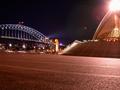
My Concrete Gardenby jasonmccarthyComment: First, the photo. I love the lense flare at the top of the Sydney Opera House and the exposure. The lighting on the bridge and the city lights in the background came out perfectly. The Harbour bridge makes the image look a bit crooked though. From the title I know including this amount of concrete was intentional but less of it, more of the opera house and less of the bridge would probably balance it better.
Second, this is a bit of a stretch for the challenge. There are several good locations in Sydney that may have proved a better choice. |
| 07/23/2003 10:27:31 PM |
Nipple Noiseby ArtessaComment: *Critique Club*
General: First impression is of a charcoal drawing.
Composition: The curves lead the viewer in and draw attention to the center of interest. Good use of negative space. Did you try shots where the vertical curve was more to the left or right therefore placing the nipple less central horizontally?
Exposure: For the effect you are presenting the exposure you chose has worked well.
Impact: Impact here is in the use of shape and form. More impact may have been achieved if the image were on the diagonal.
Exploring shape, form and texture is part of photography. Well done.
|
| 07/23/2003 10:08:13 PM |
Watering the Lawn (without the watering can!)by smellyfish1002Comment: *Critique Club*
General: The first thing that comes to mind is 'cute'. Toddlers running around in the buff (or no) are usually quite funny.
Composition: Placement of your subject is good with him looking into the rest of the frame. The fence is a bit distracting though. It might of worked better if the fence were out of focus (less DOF).
Exposure: The exposure seems to be a little too much, probably 1/3 or 1/2 a stop. The child's shoulder and hair seem just slightly over exposed.
Impact: I believe you were attempting to get impact with the portrayed activity. Unfortunately it doesn't work here though it's a great family/'show to the first date' picture.
Keep your sense of humour and keep shooting.
Colette
Edited to correct spelling Message edited by author 2003-07-23 22:29:18. |
| 07/23/2003 08:01:45 AM |
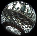
Crystal Worldby cpanaiotiComment: Thanks for the comments. The fingerprint is kind of a 'you are here' mark but I guess it didn't work very well.
Thanks tarique for the humour. |
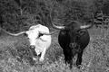
| 07/22/2003 08:17:12 AM |
Contrasting Cattleby jas0420Comment: Good take on the challenge. This is a challenging image due to the bright white and solid black bulls. It also appears that the light is coming from the left therefore adding glare to the white bull. I wonder if a diffuser would have helped here (probably out of the question though due to the nature of the beasts).
The DOF is perfect with just a touch of blurred grass in the foreground.
|
| Photographer found comment helpful. |
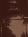
| 07/18/2003 09:58:35 PM |
Flame Onby StewanComment: I like the effect you've created here. It gives the feeling of old and worn. |
| Photographer found comment helpful. |
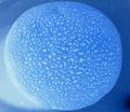
| 07/18/2003 09:54:25 PM |
Can-te-loupe Planetby canonS400Comment: Interesting idea. Did you try perspectives where the canteloupe wasn't cropped as much? This image seems to be a bit tightly cropped. |
| 07/17/2003 02:36:08 PM |
Well Used...by smellyfish1002Comment: The lighting is good and the DOF chosen adds interest having the stitches go off into a blurred background. |
Home -
Challenges -
Community -
League -
Photos -
Cameras -
Lenses -
Learn -
Help -
Terms of Use -
Privacy -
Top ^
DPChallenge, and website content and design, Copyright © 2001-2025 Challenging Technologies, LLC.
All digital photo copyrights belong to the photographers and may not be used without permission.
Current Server Time: 08/05/2025 06:21:12 AM EDT.