| Image |
Comment |
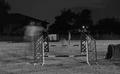
| 07/15/2005 10:26:06 AM |
A Ghost & Her Dogby RN PattiComment: The ghost effect is an interesting idea however I feel just a little more definition would make this image more effective. |
 Photographer found comment helpful. Photographer found comment helpful. |
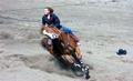
| 07/15/2005 10:24:47 AM |
Cowgirlby rodehiComment: That horse looks loco. You've captured some good action however the subject is a bit too central therefore stagnating the action. Since the horse is moving to the left a little more space on the left would probably make the image more dynamic. |
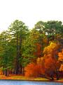
| 07/15/2005 10:19:17 AM |
Fallingby tristaliskComment: What works: vibrant colours, path into the trees, vertical lines of the trees
What doesn't work: white sky
I found when I scrolled down to effectively crop the top ~2/3 of the image off the top it just popped. The trees on the left balance the gorgeous tree on the right that is hanging over the water.
I think even a vertical shot of the trees on the left sans sky would make for an engaging image as well. |
| Photographer found comment helpful. |
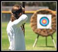
| 07/13/2005 09:24:45 PM |
On Targetby NullixComment: I like the composition though I think it may work better with her OOF and the target in focus and the arrow in view. |
| Photographer found comment helpful. |
| 07/13/2005 09:21:17 PM |
The Tagby drewmediaComment: Well composed though possibly a little under exposed. |
| Photographer found comment helpful. |
| 07/13/2005 11:39:14 AM |
^@ by unicumComment: Leading lines and circles. Well done. |
| 07/13/2005 02:07:30 AM |
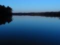
Ink Blotby NeilComment: What works: High horizon, leading line of the river, symmetry of the trees and far shore with the reflections.
What doesn't work: I feal that there is too much detail on the far shore and that it would work better if that were more in silhouette. I think this would bring out the light in the house (I think that's what it is) more.
.... it would then be more befitting your title. ;o) |
| Photographer found comment helpful. |
| 07/12/2005 09:21:05 PM |
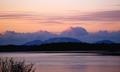
Morning Blanketby tcrock41Comment: Overall I like the colour and layered look of the background. The bush in the forground anchors the image nicely.
The horizon seems tilted slightly too the left and is a little too close to the middle making the image a bit static.
A lower vantage point pushing the horizon up could possibly make the image more dynamic though there may be something in the foreground that you were trying to avoid. |
| 07/12/2005 09:17:52 PM |
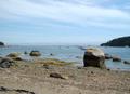
The Seaby tcrock41Comment: What works:
-- The large boulder in the forground anchors the image though it might work better closer to the bottom of the image.
-- White balance and exposure seem to be right
What doesn't seem to work:
-- The line of the beach is cutoff at the left of the image so the viewer is led out of the photo rather than through it. Showing the full curve all the way to the pier I believe would give the image more depth. Also the peninsula on the right doesn't add anything as it is quite dark and doesn't show much detail.
(sorry Neil, I stole your method for this exercise as it helps with getting my ideas down) |
| 07/11/2005 11:47:59 PM |
|
| Photographer found comment helpful. |
Home -
Challenges -
Community -
League -
Photos -
Cameras -
Lenses -
Learn -
Help -
Terms of Use -
Privacy -
Top ^
DPChallenge, and website content and design, Copyright © 2001-2025 Challenging Technologies, LLC.
All digital photo copyrights belong to the photographers and may not be used without permission.
Current Server Time: 08/12/2025 10:01:51 AM EDT.