| Image |
Comment |
| 04/19/2006 10:26:19 PM |
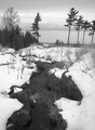
lakemi.jpgby dustinwilsonComment: Exposure and contrast seem bang on, however, the presentation (to me) lacks impact. A lower point of view emphasizing the leading line of the creek I think would make the image much more dynamic. |
 Photographer found comment helpful. Photographer found comment helpful. |
| 03/26/2006 09:55:51 AM |
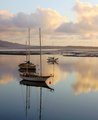
Sunset Clouds and Boatsby tinky2Comment: Great colours and reflection. Just one little nitpick, I feel that there should be a little more space at the bottom so the entire reflection is visible. |
| Photographer found comment helpful. |
| 03/24/2006 08:04:53 AM |
|
| 03/21/2006 09:05:12 AM |
|
| Photographer found comment helpful. |
| 03/13/2006 03:51:55 PM |
|
| Photographer found comment helpful. |
| 03/12/2006 04:32:18 AM |
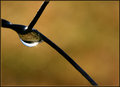
Morning lightby suemackComment: You've captured some great clarity in the water droplet. Good composition as well with all lines leading to the droplet. |
| Photographer found comment helpful. |
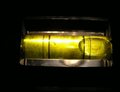
| 02/28/2006 10:24:30 PM |
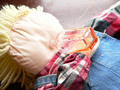
Booze gluttonyby footfungasComment: *** Critique Club ***
First impressions: Good use of diagonals. Diagonal lines make an image more dynamic.
Exposure: Nothing seems blown out or too dark.
Composition: Good use of diagonals however a lot of the elements included are distracting. The plaid shirt (red is a very strong colour and draws the viewers attention), the very light blank area of the head, the empty space at the top. The bottle does not draw enough attention away from these other items.
Impact: There are too many things in the image that draw the viewers attention. It is best to have the main subject stand out the most. The bottle here fades into the picture rather than jumps out.
Using different items that aren't so distracting (plain shirt rather than plaid) could help draw the viewer's attention to the bottle rather than all over the image.
Good try for a first entry -- don't take the comments too hard.
Keep shooting.
Colette |
| 02/09/2006 07:24:27 PM |
UnLeVeLby swallaceComment: *** Critique Club ***
First impression: meets challenge
Composition: Though not absolutely centered this shot may have worked better if the level were completely in the bottom third of the image. Focus seems a bit soft.
Exposure: Reflective surfaces make it difficult to eleminate glare 100%. In this case I feel the glare is a bit of a distraction. However, the other parts of the image seem to be exposed ok.
Impact: The image is very static and therefore doesn't have much impact. Putting the level on the diagonal in the frame may have helped in this regard.
Colette |
| 02/09/2006 05:12:22 PM |
|
| Photographer found comment helpful. |
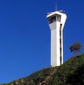
| 02/07/2006 09:31:35 PM |
Pt. Cartwright Lighthouseby sherpetComment: The strong line of the lighthouse works very well with the negative space of the blue sky. The position of the lighthouse in the frame makes the image very dynamic. The diagonal line of the hill also works and is in stark contrast to the strict geometry of the lighthouse. |
| Photographer found comment helpful. |
Home -
Challenges -
Community -
League -
Photos -
Cameras -
Lenses -
Learn -
Help -
Terms of Use -
Privacy -
Top ^
DPChallenge, and website content and design, Copyright © 2001-2025 Challenging Technologies, LLC.
All digital photo copyrights belong to the photographers and may not be used without permission.
Current Server Time: 08/14/2025 11:12:24 PM EDT.