| Image |
Comment |
| 05/07/2006 08:03:56 AM |
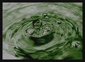
Bad Waterby marcelliebComment: *** Critique Club ***
First impressions: Relaxing feel, pleasing colour
Composition: Placement of the bubbles works well, ones on the right and three almost center. Also, the leftmost, rightmost and uppermost bubbles form a triangle. The triangle is a key design element that keeps the viewer moving from one section of the image to another.
Exposure: Exposure may be a little under though no areas seem too black. Exposing more may have blown out some of the white areas.
Impact: This is where I think the image is lacking a bit, if only due to the softness of the focus. Having sharper focus on the central bubbles I think would improve the photo.
Keep experimenting and have fun.
Colette |
| 05/06/2006 08:50:43 PM |
|
| 05/05/2006 11:01:38 PM |
Four Years Laterby KonadorComment: Great focus on the eye and detail in the hair. I really like the falloff from light to dark on the right. The light and dark areas are balance very well.
However there seems to be a hot spont on the cheek. |
 Photographer found comment helpful. Photographer found comment helpful. |
| 05/03/2006 07:47:35 AM |
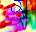
Painting with darkby arhunt35Comment: Without the blue line I think it would make a fine abstract, though maybe a bit cluttered. The blue line doesn't seem to serve any purpose since the texture and opaqueness (?) of the colour don't seem to harmonize with the rest of the image. |
| Photographer found comment helpful. |
| 05/02/2006 08:08:19 PM |
Small Cityby karmatComment: The colours in the lit area are nice and none seem blown (except maybe the one on the far left), however the horizon is tilted. |
| Photographer found comment helpful. |
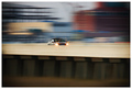
| 05/02/2006 08:05:39 PM |
moving forwardby jaxsondComment: What I like: streaks of colour in the background and stars on the headlights
What's not working for me: central location of car, bottom half of image doesn't add anything to its dynamics -- zooming in more or shifting the camera upward and to the right would take care of these things (just my opinion) |
| Photographer found comment helpful. |
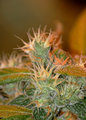
| 05/01/2006 01:27:58 PM |
Flower 2by NVPhotoComment: Interesting plant though the flash makes this look a little un-natural. It seems a little out of focus though this might be a DOF issue. Moving back and forth to get different parts in focus can help as well as closing down the lens to increase the DOF. |
| 05/01/2006 01:25:46 PM |
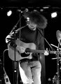
Old Silver Band 5by NVPhotoComment: Lighting and contrast are good though the lights in the top left and right may be a little bright.
The performers hair/hat(?) gives a sense of motion as do the hands.
The crop is a little tight on the right as the guitar end if cut off.
To emphasize the guitar, try framing the performer so the guitar takes advantage of the diagonal space. Do this can add dynamics to the image. A lot of event photographers use this technique. |
| 04/19/2006 10:30:37 PM |
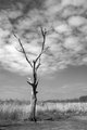
treefinished.jpgby dustinwilsonComment: The tree is contrasted well with the clouds. To exploit this I think shooting from a point closer to the tree and lower to the ground would make for a more dynamic shot. |
| Photographer found comment helpful. |
| 04/19/2006 10:28:58 PM |
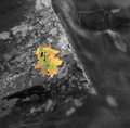
leaf.jpgby dustinwilsonComment: Good texture in the rock however I feel there is either too much or too little rock in the picture. The leaf is also a little too central for me. Putting the leaf further down and to the left could increase the dynamics of the image. |
| Photographer found comment helpful. |
Home -
Challenges -
Community -
League -
Photos -
Cameras -
Lenses -
Learn -
Help -
Terms of Use -
Privacy -
Top ^
DPChallenge, and website content and design, Copyright © 2001-2025 Challenging Technologies, LLC.
All digital photo copyrights belong to the photographers and may not be used without permission.
Current Server Time: 08/15/2025 04:27:42 AM EDT.