| Image |
Comment |
| 10/30/2003 02:56:50 AM |
Grace Finds Beauty In Everythingby space amoebaComment: Wonderful composition and use of negative space. The statue looks a bit dark on my monitor (yes I calibrated it to the scale below) but I think that adds to the feeling of this image. I really like this shot.
Quadrajet |
 Photographer found comment helpful. Photographer found comment helpful. |
| 10/30/2003 02:53:33 AM |
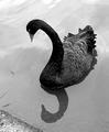
Reflection of a Black Swanby boyte1Comment: Wow, absolutely gorgeous! Fantastic contrast between the head of the swan and the water. The reflection is perfect and I like seeing just a hint of the shoreline. I can't say enough about this shot, it's pretty much perfect...and matches the challenge to a "T". Excellent work!
Quadrajet |
| Photographer found comment helpful. |
| 10/30/2003 02:50:26 AM |
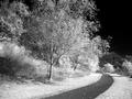
wonderlandby AmielComment: Wow, what a great image. I am assuming this is infrared? I really like the contrast and composition of the right 3/4 of this image. The trail draws my eye to the left side of the image and there's really nothing there...I feel that this image could benefit from having the left 1/4 cropped off. Overall I really like this shot....it's great.
I hope this helps,
Quadrajet |
| Photographer found comment helpful. |
| 10/30/2003 02:46:41 AM |
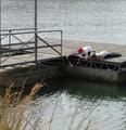
Another Day in Paradiseby clairkComment: It looks like these kids are trying to pry something from under the dock. I'm trying really hard to find the possible connection between this image and the Grace theme. If you like, feel free to email me and let me know how you connect this image to the theme.
Technically the image's color leaves a bit to be desired, the only strong colors I see is the red in the hat and the gold in the weeds. Of course there's a slight color in the water, hair and in the wood on the dock. The image is fairly well composed, although I think a bit of the top and left of the image could stand to be cropped a bit.
I hope this helps,
Quadrajet |
| 10/30/2003 02:35:26 AM |
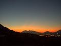
Grace of God in Monterrey.by ojardonComment: Nice shot of the sunset. It seems like the landscape is a bit soft for an image like this. If it were sharper with a bit more contrast I feel it would be a much nicer image. |
| Photographer found comment helpful. |
| 10/30/2003 02:31:38 AM |
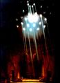
Turkish Bathby DigitankComment: Wow, this looks like a multiple image (superimposed), which I know is absolutely possible and legal using a digital camera. I like each image individually, but I'm not sure they go together very well as a composition. Of course I'll probably be eating crow because I'll find out this wasn't a superimposition type image.
Either way, I like the church/cathedral part of the image the best.
Quadrajet |
| 10/30/2003 02:26:13 AM |
Touched by Graceby bruskiComment: Let me preface this by saying that I am not a religious person.
That being said, this image is absolutely on theme 100%, excellent work.
I really like the composition in this shot, from the bowl to the baby to the wet baptisim hands...great work.
Black and white is the perfect choice, with the slight toning taking the edge off the straight b&w's harshness.
Beautiful work, top 3 in my book.
Quadrajet |
| Photographer found comment helpful. |
| 10/30/2003 02:22:08 AM |
Graceful Ladyby DianaComment: I see where you were going with the "grace" in this image. I think the background has as much of a presence as the subject. This image would have much more impact if you were to get closer, keeping the background to a minimum. I do have to say that the woodpile adds a bit of interest to the image.
I hope this helps,
Quadrajet |
| Photographer found comment helpful. |
| 10/30/2003 02:17:42 AM |
Natures Graceby melkingComment: Nice shot, its "gracefulness" might be a bit of a stretch for some people, but I like it. The composition is top notch, great diagonals combined with an interesting depth of field give this image great depth.
My only complaint is the darkness of the image (yeah my monitor is calibrated according to the scale below), a quick hit with levels would help this shot in my opinion.
I hope this helps,
Quadrajet |
| Photographer found comment helpful. |
| 10/30/2003 02:10:37 AM |
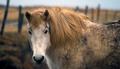
standing with grace in the mug but looking very sadby palitoComment: Great subject, horses are definitely graceful. I really like the depth of field you're using in this shot, I just wish the fence didn't run behind the horses head. I feel that a slightly higher angle would help frame the top of the image with the fence, while adding much more depth/interest to the image. In addition to that, I feel the image is too tightly cropped from top to bottom.
I hope this helps,
Quadrajet |
| Photographer found comment helpful. |
Home -
Challenges -
Community -
League -
Photos -
Cameras -
Lenses -
Learn -
Help -
Terms of Use -
Privacy -
Top ^
DPChallenge, and website content and design, Copyright © 2001-2025 Challenging Technologies, LLC.
All digital photo copyrights belong to the photographers and may not be used without permission.
Current Server Time: 08/04/2025 11:41:17 AM EDT.