| Image |
Comment |
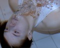
| 05/07/2007 10:11:39 PM |
symmetry underwaterby saradownendComment: This is an interesting attempt, but you need to fix the colors. Also it's too small - use all the pixels you're allowed! |
 Photographer found comment helpful. Photographer found comment helpful. |
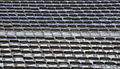
| 05/07/2007 10:09:27 PM |
Waiting, En Masseby chanComment: Beautiful - I love the couple of chairs that are out of place. Nice capture. |
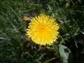
| 05/07/2007 10:06:42 PM |
Dandelion Petal Symmetryby tUpAc_LiL_bRoThAComment: Nice colors, but not terribly intersting. A closer crop and less centered composition might help. Turf grass almost never makes a good background IMHO. |
| Photographer found comment helpful. |
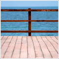
| 05/07/2007 10:04:31 PM |
Dockby alexgarciaComment: Very simple and beautiful. I love graffiti, great DOF, 4 wonderful colors, great overall. I do feel like your focal plane is maybe a foot in front of the railing? Not sure. Not a big deal. |
| Photographer found comment helpful. |
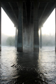
| 05/07/2007 10:01:40 PM |
Under the Fogby JammurComment: Very nice color and light; I like the sense of the mass of the bridge and the juxtaposition of the soft mist with the hard concrete.
I do feel like it's missing a certain "pop"... not sure why. Perhaps more contrast would help? Not sure. 8. |
| Photographer found comment helpful. |
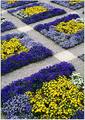
| 05/07/2007 09:57:14 PM |
Arizona Skylineby psartComment: I really like the colors and the idea of the abstraction; I think it doesn't work on a couple of levels, though;
1st, there's no focal point to the image; my eye wanders but can't find a place to rest.
2nd, since most of the flowers are in focus, the bunches close to the camera that aren't are distracting.
I'd rather see one flower, or a few, in focus much closer to the camera, and the background a blur from yellow to blue. |
| Photographer found comment helpful. |
| 05/07/2007 09:54:11 PM |
|
| 05/07/2007 01:07:27 PM |
|
| Photographer found comment helpful. |
| 05/07/2007 01:05:41 PM |
Breast Cancer.by Dona_kComment: I want to like this photo, and I applaud you taking on a difficult subject. Unfortunately the technicals in this photo are not very good, and I can't ignore that...
It appears to have been lit through a venetian blind; this is causing subtle horizonal stripes throughout. The robe is far too reflective, and has many blown out parts. Focus is poor and the image is noisy.
Hope this isn't too harsh... I wish you and your model the best. |
| Photographer found comment helpful. |
| 05/07/2007 12:54:39 PM |
|
Home -
Challenges -
Community -
League -
Photos -
Cameras -
Lenses -
Learn -
Help -
Terms of Use -
Privacy -
Top ^
DPChallenge, and website content and design, Copyright © 2001-2025 Challenging Technologies, LLC.
All digital photo copyrights belong to the photographers and may not be used without permission.
Current Server Time: 08/05/2025 07:41:06 AM EDT.