|
|
|
Showing 231 - 240 of ~620 |
| Image |
Comment |
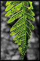
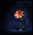
| 06/14/2007 11:42:11 PM | Spotted Pleasureby bs-photosComment: Greetings from the Critique Club! Thanks for the opportunity to critique your image - I find I learn as much or more from doing this than I do from reading critiques of my own image!
Now, on to your shot:
Pros:
I like the subject, and the way you've abstracted a natural form. The shallow depth of field works (with cateats we'll mention in the next section) to isolate your subject from the background. Your selective desat is technically pretty good; whether it adds to the image is debatable for me (though I don't know what the background looked like before, of course). The backlighting of the fern is clearly the strongest point in the images favor; the color and luminance is great.
Cons:
Your biggest problem in this shot is the focus; the whole leaf seems a little off. Having the tip fade into out-of-focus would be ok, but it would need to be obviously deliberate.
I think the image would be improved if the leaf were on a diagonal, rather than up and down; that's one of those compositional rules that begs to be broken, but in this case I don't know that breaking it is doing you any favors. Also losing the tip of the fern is a problem.
Obviously the border bothers some people; I don't mind it and actually think you did it pretty tastefully, but I don't know that it adds much and borders are not loved in these parts so it likely hurt you score-wise.
Challenge
Normally I'd comment on how I think it fit the challenge, but that's silly for a free study!
Overall, this is a nice subject and a pretty good treatment, but a little more emphasis on technicals would have added a lot. |  Photographer found comment helpful. Photographer found comment helpful. |
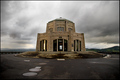
| 06/14/2007 10:07:09 PM | Vista Houseby JoshuaRaineyPhotographyComment: Greetings from the Critique Club! This is an interesting image - I'm definately finding it more difficult to assess than others I've done.
Pros:
This is an interesting, moody scene. The contrast of the bulky human-made building with the heavy sky and natural backdrop works well. Sounds like you put a lot of work into it technically, which I think came off well (with a couple of caveats I'll mention in a moment); for the most part it doesn't 'feel' like HDR or such in the way that these sometimes can. I ike the muted color palate, though it tends not to be the type that gets DPC voters fired up. Centered composition works fairly well, and the wide angle effect is nice.
Cons:
I feel like this image, which scored right around average, has several parts that feel kind of "average." For instance, the building is neither so close as to feel imposing, nor so far as to feel small; I'm left with the feeling that it's unremarkable. I think it would improve it to move closer, lose some of the foreground, and maybe get a little more of the moody sky. While I think you did very well from a technical standpoint there is a small light spot and dark spot in the sky just to the left of the building.
Challenge:
Normally I'd talk about how well you met the challenge, but it's a free study!
Overall, I think this is a good pic, with some very nice elements, but lacks the oomph to push it to the next level; your score suggests that the voters felt the same way. |
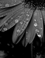
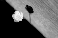
| 06/14/2007 04:18:15 PM | Evening Showerby TupeloHoneyComment: Greetings from the Critique Club! Welcome to DPC and contgrats on your first entry. It's one I like a lot!
Pros:
Beautiful subject; beautiful composition. The water drops do stand out nicely. I'm personally a fan of B&W florals; I think it forces one to look beyond 'pretty colors' to get to what a flower has to offer, and leads to subtly beautiful images.
Cons:
Unfortunately, subtly beautiful images don't score off the charts here; the ribbons tend to go to very eye catching images. This is simply a factor of the number of voters and the number of images they're going through; there's generally not time to really commune with an image.
Some people complained about the darkness of the image; I see their points though I don't personally agree; I might consider cropping some of the dark area from the bottom which feels heavy and slightly distracting. Without seeing the original it's hard to comment, but some playing around with the B&W conversion might add more contrast without compromizing the dark feel.
The water drops are great, but a few are a little smeared; it's nitpicky but tidy perfect drops are going to do better here too.
Challenge:
This is where I would comment on how you met the challenge, but as it's a free study there's not much to say! ;)
Congrats again on a great shot and welcome to DPC. Free studies are a tough place to get started but you did well, and I look forward to seeing more of your work. |
| 06/14/2007 03:47:35 PM | weedsby briantammyComment: Greetings from the Critique Club!
First let me say I'm so happy I got to see this! I missed it during voting. This is truely a wonderful image - I agree with posthumous, best windmill shot to come along in a long time; also one of the most powerful landscapes I've seen in some time.
Pros:
Composition is great; a perfect example of the power of the rule of thirds; great technicals, nice sharp lines with a high contrast background without any significant sharpening artifacts. I personally really like the sepia tone. The three layers give great depth and contribute a lot; very reminicent of your blue ribbon shot:

but flatter, which works better for this image.
Cons:
Not many I can see. I think cloning out the white line that abranton mentioned would improve it, but that's pretty nit picky. And while I understand alexjack's comment on the smokestack thingy I don't agree - I think it balances the windmill nicely and provides an anchoring mass. There are a couple of little white dots in the bottom that could also be cloned out.
So why didn't it do better? Probably because it's a fairly subtle image, and those often aren't appreciated at DPC. The cluster of votes at 5-7 shows people recognized it as a very good image, but in the throes of voting didn't take time to appreciate it. I love it. Roz loves it. I hope you do too.
Challenge:
Well, it's a free study, so pretty much anything meets the challenge. ;) So much for my default comment form!
Anyway, congrats again on a great image, and thanks for letting me critique it. I think it's tremendous. | | Photographer found comment helpful. |
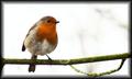
| 06/14/2007 03:28:45 PM | Rby MikeOComment: Came across this and for those who are confused -
This is a European Robin (Erithacus rubecula) which is wholey unrelated to the American Robin (Turdus migratorius), but share a common name because of their similar coloration.
And he's cute as a button. Nice shot. | | Photographer found comment helpful. |
| 06/14/2007 01:01:13 AM | He Loves Me Notby aimeethetooComment: Hum. You're clearly a victim of people who didn't understand the challenge.
Sorry. It's beautiful. The lonely little petal on the ground... wonderful. | | Photographer found comment helpful. |
| 06/14/2007 12:32:07 AM | Three Mandolinsby alexzenComment: Those old Gibson tailpieces sure are a pain, ain't they? Lovely shot, beautiful mandos, and congrats on a personal best. What's the one in the back? | | Photographer found comment helpful. |
| 06/13/2007 09:49:42 PM | | | Photographer found comment helpful. |
| 06/13/2007 09:10:55 PM | Botanyby LanndonKaneComment: Hi from the Critique Club!
You say you were unsatisfied with this one; it seems your instincts were correct, as you scored well below the challenge average.
Pros:
The pinks are nice; I personally like the up-close frame-filling composition.
Cons:
For me there are several:
There are significant blowouts on the petals, which always detracts. My camera will warn me when I have blown-out areas - I find it helps a lot with getting exposure right.
The stamen/pistil cluster has a kind of weird, electric feel to it that is distracting for me; I think it's perhaps just oversaturated.
Having complimented the frame-filling above, I would say that I think it would work better with the flower either less centered or more centered; I'd also have tried a square crop as the aspect ratio does nothing to help to image.
Challenge:
You acknowledge it's a bit of a shoehorn; I think many images in this challenge were so it didn't hurt as much as sometimes, but means you needed a compelling image to overcome it.
Overall I think it ended up scoring a little lower than it deserved, perhaps because of the loose connection to the challenge; however I think some more attention to technicals could have helped significantly. In general an image that is just "pretty" isn't going to grab me a lot unless the technicals are spot on.
-Evan | | Photographer found comment helpful. |
| 06/13/2007 08:31:15 PM | Oh Porcelain God, I Pray to Thee!by ZeusComment: Greetings from the critique club! This is my second image ever to critique, and, well... wow!
Pros:
Well, if you're looking for a powerful, viceral image, this works - it does inspire a strong reaction. And the fake (please let it be fake) puke looks very good.
Cons:
I think you know the answers here, but first of all you (as you knew going in) turned off a lot of voters; DPC voters don't vote high for "ick" as an emotion. The composition is also very busy; if the "humor and shock" element were removed I don't think you'd see many people defending the "artistic quality" of the piece; I also don't think that's what you were going for as your portfolio makes it abundantly clear that you know how to take an aesthetically pleasing shot.
Challenge:
I, for one, appreciate creative takes on challenges, and as an atheist am not bothered by your message particularly... but again from the voters perspective you're going to turn some people off with this take of what is a very serious subject to many.
Overall, I think you knew what you were signing up for when you submitted!
-Evan | | Photographer found comment helpful. |
|
Showing 231 - 240 of ~620 |
Home -
Challenges -
Community -
League -
Photos -
Cameras -
Lenses -
Learn -
Help -
Terms of Use -
Privacy -
Top ^
DPChallenge, and website content and design, Copyright © 2001-2025 Challenging Technologies, LLC.
All digital photo copyrights belong to the photographers and may not be used without permission.
Current Server Time: 08/05/2025 02:21:28 AM EDT.
|