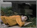
| Image |
Comment |
| 10/22/2003 07:36:01 PM |
Suspended in Timeby jpb56nyComment: Given that the man appears to be homeless and he's eating something in a paper bag beside brightly coloured signs about eating and drinking, you definitely would have had a more powerful image had you captured the subjects face. I realize that street shots are tricky though and who knows if this was an option. Kudos for skipping the staged shot and taking the more unpredictable route. |
 Photographer found comment helpful. Photographer found comment helpful. |
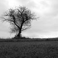
| 10/22/2003 07:32:17 PM |
Despairby jacksonptComment: I would have loved to see this photo more as a wide angle. Less grass, (I'd cut right at where there looks like there is a path) more negative space (of the sky on the right) and without such a close crop of the tree on the left. I do like the B&W. I do really thing you would have had more of a wow factor if the dark grass was not competing with the tree. |
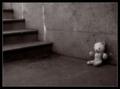
| 10/22/2003 07:29:28 PM |
Left Behindby moodvilleComment: You know aside from the fact that this is a very good photo as is....it also happens to be a very good photo of a subject matter (forgotten toy) a lot of people have tried and not done nearly as well at, for this challenge. Great light and colour choice. The black part of the border IMO is a tad wide, but I'm just nit picking now. Good job! |
| Photographer found comment helpful. |
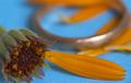
| 10/22/2003 07:26:25 PM |
Loves me notby robsmithComment: You know when I first saw this i wans't completely sold on it, however I left it and came back and I must say it's grown on me. The colour is great, as is the macro detail and the DOF. The only thing I'd remove is the top petal, for some reason I think it draws your eye up of the focus. |
| Photographer found comment helpful. |
| 10/22/2003 07:23:18 PM |
Until You Come Homeby WildflowerJoyComment: Not a terrible idea, but this isn't the most interesting picture. You have captured the audience eye right away by the use of negative space, but the small interest detail doesn't hold it. I think a harder focus of the candle with some additional soft elements in the image would help it a lot. |
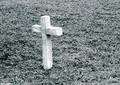
| 10/22/2003 07:21:07 PM |
she left us all to soon..by perkygothComment: I think I would have focused a bit more on the marker as it seems to have some nice details to it, as well I like the colour choice, I would have just lightened it a bit so the busy grass doesn't overwhlem the picture. certainly meets the challenge no issues with that. |
| Photographer found comment helpful. |
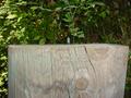
| 10/22/2003 07:19:23 PM |
Warrior solitudeby GREENMEMComment: I like how you're showing such a wide angle view of the top of the wood - yet I think I would have angled the camera a little differently as the height of the wood does not add to your picture but it does take away from your little man. Perhaps setting your camera at eye level with the wood, at one end and the man at the other to show the empty space? |
| Photographer found comment helpful. |
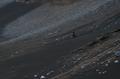
| 10/22/2003 04:41:05 PM |
Where am I?by olistComment: Overall I really like this image - with the exception of the actual subject. The dark clothing and lack of focus really don't draw your eye to the subject. Excellent idea, the actual capture just needs to be tweaked a bit. |
| Photographer found comment helpful. |
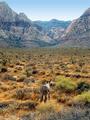
| 10/22/2003 04:39:02 PM |
Red Rock Rush Hourby richsamsComment: Wonderful colours. Comical pose & title. I don't think i would have changed a thing.
Is that a real donkey? |
| Photographer found comment helpful. |
| 10/22/2003 04:37:15 PM |
Dreamsby xionjaComment: I really like the tones in this image. i would love to know what type of adjustments were made, if any. I think i would have cropped a bit off the top just where it meets the gras line, I don't think the top bit adds anything to the image. |
Home -
Challenges -
Community -
League -
Photos -
Cameras -
Lenses -
Learn -
Help -
Terms of Use -
Privacy -
Top ^
DPChallenge, and website content and design, Copyright © 2001-2025 Challenging Technologies, LLC.
All digital photo copyrights belong to the photographers and may not be used without permission.
Current Server Time: 07/31/2025 09:20:14 AM EDT.