| Image |
Comment |
| 10/25/2005 08:16:38 AM |
Missing Youby toddheadComment: This has a great 50s feel to it. The grain is almost too subtle here. That keeps it just shy of and 8. Nice pose, great pensive look. 7 |
 Photographer found comment helpful. Photographer found comment helpful. |
| 10/25/2005 08:14:29 AM |
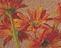
Sand Petalsby Studio18Comment: Not something that works for me asthetically. It's very, very overly processed. But, it does hit the challenge square on the head. The image is enhanced by the grain. 7 |
| 10/25/2005 08:12:04 AM |
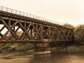
Echo of a Time Gone Byby trtfeasorComment: Good idea, but the grain here looks more like noise than grain. Which I'm sure makes no sense. :) Hmmm, okay, better explination. The sky noise/grain stands out in a way that is visually unappealing. I'm thinking it's a color conversion issue. Possibly a different quadtone conversion would give the same impact....wait, just figured it out. There's a bit of a hint of the green in the sky noise. This makes it less grainy and more noisy...and you are still looking at me like I'm smoking crack. Sorry. :) 6 |
| Photographer found comment helpful. |
| 10/25/2005 07:32:21 AM |
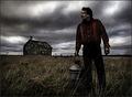
Desolation by Joey LawrenceComment: The grain is highly effective here, but the figure in the foreground is overly sharp. When/if you repost process this one it might help to not sharpen him when sharpening the rest of the image. Very cool shot. 7 |
| Photographer found comment helpful. |
| 10/25/2005 06:33:29 AM |
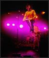
Rock On!by arnitComment: One of the few examples of color grain that I've seen in this challenge that works. Very nice. |
| Photographer found comment helpful. |
| 10/25/2005 06:27:53 AM |
Frostbiteby HoddssonComment: This one is interesting. It's not grainy in the traditional sense, but the sharp edges give it a feel that I like. |
| 10/25/2005 05:59:59 AM |
|
| Photographer found comment helpful. |
| 10/25/2005 05:58:57 AM |
Guiding Lightby gsalComment: Interesting approach here. It's got a very gothic feel to it. It's a bit too centered for me. I'd move a bit to get more of the building or the light on a thirds line. |
| Photographer found comment helpful. |
| 10/18/2005 02:26:37 AM |
Matterhorn - Pride of Switzerlandby Luca66Comment: The foregtound clutter here is a bit distracting. This is a mountain that should give me a feeling of great majesty. As it is, I don't really feel the hight and granduer of the peak. A tigher crop might help that. |
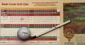
| 10/18/2005 02:21:08 AM |
First Aceby jimmspComment: This image ends up being a bit two dimensional for me. I would consider trying to reshoot at an angle, possibly a table with some green visable behind the card to give the illusion of a putting green. |
| Photographer found comment helpful. |
Home -
Challenges -
Community -
League -
Photos -
Cameras -
Lenses -
Learn -
Help -
Terms of Use -
Privacy -
Top ^
DPChallenge, and website content and design, Copyright © 2001-2025 Challenging Technologies, LLC.
All digital photo copyrights belong to the photographers and may not be used without permission.
Current Server Time: 08/01/2025 09:27:09 PM EDT.