| Image |
Comment |
| 01/26/2005 10:56:24 AM |
Rusted Windmill Pumpby RobCourseyComment: There was something about this pile of rusted bits that attracted you to it. I'm having a hard time seeing what you saw. Part of the problem for me is the additional visual clutter. There's too much going on here, and nothing of strong enough interest to pull me in. Clening the area up a bit before shooting would have made the parts more of the focus. |
| 01/26/2005 10:51:48 AM |
Marilyn Dreams in High Keyby KDOComment: For me personally, this is just too high key. You need a tad more shadow on the nose area to give it some more shape. The nostrils end up just dominating the center of the image. I'm pretty sure that wasn't the goal. :) Interesting idea, trying to replicate a Marylyn Monoroe shot. Might be fun to try again, but paint in some red on the lips? |
 Photographer found comment helpful. Photographer found comment helpful. |
| 01/26/2005 10:49:24 AM |
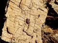
Itsy Bitsyby dv_rockComment: The big thing here is light. It's direct sunlight which is washing any and all color out of the image. That creates that "flat" look to the shot. Composition is actually pretty good though. I think with less sunlight on the spider you could have ended up with some pretty cool shadows from the legs. |
| 01/26/2005 10:47:35 AM |
Breakfastby majuicyComment: The first challenge with this shot is the focus. It looks like you were too close for your AF to lock properly. Step back about 2 paces and try again. That particular DOF choice isn't doing much for this shot. The biggest thing here is controling light. THe light used is way too hard. You can see the reflected light on the bagel. You can use some simple things around the house (Nylons, papertowels, paper) to help diffuse the light and get you a better quality of light. You also might want to think of background. Putting this on a sheet of white paper would help emphasize the subject, and prevent you from being distracted by things like the plate. |
| 01/26/2005 10:43:21 AM |
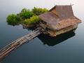
Boat Houseby naretComment: Amazing angle here. I love the totally still water, the way it just creates a totally neutral backdrop for the main subject of the shot. The overall shot is a little dark, and might benifit from being reshot on a slightly brighter day. (Not sunny, just a little brighter). The blanket on the rail helps add a human element to the composition. 8 |
| 01/26/2005 10:41:09 AM |
Lost in loveby p_johnsComment: I like this image the more I look at it. Her studied indifference, and his obvious interest make for a very entertaining story. I like images that tell me a story. And yours does that in first glance. I might move the ashtray, just because it's not really adding much to the image for me. 9 |
| Photographer found comment helpful. |
| 01/26/2005 10:38:16 AM |
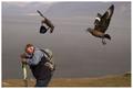
Hats off to the Great Skuaby GautiComment: One of the ultimate you had to be there shots. :) Not only is this a funny image, it's compositionally strong as well. You have an interesting sense of scale with the edge of the cliff and the wide expanse of ocean behind the subject. The image seems a bit sofrt, like the autofocus wasn't able to totally lock in. A bit of sharpening around just the second bird might help it pop out a bit more. 8 |
| Photographer found comment helpful. |
| 01/26/2005 10:36:07 AM |
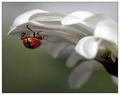
Hanging Outby JackoComment: I never noticed the colors on a ladybug before this. You think that they are just black and red. The gold color comes as a surprise. I love the visual contrast between the hard shell of the bug and the soft petals of the flower. One of the many shots in this challenge that I just sit back and look at for a good bit. 10 |
| Photographer found comment helpful. |
| 01/26/2005 10:32:04 AM |
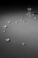
Dropsby hanlombaComment: Clever and well lit. Pindrops. :) DOF is a bit off on the last drop, One of the very best ideas I saw this challenge. 10 |
| 01/26/2005 10:31:06 AM |
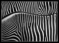
Two Zebrasby dsa157Comment: Awesome abstract image. Excellent choice of border as well. The white is coming out a tad grey on my screen. Might be worth tweaking your white point a bit more to really emphasize the overall contrasts.
I wanna know how you got the zebras to all stand the right way. 10 |
| Photographer found comment helpful. |
Home -
Challenges -
Community -
League -
Photos -
Cameras -
Lenses -
Learn -
Help -
Terms of Use -
Privacy -
Top ^
DPChallenge, and website content and design, Copyright © 2001-2025 Challenging Technologies, LLC.
All digital photo copyrights belong to the photographers and may not be used without permission.
Current Server Time: 08/05/2025 02:22:36 AM EDT.