| Image |
Comment |
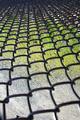
| 04/08/2002 03:41:00 PM |
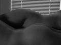
His and Hersby ngoudyComment: The lines of lght through the blinds really contrast the 'hers' curves, but the light on the foreground doesn't pick up the 'his' enough to emphasise the different person. |
| 04/08/2002 03:05:00 PM |
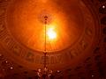
Pasta and Prongsby ReignComment: The shadow in the foreground and the bleached-out look of the background give this a back-to-front feel, which isn't always a bad thing... |
| 04/08/2002 04:10:00 PM |
|
| 04/08/2002 04:23:00 PM |
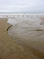
Point Reyesby MousieComment: A multitude of curves lead the eye out, but to a flat horizon. I would personally cut the image in half, and use solely the bottom half, which would emphasise more the shapes within the different flows of water. |
| 04/08/2002 03:51:00 PM |
|
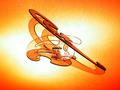
| 04/08/2002 04:27:00 PM |
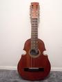
The Guitarby ElCarniceroComment: The lighting needs to be adjusted to pick up the lower, more curved body of the guitar, rather than emphasising the metallic frets against the neck. |
| 04/08/2002 03:44:00 PM |
|
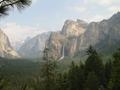
| 04/08/2002 04:38:00 PM |
valleyby bobgaitherComment: Difficult, the foreground trees are very dark, yet the main scenery feels washed out. However, you've managed to get a huge amount of detail into the shot. |
| 04/08/2002 03:08:00 PM |
|
 Photographer found comment helpful. Photographer found comment helpful. |
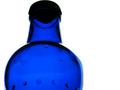
| 04/09/2002 02:45:00 AM |
Bottledby mciComment: The bright lighting makes the neck of the bottle appears to almost separate it from the body. However, the droplets inside the bottle detract from the symmetry, and the cap feels too dark - perhaps a shot without the cap on would have helped. |
Home -
Challenges -
Community -
League -
Photos -
Cameras -
Lenses -
Learn -
Help -
Terms of Use -
Privacy -
Top ^
DPChallenge, and website content and design, Copyright © 2001-2025 Challenging Technologies, LLC.
All digital photo copyrights belong to the photographers and may not be used without permission.
Current Server Time: 08/21/2025 09:24:43 PM EDT.