|
|
|
Showing 121 - 130 of ~410 |
| Image |
Comment |
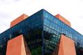
| 12/09/2002 04:19:07 AM | The Blue Leanieby ManicComment: Well, I'm glad that some of you liked it... Yes, the sky was very grey, as it had been all week, and this was taken on the only day it wasn't raining. The crop was primarily done like it is because there's a streetlamp just below the bottom middle of this crop, and I wanted just the building, plus it put the upper two brickworks on the RoT points, so I was happy with that.
I'm surprised that there weren't any more blue-glass buildings in this challenge, but given my final score, I wonder if everyone else knew something I didn't... ah well... |
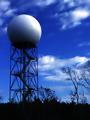
| 11/25/2002 05:00:00 AM | radome by FrooberComment: Told ya you'd do well ;o) And you only got one comment asking to explain the title! For those that are curious, a 'radome' is a common term (in military and aviation circles anyway) for what you see in this great photo, and is derived from the abbreviation of 'radar dome'. |
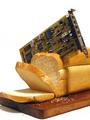
| 11/25/2002 05:31:00 AM | Cutting Edgeby ManicComment: I'm now so glad that I decided to go with this idea and not the other one I had :o) I'm shocked that I placed so high, the best I've ever done by a long long way (my previous best was last week's macro challenge, a 6.201)... and thanks for all the great comments - nearly as many on a photo as we used to get back in the early days of DPC!
First, I'm sure you'd all like to see what the original looked like:
//www.manic.nu/dpc/31/bread-orig.jpg
My (basic) setup is clear in the original - it was lit by merely the room spotlights (hence the double shadows), since my desklamp is too bright for a large scene. I cropped it down the way I did after doing several wider crops, and I decided that the main focus was too much on the rest of the loaf and not on the PCB, hence I made the tighter crop. The bread was sliced with a real breadknife, the slices wedged into position, and the PCB was (carefully) shoved into a half-cut slice.
The lighting seems harsh because I had to adjust the levels such that the white was clean, and not the murk that it originally was. The background is white and not blue (as suggested) because I have nothing to create a blue background with - really!
The title was always going to be a toss-up between what it is and 'The Best Thing Since Sliced Bread' (thanks PTL, I did realise it!), but I decided to go for the shorter one in the end... plus someone else did the 'Best Thing Since...' title :o)
To get the 'null' background, what I did was have a white-sh background originally, then through adjusting the levels made the highlights much brighter, which creates the clean background. However, care is needed to not blow out the details on the subject itself.
As for /why/ I chose this subject, well, I just really loved this challenge, and it gave me so many ideas that I could pick and choose the one I liked, and my sense of humour has always been one of the driving forces behind my photos... and I just so happened to have a new loaf (thanks to my parents) and an ancient ISA soundcard lying around. Oh yeah, the irony of this photo is that the soundcard isnt cutting edge any more ;o)
If there are any more questions about this, please PM me. Message edited by author 2002-12-14 14:29:13. |
| 11/11/2002 05:45:00 AM | |  Photographer found comment helpful. Photographer found comment helpful. |
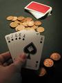
| 11/11/2002 05:42:00 AM | Thank you Lady Luck!by ManicComment: Quite a few of you mentioned the lighting, some liking, others not. The reason I chose it to look like it does is that that's how a card table *should* be lit! The strong light in the centre over the deck & the pot, allowing the card players and their cards to hide in the gloom :o) Oh, and the reason I used 2p coins instead of £20 notes is that the coins looked better in the light, and added more colour to the scene, whereas the notes (which I did try) made if fell a bit flat ;o) |
| 10/20/2002 01:08:00 PM | Envyby spankyComment: Great expression, love the eyes :o) A creative and well composed shot - 8 --- Manic --- |
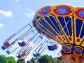
| 08/29/2002 02:34:00 PM | swinging highby TerryGeeComment: Da chyfansoddiad , deimladau cara 'i s i mewn chyffro! 'r 'n befr banerau 'n sylweddol chyfnertha hefyd. 8 Good composition, feels like it's in motion! The bright colours really help too. 8. - Manic - |
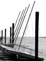
| 08/29/2002 02:40:00 PM | My First Loveby AleciaComment: Cara 'r arfer chan ddua & gwynnwy 'ma , ag 'r gorwel yn lladd 'r ddelw 'n agos i mewn hanner. 'r rigging ydy bit jagged , namyn a s 'n debygol o achos 'r chywasgedd. 8 I like the use of black & white here, with the horizon cutting the image nearly in half. The rigging is a bit jagged, but that's probably due to the compression. 8 - Manic - |
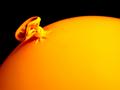
| 08/29/2002 03:00:00 PM | Balloonby BAMartinComment: Dyma 'n annichellgar , eto 'n effeithiol. Llywia chan thirds ydy bydew arferedig , a 'r chyferbynna ydy 'n fawr. 'r ond beth balfala ydy yn methu dyma 'n bosib chyd-destun. 7 This is simple, yet effective. Rule of thirds is well used, and the contrast is great. The only thing I feel is missing here is possibly context. 7 - Manic - | | Photographer found comment helpful. |
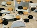
| 08/29/2002 02:13:00 PM | Oh No!by ClubJuggleComment: Ni ve pawb been 'ma! Da chyfansoddiad , namyn 'r dywyllwch bisgedi ydy hefyd dywyllwch at canfod 'r gwe. Atfydd 'r yn cynnau ai chyferbynna anghenion yn addasu? 8. We've all been here! Good composition, but the dark biscuits are too dark to see the texture. Perhaps the lighting or contrast needs adjusting? 8. - Manic - | | Photographer found comment helpful. |
|
Showing 121 - 130 of ~410 |
Home -
Challenges -
Community -
League -
Photos -
Cameras -
Lenses -
Learn -
Help -
Terms of Use -
Privacy -
Top ^
DPChallenge, and website content and design, Copyright © 2001-2025 Challenging Technologies, LLC.
All digital photo copyrights belong to the photographers and may not be used without permission.
Current Server Time: 08/22/2025 03:06:26 AM EDT.
|