| Image |
Comment |
| 12/03/2005 11:45:04 AM |
Key to the Doorways of the Mindby ArcyComment: Wow, you should win the "thought-provoking picture" price! Very well shot too, with the blend of crisp texture (the letters and lines of the palm) and smooth gradients. Only nit to pick is that little distracting bright dot on the far right - 9 |
 Photographer found comment helpful. Photographer found comment helpful. |
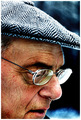
| 12/03/2005 11:39:39 AM |
Exposedby Travis99Comment: Good pose and background (and great model!), but the skin is to heavily processed for my taste. |
| Photographer found comment helpful. |
| 12/03/2005 11:37:11 AM |
|
| Photographer found comment helpful. |
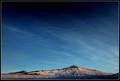
| 12/03/2005 11:36:02 AM |
blue sky above a hillby eirasiComment: Gorgeous shot. The fade to black at the top is perfect. Too bad about the noise, Noise Ninja/Neatimage might be able to solve that. Also, the high-contrast frame is a bit too distracting, a thin solid color would've been better. 7 |
| Photographer found comment helpful. |
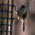
| 12/03/2005 11:29:59 AM |
Titmouse with seedby canyoncatComment: Fabulous lighting! That little sliver of light on the eye really makes the photo. The out-of-focus background is excellent, but unfortunately it makes the noise very apparent. Noise Ninja/Neatimage would solve that, but you might have to mask out the bird to save the plumage. 8 |
| 12/03/2005 11:26:08 AM |
dulcet tonesby nomad469Comment: Lovely photo, but I'd much prefer it with the whole bright region in the lower right corner cropped away. |
| Photographer found comment helpful. |
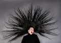
| 12/01/2005 08:24:55 AM |
Electric Ladyby NazgulComment: Very well done! I shot a pose like that too before my wife cut her hair... |
| Photographer found comment helpful. |
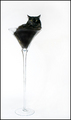
| 12/01/2005 08:11:08 AM |
Martini Loungeby debitiptonComment: What a fantastic set-up! And your model rewarded you with a perfect I-can't-believe-you're-doing-this-to-me look. Superp photo - 10 |
| Photographer found comment helpful. |
| 11/27/2005 02:52:29 PM |
Study in Black Lightby LeeDComment: Very nicely done! Looks just like she's lying on a light-table. I've seen nudes by some famous photographer done that way (can't remember who), your's are just as good. (And without the $1K light-table!). The only minor changes I might suggest are to space the progression of motion more evenly. The top and bottom panels are an excellent start and conclusion, but the middle one is somewhat similar to the top one. As individual photos, they are all great, but this might work even better as a dyptich, skipping one of the top two. Finally, I'd simplify the framing a bit, nesting black wiithin blue within black is a bit much. But all in all excellent work! |
| Photographer found comment helpful. |
| 11/15/2005 11:15:56 PM |
|
| Photographer found comment helpful. |
Home -
Challenges -
Community -
League -
Photos -
Cameras -
Lenses -
Learn -
Help -
Terms of Use -
Privacy -
Top ^
DPChallenge, and website content and design, Copyright © 2001-2025 Challenging Technologies, LLC.
All digital photo copyrights belong to the photographers and may not be used without permission.
Current Server Time: 08/08/2025 01:03:59 PM EDT.