| Image |
Comment |
| 01/13/2007 11:40:58 PM |
gangstaby nomad469Comment: Fabulous portrait! The money is too much, but the rest of the outfit is perfect! |
 Photographer found comment helpful. Photographer found comment helpful. |
| 01/13/2007 11:38:47 PM |
Age of Enlightenmentby JutildaComment: Lovely model and you've certainly captured her eyes beautifully. My only nitpick is the yellow cast on parts of her face. It's probably deliberate, to add a sense of warmth, but it's too uneven. There's also a strange faint blue horizontal line across her neck. |
| Photographer found comment helpful. |
| 01/13/2007 11:33:04 PM |
|
| Photographer found comment helpful. |
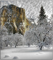
| 01/13/2007 11:24:17 PM |
Snow Day in Yosemiteby TDCollinsComment: That's quite a sky you got for a backdrop there! And the color on the cliff and nowhere else works very well. I'm assuming this is not selective desaturation, but rather just what the scene looked like, either way it just looks right! |
| Photographer found comment helpful. |
| 01/13/2007 11:17:03 PM |
The freedom to dreamby jaxedComment: I think would have liked this one more with less postprocessing. In particular the artifacts around her right arm are very strange (supposed to look like fairy-dust?). |
| Photographer found comment helpful. |
| 01/13/2007 11:13:16 PM |
|
| Photographer found comment helpful. |
| 01/13/2007 03:04:07 PM |
The Badlandsby sfarrell23Comment: The matching horizontal layers in the land and the clouds are great. Also the muted colors work very well, many DPCers would have been tempted to boost the saturation. But I don't like the composition much, in particular how that cloud looks like it's billowing out of the mountain peak. |
| 01/13/2007 02:59:48 PM |
I Hate Mondays...by Blue MoonComment: Great idea! The expression and title match perfectly. But the fur looks very postprocessed, looks more like feathers than fur... |
| 01/13/2007 02:57:40 PM |
The Lochby JustinMComment: Great mountain scene, only the purple cast to the sky isn't very natural (and if you look too carefully, you see the the selection outline of the sky) |
| Photographer found comment helpful. |
| 01/13/2007 02:53:17 PM |
What's Simple is Trueby nsoroma79Comment: I like the concept and pose, but wish I could see just a bit more face (at least the whole mouth). Also, the contrast is a little to much, causing banding on her right arm and highlights just about blown. |
Home -
Challenges -
Community -
League -
Photos -
Cameras -
Lenses -
Learn -
Help -
Terms of Use -
Privacy -
Top ^
DPChallenge, and website content and design, Copyright © 2001-2025 Challenging Technologies, LLC.
All digital photo copyrights belong to the photographers and may not be used without permission.
Current Server Time: 08/05/2025 06:21:13 AM EDT.