| Image |
Comment |
| 11/27/2007 10:35:57 PM |
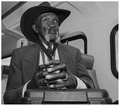
An Ingenious Gentleman Of Our Days by nutzitoComment: Very good portrait, seems to capture the essence of the individual. I don't normally like a point of view from below the face, but here it seems to work well. |
 Photographer found comment helpful. Photographer found comment helpful. |
| 11/27/2007 10:33:23 PM |
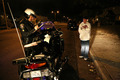
In My Hood - Ode to 50 Centby elizadebComment: Very good challenge rendition, facial expression and contrast with the t-shirt. There's something about it that I don't really like... I think it's the background with it's dominating mid-tone gray. |
| Photographer found comment helpful. |
| 11/27/2007 10:32:02 PM |
|
| 11/27/2007 10:29:52 PM |
Walking to work.. And loving every second of it!by Graeme44Comment: Wouldn't normally care for the blown sky, or the cut-legs composition, but matches the challenge perfectly so a high score from me. Suggestion for blown overcast sky: convert to black & white. The colored stripes steal too much attention from the face anyway. |
| Photographer found comment helpful. |
| 11/27/2007 10:15:05 PM |
Bustedby TomComment: The street is here, not sure where the smarts are :) Good candid. |
| Photographer found comment helpful. |
| 11/15/2007 11:34:29 AM |
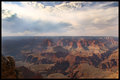
Big Bowlby HoserComment: Hmmmm - excellent! Magnificent sky - that really makes the photo! Very often people forget when shooting landscapes that one of the crucial elements is... the sky.
I agree with previous comment that horizon should not be in the middle - I've made that mistake myself many times. Now the problem is - where do you move it, up or down? You don't want to cut out the canyon, but you don't want to crop that great sky either! Tough choice, I guess maybe on the spot, through the lens, it's easier to make this decision.
Yes, colors are muted and hazy, but I don't think there is anything you could have done differently photographically - this is properly exposed. Any more and you would have blown out the sky. So either shoot at a different time of day (not easy, it's not like this view is from your backyard, I know) or maybe a GND filter?
Now, this problem can be somewhat solved in Photoshop. I will give it a quick go later and see if the beautiful tones and textures in the rock can be brought back to life.
Great shot.
Matei
Edit: oh, and the close-up rock in the bottom left contributes more to the balance and "impact" of the image than it would seem at first glance. Message edited by author 2007-11-15 11:35:19. |
| Photographer found comment helpful. |
| 11/14/2007 09:19:04 PM |
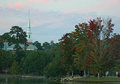
Lake Ella Churchby bennettjamieComment: I actually like the composition here quite a bit... I think the church the upper left is balanced by the strong reds in the tree in the bottom right. Unfortunately, the church spire gets lost a bit in the sky, which is about the same intensity.
Again - tough scene to expose properly. Trees are a bit underexposed (no other way to get the sky in right). Plus the lighting on the trees is a bit "flat" which is a pity given the nice colors. I would suggest bringing the trees back with Levels adjustement in Photoshop. I also enhanced the contrast on the church a little bit, not entirely sure that worked well though:
 Message edited by author 2007-11-15 10:11:42. Message edited by author 2007-11-15 10:11:42. |
| Photographer found comment helpful. |
| 11/07/2007 09:33:02 AM |
Goldby The_DentistComment: Woo hoo - completely destroyed!! No problem, I knew it was going to happen :)
So, my idea at least - of course the subject here is something old! The leaves are dying! Quite a few pics in the top 10 are about fall and the death of summer, but I chose to focus on one branch instead of the forest, plus I didn't want to push it with the title. So I tried to be more subtle: "Gold" as in "the golden age" but also "gOLD"...
It's my free study from the same trip that's also bombing and that's killing me because I had high expectations for THAT one. This image, I just had some fun with it. |
| 09/12/2007 09:55:45 AM |
|
| Photographer found comment helpful. |
| 09/07/2007 10:42:05 PM |
Birthday-6-720.jpgby idnicComment: I like this one most of the bunch. The negative space on the left seems to work very well with the pose and expression, so does the metalic chair and the light touch on it. You can really feel the emotion in this image. |
| Photographer found comment helpful. |
Home -
Challenges -
Community -
League -
Photos -
Cameras -
Lenses -
Learn -
Help -
Terms of Use -
Privacy -
Top ^
DPChallenge, and website content and design, Copyright © 2001-2025 Challenging Technologies, LLC.
All digital photo copyrights belong to the photographers and may not be used without permission.
Current Server Time: 06/17/2025 12:38:23 AM EDT.