| Image |
Comment |
| 05/06/2007 11:12:52 AM |
|
 Photographer found comment helpful. Photographer found comment helpful. |
| 05/06/2007 11:11:26 AM |
UIUIUby tateComment: To me, this shows that you can shoot a boring subject with a different angle to jazz things up a bit. Shooting from the ground makes this image really interesting while giving a clean background. Good job! |
| Photographer found comment helpful. |
| 05/06/2007 11:09:05 AM |
Down The Riverby JudiComment: WOW!! Shots like this make you feel humble in front of Mother Nature... |
| Photographer found comment helpful. |
| 05/06/2007 11:07:42 AM |
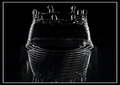
Every Wall falls downby janbruderComment: I am always impressed by shots like this. Just the patience you must have to redo it again and again until you catch it just perfect. I would have preferred if it had not been cropped so tight at the bottom. The reflection would have given an additional symmetric axis. |
| Photographer found comment helpful. |
| 05/06/2007 11:04:50 AM |
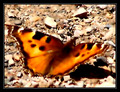
madamby BlackboxComment: This is a great shot and I can't imagine why you would apply a blurring effect to it. The colors jump out of the sreen, the composition is great. I don't understand. The blurring of the surroundings don't bother me as much as the blur on the butterfly. With basic editing, I understand you could not do differently but still... WHY? |
| Photographer found comment helpful. |
| 05/06/2007 11:02:05 AM |
Powerlinesby jparisiComment: This is a very unusual angle for shooting powerlines. A bit too wahsed out though... But because it sticks so well with the challenge theme, I'll give you more points. |
| Photographer found comment helpful. |
| 05/06/2007 10:59:13 AM |
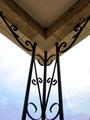
Calling All Saintsby JustinBellComment: Not completely symmetric so I will have to note it down vs the other totally symmetric shots. But I love the sepia treatment and the grain. I would have loved to see this with a different shooting angle so that the "tower" is not right in the middle. |
| Photographer found comment helpful. |
| 05/06/2007 10:56:41 AM |
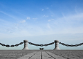
Corner Postby Blackstarlight0Comment: Symmetric but does not have a real point/story to tell. The composition with the post right in the middle also make the shot a bit boring. A different shooting angle would have jazzed it up a bit. |
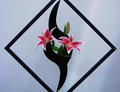
| 05/06/2007 10:53:49 AM |
The Art of Arrangementby bdennyComment: This is lovely - the colors, the saturation of the pink. I am a bit distracted by the lnely bud on top of the right flower. Symmetry would have been enhanced if not for that bud. I love the ray of light that falls onto the right flower. |
| Photographer found comment helpful. |
| 05/06/2007 10:52:01 AM |
The dry Woodby vishalpsuComment: No real symmetry here compared to what others have submitted. Would have been more fitted for submissions in the Rule of thirds challenge. The colors are a bit dull. Maybe you could try covnerting to B&W and play with the channels to give it a bit more depth and contrast. Not a bad shot - just needs a bit of work IMO. |
Home -
Challenges -
Community -
League -
Photos -
Cameras -
Lenses -
Learn -
Help -
Terms of Use -
Privacy -
Top ^
DPChallenge, and website content and design, Copyright © 2001-2025 Challenging Technologies, LLC.
All digital photo copyrights belong to the photographers and may not be used without permission.
Current Server Time: 09/04/2025 08:02:52 AM EDT.