|
|
|
Showing 321 - 330 of ~1067 |
| Image |
Comment |
| 12/11/2003 06:17:50 PM | My Little Explorerby delarimanComment: Greetings from the Critique Club!
I think this is a really fantastic shot. The expression on her face is well captured, and the overall composition, while unusual, works well here. Your use of flash has really lit your subject well. I almost wish that the background/surroundings were just a little bit brighter, to give us a little more context.
Nice job!
Steve |
| 12/08/2003 12:35:33 AM | |  Photographer found comment helpful. Photographer found comment helpful. |
| 12/08/2003 12:06:42 AM | | | Photographer found comment helpful. |
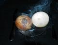
| 12/07/2003 11:12:55 PM | They Are Sweet Onions.... Really, Trust Me !!!!by DrakeComment: Greetings from the Critique Club.
OK, I see what you were going for here. But, the lighting makes it tough to figure out exactly what's going on here.
As for composition, I think you should have made it ovbiously off-centered, or exactly centered. Either would have worked, but this barely off-centered thing here makes it look like an accident.
Finally, as for the smoke, it is a great idea, and very well captured. Unfortunately, it starts from below your image, so it really just looks like smoke from an unrelated source.
I hope this helps!
Steve |
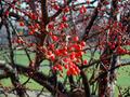
| 12/07/2003 01:30:11 AM | Berry Interestingby str8edgemurdarioComment: Greetings from the Critique Club!
This is a pretty good idea, and the colors are great here. The main problem is, the very centerpoint of your shot is out of focus. I think your plane of focus is a little bit behind that front clump of berries. What happens is, I am left with my eyes wandering around looking for what you intended me to see.
Also, your image may be showing something that has an aroma or scent, but it isn't really conveying that sensation to the viewer.
The composition and colors are very nice, however.
Steve |
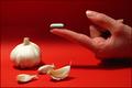
| 12/02/2003 06:20:49 PM | Finger-tip Solutionby GPComment: Greetings from the Critique Club!
There are lots of good things to say about this image. I like your lighting - the shadows resulting from a single light-source are very pleasing. The shadow of your hand is making an accusatory gesture to the garlic. The composition is well thought-out. The color Red is a great contrast against the gum.
A couple of very minor issues: As you know, your garlic is just a tad bright - not enough to hurt your image, though. The major problem I had was not being able to tell what that thing was resting on your finger until I read your comments. At first, I thought maybe it was a vitamin supplement for garlic, and this was a poster advertising the health benefits of garlic pills, free from the smelly breath. Anyway, all around good shot!
Steve | | Photographer found comment helpful. |
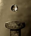
| 11/30/2003 07:58:42 PM | To spike a drink by kosmikkreeperComment: Greetings from the Critique Club!
Oh wow! I just clicked on the button to do a CC crit, and this shot popped up!
Your flash use was obviously very effective here. It really put highlights in the shot where there wouldn't have been any otherwise. Your idea is great, definitely fits the challenge, and your composition is well chosen - I like the horizontal centering, and vertically, it seems both the droplet and the spike head are on thirds lines. Of course, the focus is tack-sharp, as it needs to be for an effective water macro.
I guess the reflection in your water droplet are the faucet and handles of the sink, right? I guess the only thing that I would have done differently is the toning - I wonder what it would have looked like with a slight blue toning added to it, instead of the greenish-brown it has here? Anyway, congratulations on a great shot! | | Photographer found comment helpful. |
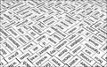
| 11/27/2003 12:09:42 PM | “A Picture Is Worth A Thousand Magnets”by melongrindComment: Greetings from the Critique Club!
I like the unreal feel to this. I'm guessing you created this effect by bumping up the contrast quite a bit. It really works for you. Also, you have done a great job controlling your depth of field - each word is crisp and in focus. Also, your composition - the placement of each individual word - is very nice. I wonder what it would have looked like if you had shot the words right-side-up instead of up-side-down. Finally, I don't think that shot under "aesthetic" hurt your image at all - I had to look pretty hard to even find that word, and find your mark. If you hadn't mentioned it, I never would have noticed it.
Good job!
Steve |
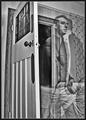
| 11/26/2003 12:02:06 PM | Neither Here Nor Thereby ImagineerComment: Greetings from the Critique Club!
This photo is absolutely fantastic. Your idea is unique and well thought out. Your composition is perfect; I like how you have chosen a lower perspective.
I think the door may have moved just a tiny bit during shooting; look at the doorknob - there seem to be two of them.
Anyway, this great idea was very well executed, and the score reflects that. Congratulations!
Steve | | Photographer found comment helpful. |
| 11/24/2003 12:32:48 AM | Guess Who? by Firstrich1Comment: Wonderful. The star filter effects on the earrings don't really have much to do with the shot itself, but somehow I think they give it the mood it needs. 9. | | Photographer found comment helpful. |
|
Showing 321 - 330 of ~1067 |
Home -
Challenges -
Community -
League -
Photos -
Cameras -
Lenses -
Learn -
Help -
Terms of Use -
Privacy -
Top ^
DPChallenge, and website content and design, Copyright © 2001-2025 Challenging Technologies, LLC.
All digital photo copyrights belong to the photographers and may not be used without permission.
Current Server Time: 08/05/2025 07:35:13 AM EDT.
|