| Image |
Comment |
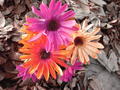
| 01/14/2006 04:11:40 PM |
Bloomby jsasComment: I think the texture of the leaves is competing with the flowers for focus. Maybe shallow depth of field would have worked better? |
 Photographer found comment helpful. Photographer found comment helpful. |
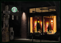
| 01/14/2006 04:10:58 PM |
Boulevard of Java Dreams (ala Gottfriend Helnwein)by DrAchooComment: Very Edward Hopper-esque...I like the moodiness of this. This wasn't the type of shot I envisioned for "A Burst of Color" but I can't argue that there are colorful (if subdued color) elements in an otherwise neutral background. I just noticed the title. I will have to look up Gottfriend Helnwein. |
| Photographer found comment helpful. |
| 01/14/2006 04:07:36 PM |
Crazy Daziesby hideoutComment: There is a stark and offbeat quality to this shot that appeals to me. At first I was inclined to critique the unbalanced placement of the flowers at the top of the frame and dismiss the line of grout as a distracting element. However, the more I look at this the more I like it. I can actually imagine enjoying viewing this in a gallery frame. It is likely a happy accident but thanks for sharing it. |
| Photographer found comment helpful. |
| 01/14/2006 04:02:30 PM |
Beach Meltdownby TransitComment: Only Yellow appears to be upset by this tragic mishap. Blue seems peeved but not overly concerned over the fate of poor Orange and Red is standing off in the background rubbernecking. I like that there is stil a bit of head left on Orange--it's rather unsettling and gory in a whimsical sort of way. |
| Photographer found comment helpful. |
| 01/14/2006 03:59:23 PM |
Blast from the Pastby GermaineComment: I like the red in contrast with the blue-grey. I also like the layers of pattern on the left side created by the different focus levels. The right of the frame is a bit weak for me---too much bright white competes with the pleasing harmony of the left of the frame. There are some really nice elements in this shot but overall it doesn't quite come together for me. |
| 01/14/2006 03:56:59 PM |
Sarah - Land downunder coloursby trobergeComment: I like this in a weird 80's graphics kind of way. The cropping is cutting it close near her head, however. Also, there is a harsh line of shadow along her right arm, and an area of darkness between her left arm and her jeans that give this a weird cut-out appearance. I think the cloning could have been a bit smoother. |
| Photographer found comment helpful. |
| 01/14/2006 03:53:16 PM |
Peek-A-Booby 2hooComment: This is a nice portrait. I love the red of the blanket in contrast with the deep blue of the baby's eyes. I think it is a bit washed out in the highlight areas though. There is quite a large expance of overexposed white blanket in the foreground that isn't doing much for the composition. |
| Photographer found comment helpful. |
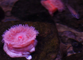
| 01/14/2006 03:51:55 PM |
Anemoneby Mal37Comment: Interesting subject and I like the color scheme. The focus could be sharper on the anemone. |
| Photographer found comment helpful. |
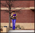
| 01/14/2006 03:51:14 PM |
School's Outby JutildaComment: This background is a bit busy--
All these things are competing for focus which detracts from the impact of the purple binder:
*the two-tone stripe pattern on the wall
*the brick pattern
* the texture in the shrubbery
*the twiggy lines of the branches
* the broken line created by the grey/white elements on the stair wall
*her large, shiny studded belt |
| 01/14/2006 03:45:28 PM |
Mc Burstby keoneComment: Interesting idea. It needs to be sharper in focus and lit better to cut down on the shiny highlights. The white background looks a bit pink in my monitor. |
| Photographer found comment helpful. |
Home -
Challenges -
Community -
League -
Photos -
Cameras -
Lenses -
Learn -
Help -
Terms of Use -
Privacy -
Top ^
DPChallenge, and website content and design, Copyright © 2001-2025 Challenging Technologies, LLC.
All digital photo copyrights belong to the photographers and may not be used without permission.
Current Server Time: 08/28/2025 06:32:34 PM EDT.