| Image |
Comment |
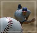
| 04/28/2004 08:50:20 PM |
Painting the Corners by toddheadComment: I was wondering, "How'd you do that?" and then it struck me. I'm guessing you propped the baseball on something and had the pitcher mime the act of throwing a ball. Pretty clever. I haven't decided how I feel about the border. It kind of looks like the framing guide in a viewfinder and I suspect that's what you were aiming for. This is by far the best photograph I've seen today. I think it says more about forced perspective then proportion but maybe the two go hand in hand. |
 Photographer found comment helpful. Photographer found comment helpful. |
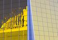
| 04/28/2004 08:48:08 PM |
Half and halfby bmatComment: Your fractions are off. Blame that blue wedge in the middle. This would have been a much better photo had you just included the panel with the reflections. |
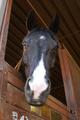
| 04/28/2004 08:45:46 PM |
Look Up to Those Who are Radiantby mirdonamyComment: I like the unusual perspective of this horse portrait but it suffers from lack of focus and washed out colors. While it demonstrates perspective, I don't find that it says anything about proportion. |
| Photographer found comment helpful. |
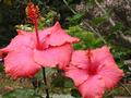
| 04/28/2004 08:44:28 PM |
Paradise Pinkby acarnComment: This is too small to really make an impression. There isn't any brilliance to the pink petals. The background should have been blurred using shorter DOF. It doesn't say anything to me about proportion. |
| Photographer found comment helpful. |
| 04/28/2004 08:41:40 PM |
Perfect proportionsby johnmComment: I like the curvy lines and the orange against the metallic silver. I don't like all the reflection in the fender. |
| Photographer found comment helpful. |
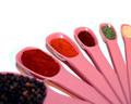
| 04/28/2004 08:40:17 PM |
Spicy!by cbellerComment: I like this for it's color and design. It needs sharper focusing to make a stronger impact. |
| Photographer found comment helpful. |
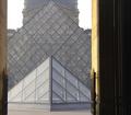
| 04/28/2004 08:38:04 PM |
Louvre Pyramidsby chinkenminComment: Perhaps if you had framed this so that only the glass structures were included? I generally like doorways for framing the subject but they aren't working hard enough here. |
| Photographer found comment helpful. |
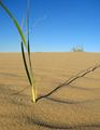
| 04/28/2004 08:34:24 PM |
The Shady Proportions of Time.by boredComment: I wonder if you needed to include so much sky, if any, in this photo? I cropped it by scrolling up to obscure the sky and I liked it much better. I also like it with just the thinnest strip of blue at the top. Try it, you'll like it. High marks for the excellent detail in the sand and shadow. |
| Photographer found comment helpful. |
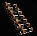
| 04/28/2004 08:32:10 PM |
Copper Topsby Beerme425Comment: This is an nice abstract composition. I don't love it but its one of the best photos I've seen today. |
| Photographer found comment helpful. |
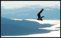
| 04/28/2004 08:30:54 PM |
Unassisted Flightby mbardeenComment: Lose the distracting double-border. Otherwise, this is one of the better shots of seen today. Could use some more sharpness in the first two foothills. The washed out color leaves much to be desired. I can't tell if that's snow or water. |
| Photographer found comment helpful. |
Home -
Challenges -
Community -
League -
Photos -
Cameras -
Lenses -
Learn -
Help -
Terms of Use -
Privacy -
Top ^
DPChallenge, and website content and design, Copyright © 2001-2025 Challenging Technologies, LLC.
All digital photo copyrights belong to the photographers and may not be used without permission.
Current Server Time: 08/24/2025 08:28:51 AM EDT.