| Image |
Comment |
| 05/03/2004 02:33:43 PM |
Blueby nicklevyComment: This is a nice clean abstract image. Nice form and good contrast. It doesn't wow me but it works. |
 Photographer found comment helpful. Photographer found comment helpful. |
| 05/03/2004 02:32:36 PM |
SPLAT!!!by rickhd13Comment: The dead centered white paint splotch isn't doing much for me. Perhaps if you had framed it so it was off center and coming from a corner of the frame. It might have been interesting, for instance, to have the white lines radiating from the top left corner of the frame. |
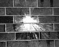
| 05/03/2004 02:29:11 PM |
Bus Tourby Clifton E JonesComment: This is really nice. Nice sharp image, good deliniation of line, form, and color. Kudos on meeting the challenge so well. |
| Photographer found comment helpful. |
| 05/03/2004 12:28:48 PM |
867by Links 2 3 4Comment: NICE! Great color, good lines. High marks from me! |
| Photographer found comment helpful. |
| 05/03/2004 12:28:12 PM |
Wings of Yesterdayby MotoCycleBoiComment: The piles of flaked paint detract from the abstract quality of this image. For me, an abstraction needs to have clear delineations between design elements. Perhaps if you swept the scene first? Shooting from directly above might be an improvement. |
| Photographer found comment helpful. |
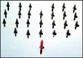
| 05/03/2004 12:25:30 PM |
Inspecting the Troopsby ColeyComment: I'm reminded of The Sea of Holes in The Yelllow Submarine movie. There's some image quality lost in the file compression, it seems, so the effect isn't quite as powerful as it should be. Still, it's imaginative, shows good design sense, and makes me wonder how it was done. Ah, and I just noticed all the shapes made an overall shape of a heart. Not sure why that didn't jump out at me right away. |
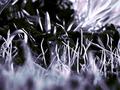
| 05/03/2004 12:22:18 PM |
the Forest for the Treesby dacrazyrnComment: I don't know if black and white (or is it duotone?) is working too hard here. The shallow depth of field (too much blurring in the front) doesn't help. I have to say this isn't a great effort. Better luck next time! :D |
| Photographer found comment helpful. |
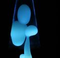
| 05/03/2004 12:20:26 PM |
Father & Childby RoosterComment: This is spooky and definitely abstract. It took me a second to figure out what this is. It looks like trick photography until you realize how simple it actually is. |
| Photographer found comment helpful. |
| 05/03/2004 12:17:45 PM |
|
| Photographer found comment helpful. |
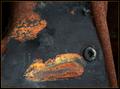
| 05/03/2004 12:13:40 PM |
Rust Paintingsby KaveyComment: I think this might have looked more abstract without the fly. I like the fly in this photo (although it could be a bit more obvious. I think if you upped the contrast and fiddled with the hue/saturation levels, you would have a stronger design. Also, the bit of negative space along the right edge gives too much sense of depth and doesn't really add to the overall design. I don't see enough of a contast between the negative space created by the black and the shapes created by the rusty splotches. |
| Photographer found comment helpful. |
Home -
Challenges -
Community -
League -
Photos -
Cameras -
Lenses -
Learn -
Help -
Terms of Use -
Privacy -
Top ^
DPChallenge, and website content and design, Copyright © 2001-2025 Challenging Technologies, LLC.
All digital photo copyrights belong to the photographers and may not be used without permission.
Current Server Time: 08/24/2025 02:16:47 PM EDT.