| Image |
Comment |
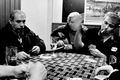
| 04/19/2006 04:55:28 PM |
The Turksby kiwinessComment: Why oh why did this rank so low in a CANDID challenge.You're right--it's not DPC material but this is a candid challenge, right? Loved the content, loved the motion blur, especially loved the expression and overall look of the guy with the cigarette. It got an 8 from me. Now I wish I scored it higher. |
 Photographer found comment helpful. Photographer found comment helpful. |
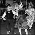
| 04/19/2006 04:52:36 PM |
Joyby garlicComment: This got a 9 from me because you captured, quite naturally, their exhuberance of the dance. I love the expression on the girl to the right. It's too bad the front girl's feet got cropped, but for me, with this type of shot that's not really such a big deal. I disagree immensely with epsy's persistance (in this and other comments that she has made) that it is 'easy' to grab really great candids of children. Feh!
[i]edited to correct incorrect gender pronoun. Message edited by author 2006-04-21 13:31:59. |
| Photographer found comment helpful. |
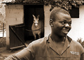
| 04/13/2006 08:42:14 PM |
Bikkieby admart01Comment: This fellow looks like my Opie, only with more true Aussie character to his face. Opie's muzzle is a bit longish for an Aussie. Also, this is a better photo. :D

oops! I see now Bikkie is a girl not a fellow. So sorry...:D Message edited by author 2006-04-13 21:05:51. |
| Photographer found comment helpful. |
| 04/13/2006 01:52:05 PM |
New Waveby melismaticaComment: Originally posted by posthumous:
I know there's one artist in particular who is known for taking photographs of her self that look like film stills (sorry I don't know her name off the top of my head) |
It's Cyndi Sherman
I don't mind the Warhol reference at all. :D |
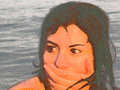
| 04/13/2006 01:40:56 PM |
Pleasedby balancedfoxComment: I like the inclusion of the horse as it adds a sense of place. Her expressioon is great but I'd like to see who or what she is responding to and pleased about. I'd sacrifice the horse to be included more. |
| Photographer found comment helpful. |
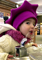
| 04/13/2006 01:38:54 PM |
Thirst for Knowledgeby ronnytComment: Fun, quirky angle and great capture of her expression. Her crazy hat adds interest and a bit of framing, as well as blocking out a potentially distracting background. I'll forgive the hokey title. |
| Photographer found comment helpful. |
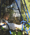
| 04/13/2006 01:37:16 PM |
Its hard work playing all day mum....by EmyloyComment: This looks like a snapshot and not a particularly good one, I'm sorry to say. The background is too cluttered and the image is overly contrasty, i.e., blown out in the highlight areas and too dark in the shadow areas. If you had not included the title I would have thought this was a snap that caught the subject in mid-blink --- it's not a very flattering photo of the little girl. Next time, try to be aware of what you are including in the frame when you compose a shot. It is easy for the mind's eye to ignore a distracting background but the camera sees it all. As far as the contrasty image goes, it is a contrasty scene and difficult to shoot using automatic exposure settings. Your camera should have a basic EV mode which allows you to bracket exposures in this type of difficult lighting situation. It also helps to use some sort of reflector near the subject. This can be as simple as a sheet of white poster board, as is, or wrapped with aluminum foil. |
| Photographer found comment helpful. |
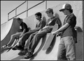
| 04/13/2006 01:25:09 PM |
A day at the skateboard parkby CoozComment: It would have been more interesting to me if you included a view of some of the skaters in action. It is generally not a great idea to show everyone in a group of people looking off-camera unless you involve the viewer by showing what everyone is looking at, or unless one of the subjects is looking at the camera in some way which draws the viewer in, or looking off in an unexpected direction that adds something humorous to the shot. This sort of shot tends to be very impersonal to the objective viewer. |
| Photographer found comment helpful. |
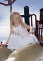
| 04/13/2006 01:19:41 PM |
Springtimeby chabesComment: The background is too cluttered for me and while the girl has a pleasant smile, she is looking off camera and she was captured in an awkward stance that doesn't really reveal much about her enjoyment or the exhuberence of sliding. I think placing yourself at the bottom and timing the shot so you could catch the girl's expression in mid slide would have created a far more dynamic and interesting photo for the objective viewer. |
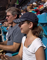
| 04/13/2006 01:14:36 PM |
Marlins Home Opener - "Enjoy The Game"by LVEComment: This is very for me. I think the vertical format was a poor choice for this scene as it cramps everything in. It would have been more interesting to see the girl reacting to the playing field below than seeing the people in the stands over her head. If the field were included the viewers eye would have a more natural progression to follow--from the girl, to what the girl is responding to. Instead, the viewers eye is led upward to the other attendees who don't provide any interest or answers. |
| Photographer found comment helpful. |
Home -
Challenges -
Community -
League -
Photos -
Cameras -
Lenses -
Learn -
Help -
Terms of Use -
Privacy -
Top ^
DPChallenge, and website content and design, Copyright © 2001-2025 Challenging Technologies, LLC.
All digital photo copyrights belong to the photographers and may not be used without permission.
Current Server Time: 08/24/2025 08:05:34 AM EDT.