| Image |
Comment |
| 04/24/2006 01:43:17 PM |
Old Friendby GoodEndComment: The focus is a bit fuzzy in the torn area which is where you really want to see sharp detail. the background material is bad---it looks random and adds distracting texture and detail. |
 Photographer found comment helpful. Photographer found comment helpful. |
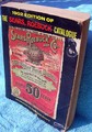
| 04/24/2006 01:41:15 PM |
1902 Sears Catalogueby RubyRedComment: Ebay item #89433282. The towel as background really accentuates the quality of an ebay listing. This is an interesting subject but more thought needs to go into the composition to make the image stand out. I suggest unless you are setting up a beach or bathroom still-life or using it in a beach or pool portrait, never, never, never use a towel as your background. NEVER! |
| 04/24/2006 01:36:13 PM |
Rest In Peaceby djtj1980Comment: Ahhhh...the old Jamestown bridge is no more. I didn't get out to shoot it and now I wish I had. I didn't watch the demolition either. This is a lovely tribute.. |
| 04/24/2006 01:32:52 PM |
|
| Photographer found comment helpful. |
| 04/24/2006 01:30:56 PM |
>:-(by yourbuddyjhawkComment: This is a bit too busy for me. The image quality isn't very good either. The image lacks sharpness. I think shooting this at a different time of day when the lighting is less harsh and contrasty would have helped your exposure. It is possible to get a good image in contrasty sunlight but it involves bracketing your exposures. This kind of lighting fools most light meters and you have to perform some manual functions to compensate for that. I use a point-and-shoot and what I do is adjust the EV setting which automaticallly brackets exposure for you. I would have concentrated on the area at the top of the pump to bring out detail in the lettering and included more of the faucet. The chain and lock don't add any visual interest and the window grill in the background adds a lot of distracting pattern. Really, this was a poor angle of view for this shot. |
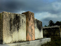
| 04/24/2006 01:20:23 PM |
Good Ol' Dooleyby Perfecti0nComment: I think you could have cropped this more to eliminate the trees in the background. Shooting at less of an extreme angle might have worked better, IMO. |
| Photographer found comment helpful. |
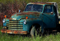
| 04/24/2006 01:18:57 PM |
Truckby bobgaitherComment: Great subject. I think this composition is a bit literal, however. This is the type of subject that can benefit from a more unusual POV. My choice would be to shoot it from a lower vantage point to exaggerate the curves and give the truck more of a looming, grand presence. If you wanted to accentuate the abandoned quality you could try framing the shot so that the truck was a much smaller, lonelier presence surrounded by an expanse of grass and sky or if it is surrounded by overgrown brush than you could show more of that. Another creative approach would be to take a close-up shot to capture the texture and color of the rusted blue paint, including some sort of contextual clue like a headlight or the hood ornament. This is one of the subjects that you can explore for a really long time if you have access to it. |
| Photographer found comment helpful. |
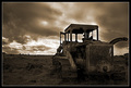
| 04/24/2006 01:10:06 PM |
Bulldozedby marvinComment: Great subject. I like the dramatic POV. I would almost suggest that you could have sacrificed some of the dramatic sky to get a bit more detail in the bulldozer. Since this is an advanced editing challenge you could have gone back and done some dodging and burning to the sky. |
| Photographer found comment helpful. |
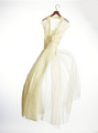
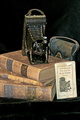
| 04/24/2006 01:07:18 PM |
Memoriesby pmichaudComment: Nice set-up.I'm not crazy about the lighting which looks rather flat. There are too many glares, especially in the velvet at the bottom. I suggest lighting from the side to add more drama and contrast. This looks somewhat literal to me. |
| Photographer found comment helpful. |
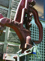
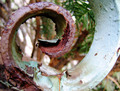
| 04/24/2006 01:04:17 PM |
curled rustby moolacoolaComment: The background is a bit distracting. It obscures the pleasing curve of this object. I think this is a bit overexposed. The detail in the light area is nearly washed out. Interesting choice of subject matter. |
| Photographer found comment helpful. |
Home -
Challenges -
Community -
League -
Photos -
Cameras -
Lenses -
Learn -
Help -
Terms of Use -
Privacy -
Top ^
DPChallenge, and website content and design, Copyright © 2001-2025 Challenging Technologies, LLC.
All digital photo copyrights belong to the photographers and may not be used without permission.
Current Server Time: 08/24/2025 02:59:53 AM EDT.