| Image |
Comment |
| 05/09/2003 01:31:49 PM |
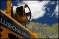
Forkliftby SharQComment: Technically this picture is perfectly executed. I like the angle and the choice of reduced DOF to focus on the tank against the sky. The use of a polarizing filter makes the sky beautiful and the blue contrasts well with the orange. The great clarity and detail make this picture very pleasant to look at.
But the main problem in my opinion is that this image does not convey the idea of transportation. I am not sure I understood what your point was when you took this picture. I think the way you took this picture is in contradiction with what you meant. The angle and composition of this picture in my opinion make this image quite static, which is in opposition with the theme.
This is really too bad, since otherwise the technical quality of this image is very impressive. Great work anyway.
The Critique Club Message edited by author 2003-05-10 00:06:02. |
| 05/09/2003 01:09:19 PM |
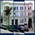
What color do you like?by Pep VentosaComment: First of all, this is a very creative entry. I like the fact that the images don't perfectly overlap. It makes this entry very original and fits better the theme than a single picture cut in 3 parts. I think you found a good balance in the adjustment of the different images.
The use of different colors for each part of the triptych also perfectly suits the theme and the idea behind your entry. Your choice of colors is very good: they complement each other well and I like the soft tones you chose.
Now let's talk about the cars. :) If this was a "regular" picture, they definitely would distract from the subject. In this case, since they add to the non-overlapping effect, I can't decide if they distract or not. I would love to see the same picture without them. This might be the one thing to do to improve this already very good entry.
Very well done.
The Critique Club |
 Photographer found comment helpful. Photographer found comment helpful. |
| 05/07/2003 11:42:05 PM |
Born in the USAby RoseytoneComment: I LOVE the way you captured this glass bottle. Great tonal range and lighting.
It would need a slightly bigger DOF to be perfect (the middle of the image seems out of focus). I also notice this a french bottle, so it might actually not be born in the US... :)
Beautiful work, congratulations. |
| Photographer found comment helpful. |
| 05/07/2003 08:47:28 PM |
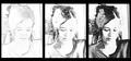
Story of a portraitby bcncrazyComment: This is a very original approach of the theme you developed pretty well.
The idea of progress in the drawing is very well shown. It was a very important point: it makes the viewer get your point easily.
Now, a major problem with this entry in my opinion is that the last image of the trio should have been the original picture. Because otherwise what you're showing here is a pure digital art creation which has nothing to do with photography. For example the technical details of the original shot are displayed here, but have no sense!
I often ask myself this question when looking at my pictures: could I have done this without a camera? If the answer is yes, then it means it is not photography.
But once again, this is a great original digital art creation perfectly executed. The thing is it does not qualify as a photography in my opinion.
The Critique Club |
| 05/07/2003 10:22:26 AM |
14th Street - Union Squareby christoComment: Originally posted by jmsetzler:
I really hate that this photo didn't finish much higher... great work :) |
It is very kind of you John.
|
| 05/07/2003 12:49:30 AM |
14th Street - Union Squareby christoComment: Thanks a lot to everyone!
Your comments are very helpful, it is very nice to hear what you like/dislike/noticed in this picture.
Thanks again! :) |
| 05/07/2003 12:44:05 AM |
The Magic Wheelby GeocideComment: I like this picture a lot.
Very original idea, and very well executed. I like the abstract touch. My eyes keep being captivated by the shapes. I guess this is the reason you didn't do better at the time of the challenge: this picture is not focused enough on colors. The shapes are too complex: they drive the attention.
But outside the original theme, it is an excellent picture IMO.
|
| Photographer found comment helpful. |
| 03/24/2003 09:50:02 PM |
Lottie by dsidwellComment: I'm glad you're rewarded for this shot. One of my favorites this week. I like this picture a lot: original point of view, good composition, lovely subject, and interesting background very well captured at the same time. Very good work. |
| Photographer found comment helpful. |
| 03/24/2003 08:00:12 PM |
Who's up there?by JeanComment: Another of my surprise this week with the results.
I liked this entry a lot. You deserve a better score IMO. |
| 03/24/2003 07:58:11 PM |
Above the trackby paynekjComment: This picture deserves a much better score than that.
Perfect composition, great amount of detail, and I love the tones.
Fits perfectly the assignment as the point of view makes me look at this track differently.
Very well done. I like this picture a lot. |
Home -
Challenges -
Community -
League -
Photos -
Cameras -
Lenses -
Learn -
Help -
Terms of Use -
Privacy -
Top ^
DPChallenge, and website content and design, Copyright © 2001-2025 Challenging Technologies, LLC.
All digital photo copyrights belong to the photographers and may not be used without permission.
Current Server Time: 08/05/2025 03:41:30 AM EDT.