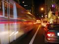
DPChallenge: A Digital Photography Contest You are not logged in. (log in or register
 
Browse Settings
Currently viewing:
Registered Userchristo

Show comments:

Per page:

Order:

Comments:


Comments Made by christo
Pages:  
Showing 21 - 30 of ~54
Image Comment
Philadelphia Museum of Art
05/14/2003 10:54:42 PM
Philadelphia Museum of Art
by ClubJuggle

Comment:
I think this is a pretty good entry for the "postcard" challenge.

First, the subject you chose (a museum) perfectly fits the theme. It was a good move to photograph one of the usual sights of your city. The composition you chose to illustrate the subject also well fits the theme since it is classic of postcards: a global view of the building. But the trees are definitely too distracting. The angle you chose to photograph this museum is perfect, but couldn't you have avoided those trees? It is sometimes interesting to add something in the foreground, I agree. But this has to be related to the subject and shouldn't distract from it. And in this case I think it does.
The exposure is very good, and you achieve a very good detail and sharp image. Very well done. It might even look oversharpened, but most of the postcards are... Same thing for the sky: the cyans are oversaturated in my opinion, but I think it fits the theme.
Looking again at this entry and thinking of what *I* would have done to improve this pic comes to my mind that the right side of the building is not very interesting. Maybe I would have tried a portrait crop of the columns between the trees. Pretty much with the same angle. Try and crop this one to have an idea.
That's all I can think of. A good picture anyway.

Good luck with your future entries!

The Critique Club
Photographer found comment helpful.
Drink to colors
05/14/2003 09:41:20 PM
Drink to colors
by Becky

Comment:
Too bad your post processing totally killed it!
Born in the USA
05/14/2003 05:54:59 PM
Born in the USA
by Roseytone

Comment:
A very underestimated picture...
I loved the lighting on this one.
Zebra Features
05/14/2003 12:54:39 AM
Zebra Features
by Eliza

Comment:
I hate it that you didn't get better votes...
You deserve much better, this was a very creative shot.
Next time, put a frog in your glass, this won't have much to do with glass anymore, but at least you'll get better votes... :-)
Photographer found comment helpful.
code orange
05/13/2003 12:29:24 AM
code orange
by tomzinho

Comment:
This is a very original entry. I like it when people go out in the streets to find interesting scenes to capture that fit the theme. You've been well rewarded with this finding.
You also pretty well captured this yellow line. The composition is pretty good. I like your tight cropping, I think it adds a lot to the picture. But maybe a less conventional composition would have worked better. For example more right behind the cars. I don't know, this was something to experiment.
The exposure is very good. The wide DOF fits your image well. I'm even surprized you get this depth of field with an aperture of f/3.5...
My main criticism is about how well this subject fits the theme. In my opinion the best pictures this week were those which conveyed the idea of transportation and motion. I think this is what this image needs: a sense of motion. Parked cars don't convey too much this idea, and I think it was important to describe the "transportation" theme.
So, to summarize: perfectly executed photography, but another subject would maybe have had a better impact.

Good luck for your future entries!

The Critique Club
Photographer found comment helpful.
Hop on the Bus
05/11/2003 03:42:26 PM
Hop on the Bus
by tolyanchik

Comment:
What I really like in this entry is that you obviously wanted to convey the idea of motion. In my opinion it was very important to fit the theme of transportation and I am surprized that so few people did.
So I like your idea of capturing this blurred bus.
But to me there are a few mistakes that prevent this image to be better.
First, if you wanted to show the contrast between a moving and a still subject, the still one has to be perfectly sharp. Otherwise the viewer is confused. The opposition has to be perfectly obvious to work. So in those conditions the use of a tripod was almost mandatory, unless you have a very still hand. What could have helped you was to use a higher ISO.
The camera settings is the second thing I wanted to discuss. I'm not sure what settings you used. A shutter speed of 1 sec handheld is definitely to prohibit, unless the effect you want is a blurred picture ( but I mean a totally blurred picture even for the still elements). SO a higher ISO would have helped. Especially also because I think a smaller aperture would have been more suited for this image. You would have got more details in the still elements, which was important for pointing out the contrast with the moving subject.
One last thing is the use of flash. I think you used it, right? The reflection of the flash in the red reflectors of the cars are very disturbing and draws the eyes of the viewer to them. Those cars become the more important subject of the photography. Since you used a long shutter speed anyway, I wouldn't have used it.
All those conditions definitely require the use of a tripod. I know it is not always feasible. So maybe you could have used another car to put your camera on during the long exposure. I often use elements of the streets like that for long exposures.

So, to summarize: I think your original idea was very good, but that the scamera settings you used were not totally appropriate.

Good luck for your future entries!

The Critique Club
Photographer found comment helpful.
Rolling Down Sunset
05/11/2003 03:06:18 PM
Rolling Down Sunset
by buck4free

Comment:
This is a very well executed picture.
First of all the exposure is very good. You captured this beautiful dusk (dawn?) light very well. The resulting soft colors are wonderful. The exposure chosen also allows the cars in the mirror to be sharp, in contrast to the road on the side of car.
About the composition, I think you couldn't have done much better. Each element of the picture has the correct level of importance. I also like the reflections on the car, reflected itself in the mirror...
The image in the mirror could be a bit sharper, but to take a crisp picture in a moving car with this amount of light is not easy...
My main criticism about this entry is about relevance to the theme. Of course this is about cars, but for me this image doesn't convey too much the idea of transportation. I think this is due to the fact that the main subject here are the cars in the mirror. And those cars appear still since you move at the same speed as they do.
But this is a minor criticism, this image is perfectly executed. Very well done.

The Critique Club
Photographer found comment helpful.
glass
05/11/2003 02:44:57 PM
glass
by shutterfly

Comment:
Too dark? hehehe, just kidding... I guess you've had this comment already...
Very interesting work on the lighting. The white spot close to the left bottom corner is VERY distracting, you should have get rid of it.
Good work anyway.
Photographer found comment helpful.
Marbelous
05/10/2003 12:13:41 PM
Marbelous
by Remie

Comment:
Great composition! Perfect exposure too. A very delicate picture. Beautifu.
Zebra Features
05/10/2003 12:07:59 PM
Zebra Features
by Eliza

Comment:
Beautiful.
Very original idea and perfectly executed.
I love the wide range of tones you captured. Good work on the DOF too: a perfect balance. Very well done.
Photographer found comment helpful.
Pages:  
Showing 21 - 30 of ~54


Home - Challenges - Community - League - Photos - Cameras - Lenses - Learn - Help - Terms of Use - Privacy - Top ^
DPChallenge, and website content and design, Copyright © 2001-2025 Challenging Technologies, LLC.
All digital photo copyrights belong to the photographers and may not be used without permission.
Current Server Time: 08/04/2025 05:48:38 PM EDT.