| Image |
Comment |
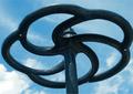
| 07/19/2003 08:23:03 PM |
Brake Wheelby DoorskidderComment: Nice. I like it. Good subject that meets the challenge well. DOF is good - clouds are blurred, but not so much as to be indistinct. The focus seems about right. I think the only thing I can think of that might have improved it is using a slight fill flash - I just don't like the bottom of the wheel (the part we're looking at) being as dark as it is. |
 Photographer found comment helpful. Photographer found comment helpful. |
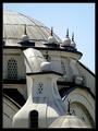
| 07/19/2003 08:20:37 PM |
Religous Roundnessby ChezComment: Nice. I like the sort of "layers" or levels of roundness - the dome, the arches, the balls, the crescents. Good cropping and composition to draw that out. Lighting is ok, probably better than most times of day - the shadows are there, but not too dominant. Focus is good, sharpness could maybe be a little better, but it's OK. Overall a nice shot, one of my favorites so far in this challenge. |
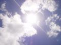
| 07/19/2003 08:17:32 PM |
the sun is shining...weather is niceby watermelon_junkieComment: Did your CCD survive? I didn't think you were supposed to do this with a digital camera... What else can I say - Focus: did it focus to infinity - then I guess it would have been in focus! ;-) Sorry, just havin' some fun with you. It's an OK photo of the sun, as it were, but doesn't really convey "round". OK, the sun is round, but you can't really see the sun. The clouds are nice, but not really spectacular. Just basically an OK shot. |
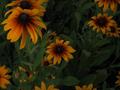
| 07/19/2003 08:15:03 PM |
Lushby redlodge55Comment: The colors don't say "lush" to me. It's also kind of dark, and not very sharp. I guess the flowers are roundish, but don't really convey roundness very well. |
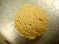
| 07/19/2003 08:13:32 PM |
Good Karmaby natorComment: What is it? Ice cream on the floor? It is round... But the focus and lighting just make it too hard to make out what it is. Or why it's "good karma". |
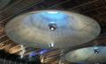
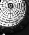
| 07/19/2003 08:10:57 PM |
Britomart ceilingby RobroComment: Did you try a shot from straight under? The angle doesn't lend itself very well to a feeling of "round". (I'm not saying it doesn't meet the challenge, just that it might have done it better from a lower angle.) |
| Photographer found comment helpful. |
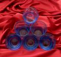
| 07/19/2003 08:09:30 PM |
Geometryby chickadeeComment: Good effort, but the color's a bit muted. I'm assuming you were trying to keep reflections out of the glass. The angle feels a little odd - it leaves a lot of background at the top that keeps drawing my attention away from the glasses. A good idea that you might have been able to improve a little with some more work. |
| Photographer found comment helpful. |
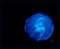
| 07/19/2003 08:06:50 PM |
Psychedelic Scyphozoaby crabappl3Comment: Too bad you couldn't get rid of whatever's down to the right. The jelly (I assume that's a jelly fish?) looks quite cool. Well captured. |
| Photographer found comment helpful. |
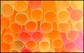
| 07/19/2003 08:04:50 PM |
Drinking Strawsby marboComment: This was a really good idea. I think it could have been done a lot better by taking some time to get the straws a little neater. Color feels a little faded, and its pretty soft. And the slight over-exposure at the right is a little distracting to me. |
| Photographer found comment helpful. |
| 07/19/2003 08:02:47 PM |
Serenityby bsaluComment: I'm curious how the title fits? It doesn't really convey "serene" to me. But aside from that, good subject for the challenge, like the composition. Lighting, choice of B&W, focus are all good. Nice job. |
| Photographer found comment helpful. |
Home -
Challenges -
Community -
League -
Photos -
Cameras -
Lenses -
Learn -
Help -
Terms of Use -
Privacy -
Top ^
DPChallenge, and website content and design, Copyright © 2001-2025 Challenging Technologies, LLC.
All digital photo copyrights belong to the photographers and may not be used without permission.
Current Server Time: 08/26/2025 05:10:41 AM EDT.