| Image |
Comment |
| 05/05/2003 05:50:09 PM |
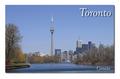
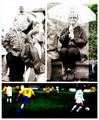
Torontoby ToddhComment: Great loooking postcard and one of my favorites. IMHO the shadow behind the photo and behind the text at the same time iis a little to much though :) |
 Photographer found comment helpful. Photographer found comment helpful. |
| 05/05/2003 05:42:22 PM |
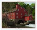
Old Mill Innby TerryGeeComment: The text at the top looks kinda out of place to me, but the photo is very good. I've never been in New Jersey, but this photo makes it look like Clinton is one of the places to visit over there :)
|
| Photographer found comment helpful. |
| 05/05/2003 05:24:36 PM |
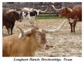
Longhorn Ranchby AnachroniteComment: This is a wonderfull photo. The background is a little disturbing because it's not totally lined up with the border, but besides that the composition is great.
The text below the actual photo is not perfect, but it I realize that not everbody is using high-end photo editing software to add text. All in all, a very good job! |
| Photographer found comment helpful. |
| 05/05/2003 05:03:24 PM |
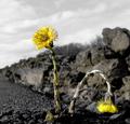
breakthroughby helgihelgiComment: Great catch, but not very much of a postcard representing your city or state, or is it? |
| Photographer found comment helpful. |
| 05/05/2003 04:57:45 PM |
Jefferson Memorialby magnetic9999Comment: It's a pretty good image, but I find the pillars not being parallel to the borders of the photo rather disturbing. And somehow there seems to be something wrong with the balance between the amount of visible building and the amount of visible sky. I think you should have shown more sky or no sky at all. |
| Photographer found comment helpful. |
| 05/05/2003 04:14:16 PM |
At the soccer gameby jjbeguinComment: It's sad to see such a great image ending up so low in the ranking. Not only is it a great composition, but IMHO it perfectly reflects the atmosphere of an amateur football-match and it's spectators. |
| 04/30/2003 03:33:09 AM |
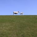
Dutch sheeps!by pollonosComment: Cool shot. I'd like to see some more sky though, but that's just my personal taste :) |
| 04/28/2003 05:24:01 PM |
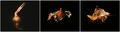
Couldn't Resist the Kissby GekkerComment: I like the idea of the sequence, but I think you should have left the wrapper at the bottom of the second and third frame. The way it is now, it looks like the wrapper is floating away and because of that, the illusion of the eaten chocolate is not so strong anymore. |
| Photographer found comment helpful. |
| 04/28/2003 05:01:45 PM |
|
| Photographer found comment helpful. |
| 04/28/2003 04:55:21 PM |
|
Home -
Challenges -
Community -
League -
Photos -
Cameras -
Lenses -
Learn -
Help -
Terms of Use -
Privacy -
Top ^
DPChallenge, and website content and design, Copyright © 2001-2025 Challenging Technologies, LLC.
All digital photo copyrights belong to the photographers and may not be used without permission.
Current Server Time: 08/23/2025 11:57:08 AM EDT.