| Image |
Comment |
| 04/30/2008 04:59:19 PM |
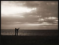
"Getting so much better all the time" (Lennon/Mc Cartney)by jjbeguinComment: Its really sad that the white on top is sooo blown!!! It would have been great to see all the detail in the curtain. I would suggest using a fill flash next time. The shadows on the table are great! I love the photo overall.
My only other complaint is that it looks more B&W than Sepia. 6 |
 Photographer found comment helpful. Photographer found comment helpful. |
| 04/30/2008 04:56:57 PM |
|
| Photographer found comment helpful. |
| 04/30/2008 04:55:47 PM |
LAFDby socalsteveComment: Theres too much going on in the frame. I do love how sharp it is. |
| Photographer found comment helpful. |
| 04/30/2008 04:53:03 PM |
|
| Photographer found comment helpful. |
| 04/30/2008 04:49:56 PM |
|
| Photographer found comment helpful. |
| 04/30/2008 04:46:20 PM |
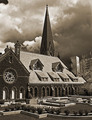
St. Petersby scotthadlComment: I wish it was more sepia tone. It looks B&W to me. I like the sky and the detail of the walls. |
| 04/30/2008 04:45:40 PM |
|
| 04/30/2008 04:45:09 PM |
Industrial wearby SpeedtownComment: I like the DOF, but the photo is just not very interesting. Maybe would have been better if you could see more of the fence.
Actually, Y would have cropped off the right side, where there's nothing. |
| Photographer found comment helpful. |
| 04/30/2008 04:40:41 PM |
|
| 04/30/2008 04:40:03 PM |
|
| Photographer found comment helpful. |
Home -
Challenges -
Community -
League -
Photos -
Cameras -
Lenses -
Learn -
Help -
Terms of Use -
Privacy -
Top ^
DPChallenge, and website content and design, Copyright © 2001-2025 Challenging Technologies, LLC.
All digital photo copyrights belong to the photographers and may not be used without permission.
Current Server Time: 08/28/2025 10:29:27 PM EDT.