| Image |
Comment |
| 01/12/2007 08:21:22 AM |
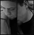
Shy Boyby cubixComment: I don't get the point of the split image here, and to my opinion, it adds nothing to the photo. Furthermore, I think the photo is too gray. |
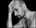
| 01/12/2007 08:16:23 AM |
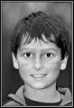
Daytonby brownsmComment: I get the strong impression that the original picture is blurred and you tried to save it using PS. My impression may be wrong, but a photo that leaves that impression is not a good photo. |
 Photographer found comment helpful. Photographer found comment helpful. |
| 01/12/2007 08:13:17 AM |
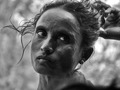
Opening Her Hairby balmikiComment: I don't like the composition (way too centered, I would have let more room in the direction she looks in) or the lighting (face too dark, details get lost. Furthermore, there is a fuzzy shadow bottom right that you could have easily cropped of. Not a very good picture in my view, sorry. |
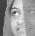
| 01/12/2007 08:10:41 AM |
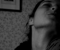
Tilted Pleasureby hannkaComment: I think the picture is both too dark and too gray. Please use more contrast when converting to black and white, don't just desaturate. And I don't like to look up people's noses. |
| 01/12/2007 08:09:15 AM |
Close Lookby ankursomaniComment: The picture is not sharp on the eyes, and the bw-conversion is very greyish. This picture realy craves for some more contrast imho. |
| Photographer found comment helpful. |
| 01/12/2007 08:07:36 AM |
thoughts...by IreneMComment: The picture seems sharp in some place and blurred in other and it does not seem to have to do with the DOF. No idea what you did there, but I don't like it, sorry. |
| Photographer found comment helpful. |
| 01/12/2007 08:05:26 AM |
Proud Grandpaby chesireComment: Proud Grandpa has his eyes shut, you cut his ears of, there is a weird shadow right below and the background is a bit messy. None of these are serious crimes ofcourse, but together they don't yield a pretty picture. |
| Photographer found comment helpful. |
| 01/12/2007 07:20:23 AM |
Ageing Gracefullyby sherpetComment: This lady probably is ageing gracefully, but that is not what the picture shows us. I think you should really work on your editing skills and use PS-tools (or other) with much more care. Look how the hairs contrast with the background (that you probably deleted). And what have you done to the eyes and the teeth? They look so unnatural. |
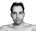
| 01/12/2007 07:13:34 AM |
Jamesby Shadowi6Comment: I don't like this picture! Centered composition with too much empty space, empty staring eyes and unnatural crop. |
| Photographer found comment helpful. |
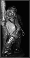
| 01/12/2007 07:11:33 AM |
The Drunken Masterby tiby_dicuComment: I am sorry to say that I think this photo went wrong. The harsh reflections of your flash put highlights in the wrong places, forcing you to leave other areas too dark, and renderning the picture 2-dimensional. |
| Photographer found comment helpful. |
Home -
Challenges -
Community -
League -
Photos -
Cameras -
Lenses -
Learn -
Help -
Terms of Use -
Privacy -
Top ^
DPChallenge, and website content and design, Copyright © 2001-2025 Challenging Technologies, LLC.
All digital photo copyrights belong to the photographers and may not be used without permission.
Current Server Time: 12/20/2025 11:06:39 AM EST.