| Image |
Comment |
| 08/24/2007 10:41:56 AM |
|
 Photographer found comment helpful. Photographer found comment helpful. |
| 08/24/2007 10:41:35 AM |
Redrumby whiterookComment: This picture is blurred. You tried to sharpen it, but a picture like this can not be saved in PS. What's worse, I can't even see what te guy is doing. I a sorry to say this is a really bad picture. (2) |
| 08/24/2007 10:13:20 AM |
Red Soxby WCpilotComment: LOL, like your interpretation. Colors are pretty dull though, and the crop is very thight. (5) |
| Photographer found comment helpful. |
| 08/24/2007 10:11:44 AM |
Sad or Sacred?by abbmillaComment: owch! I guess she holding her hands in front of her eyes beacuse of all the blown highlights surrounding her. They hurt my eyes too. (3) |
| 08/24/2007 10:10:37 AM |
Life: Sunrise, Sunsetby elizadebComment: Your whitebalance is off: building and clouds are pink rather than white and I see a halo around the palm tree. All in all, not a very pretty picture, sorry. (3) |
| Photographer found comment helpful. |
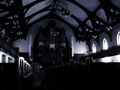
| 08/24/2007 10:08:38 AM |
Intimidation by HaneckComment: way too dark. I understand that the combination of church interiors and basic editing is extremely hard, but this one is so dark, I can hardly see the lines that will have to make the composition. (3) |
| 08/24/2007 10:05:23 AM |
|
| Photographer found comment helpful. |
| 08/24/2007 10:03:40 AM |
In our mother's armsby JaimeVinasComment: The idea is nice, but the picture is way too dark. I can't see the statue properly, and the windows are not interesting enough to carry the picture all by themselves. Furthermore, the left window is cropped too tight. (3) |
| Photographer found comment helpful. |
| 08/24/2007 10:01:09 AM |
Sacred groundby zirkovicComment: Love the composition and the vivid colors. Would have liked a little more space in the top end though (7) |
| 08/23/2007 04:18:09 AM |
Reflectionsby sekarmalathyComment: Nice. I like the vivid colors and the contrast. Gave it a 7 yesterday, added one today. |
| Photographer found comment helpful. |
Home -
Challenges -
Community -
League -
Photos -
Cameras -
Lenses -
Learn -
Help -
Terms of Use -
Privacy -
Top ^
DPChallenge, and website content and design, Copyright © 2001-2025 Challenging Technologies, LLC.
All digital photo copyrights belong to the photographers and may not be used without permission.
Current Server Time: 08/24/2025 11:18:52 PM EDT.