| Image |
Comment |
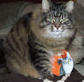
| 12/29/2007 08:56:54 AM |
We are not a-mew-sed by a Cat's Meow Christmasby flickerslairComment: That IS a stupid gift, I have to agree :D I like your title too, but I am not too fond of the pic, I must say. It think it would benefit from a more exciting composition than just the cat plain in the middle of the pic. I also feel there is something wrong in the lighting. The pic lacks contrast overall, but the cat ON the CD has blown out highlights, thus directing the eyes of the viewer to the CD, rather than to the face of the real cat. On top of all that, you chopped of one of the eartips. |
 Photographer found comment helpful. Photographer found comment helpful. |
| 12/29/2007 07:40:28 AM |
Grow a Buddhaby handicapjoeComment: I am not too fond of photographs where someone simply makes a flat pic of something. You might as well put it under the copier. Please devote more time to composition and lighting to make your subject stand out and generate an appealing picture. |
| Photographer found comment helpful. |
| 12/29/2007 07:38:03 AM |
100 pairs of socks: ask for them and you get them!by Yo_SpiffComment: Nor sure from the pic whether these are socks, towels or any other type of cloth. ANd you'll have to agree that if I can't see what is depicted in a photograph, it's probably not a very good one, unless it's an abstract. I think this pic has two main problems:
1) lighting, or better, the reflection of light from the plastic
2) composition: in the sense that it lacks one. I am sorry to say it this rude, but I realy feel you should have devoted some time to creating a nice composition and show the viewer that these are actually socks. |
| Photographer found comment helpful. |
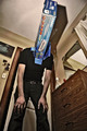
| 12/29/2007 04:51:49 AM |
WTF?!?by rob_smithComment: I think this pic has several problems. Let's start with the subject of a swear box. I have no idea what it is, and it is not apparent from the pic either. You miss me there, and if you miss too many voters, it will affect you score. Furthermore, your background has distracting patterns as well as disturbing wrinkels. I am also not too found of the harsh (though not blown) highlights in your pic or the central composition. |
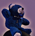
| 12/29/2007 04:46:17 AM |
Stupid teddy bearby andrijaComment: I am sorry to say I don't like this picture much. I'm especially not too fond of the halo around the bear. I also dislike the central placement and he fact that you cropped of the poor bear's paw below. |
| 12/29/2007 04:43:03 AM |
An empty boxby shenanigansComment: hmmm, not a very appealing pic, alhough some people may like the weird POV and concept. I do appreciate the weird nature of the pic, but I am bit put of by the harsh shadows and the many distractions. As to PP, I think it is generally strong, but it seems to be overdone relative to the IQ of the original picture. I would love the see you repeat this type of PP to a well-lit portrait someday. |
| Photographer found comment helpful. |
| 12/29/2007 04:43:00 AM |
Oh, a textbook, its just what I wanted!by HannahBanana11Comment: I am afraid this picture suffers from quite some technical problems. First of all, lighting is very harsh, leading to white that hurts the eyes and harsh shadows. You may want to consider a simple sollution like putting a tissue in front of your flash. Second, the focus in the picture seems to be on the bag rather than the book, whereas the book is supposed to be the main subject. Third, the crop is very tight, giving the pic a restless 'feel'.
PS Please be more carefull with your school gear ;-) |
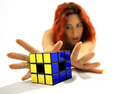
| 12/29/2007 03:59:26 AM |
Stupid and frustratingby JudiComment: Nice. Love the use of shallow DOF combined with the suggestion of nudity. Not clear to me why the cube misses the centers and has a hole. Is this a specific type or is it justbroken? I find the shadows of the hand and cube a bit distracting, whereas the overall lighting is so much better. |
| Photographer found comment helpful. |
| 12/29/2007 03:56:08 AM |
|
| Photographer found comment helpful. |
| 12/29/2007 03:31:07 AM |
Um... Thanks? by SherwinJamesComment: Great facial expression and the use of a deep DOF is very functional here. I am not too fond of the POV though. The high angle makes the head look extra large. Furthermore, there seems to be a halo around the head. |
| Photographer found comment helpful. |
Home -
Challenges -
Community -
League -
Photos -
Cameras -
Lenses -
Learn -
Help -
Terms of Use -
Privacy -
Top ^
DPChallenge, and website content and design, Copyright © 2001-2025 Challenging Technologies, LLC.
All digital photo copyrights belong to the photographers and may not be used without permission.
Current Server Time: 08/25/2025 12:14:41 PM EDT.