| Image |
Comment |
| 08/24/2008 10:58:26 AM |
|
 Photographer found comment helpful. Photographer found comment helpful. |
| 08/24/2008 10:57:52 AM |
|
| Photographer found comment helpful. |
| 08/24/2008 10:57:27 AM |
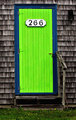
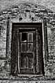
Getting Readyby PXL8ITComment: Needed a good explanation of why you were snapping nekkid shots? Been there. Straighten the vertical lines, add a curves adjustment to bring the contrast into check. Too little contrast, no solid blacks and looks a bit soft on focus. |
| 08/24/2008 10:55:12 AM |
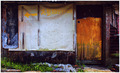
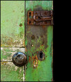
Backdoor with wallfresco and garbageby efraimkarshComment: I'd like to see a wider crop and the colors to pop more. Try this little trick. In photoshop convert the image to LAB color, then Apply Image in Soft Light at about 80% opacity. Test the different color channels in the Apply Image dialogue to pick the best "pop". Great location. Perfect content contrast. |
| 08/24/2008 10:52:30 AM |
|
| Photographer found comment helpful. |
| 08/24/2008 10:50:17 AM |
|
| Photographer found comment helpful. |
| 08/24/2008 10:48:46 AM |
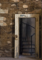
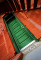
Old Green Doorby timwest167Comment: I like the composition. I think maybe it would work better if you rotated the shot 180 Degrees. Seems a little soft for this kind of texture work. I'd like to see it with some curves adjustment to bring out more contrast. |
| Photographer found comment helpful. |
| 08/24/2008 10:46:39 AM |
|
| Photographer found comment helpful. |
| 08/24/2008 10:44:59 AM |
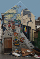
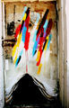
the big bloomer entryby cutoutComment: Great juxtaposition of color/textures. The angled and tight crop stop me from being drawn in to take in all the little details/textures and contrast of colors splashed in the shot. |
| Photographer found comment helpful. |
| 08/24/2008 10:42:38 AM |
batteredby photokariangelComment: Pushed the curves a bit too much. Almost reversed/solarized some of the tones when pushing the contrast so much. I'd like to see a tighter crop to get rid of the distracting horizontal line between the door frame and foundation. Good potential. |
| Photographer found comment helpful. |
Home -
Challenges -
Community -
League -
Photos -
Cameras -
Lenses -
Learn -
Help -
Terms of Use -
Privacy -
Top ^
DPChallenge, and website content and design, Copyright © 2001-2025 Challenging Technologies, LLC.
All digital photo copyrights belong to the photographers and may not be used without permission.
Current Server Time: 08/07/2025 12:33:54 AM EDT.