| Image |
Comment |
| 06/02/2007 09:37:47 AM |
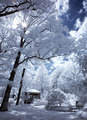
Heartland - earth and skyby alexjackComment: Very nice. The clouds, earth and windmill all come together, and you've captured the colors and feel of the landscape very well. |
 Photographer found comment helpful. Photographer found comment helpful. |
| 06/02/2007 09:35:54 AM |
|
| Photographer found comment helpful. |
| 05/30/2007 09:05:55 AM |
dreamypixby LanceWComment: WTG Lance -- this rocks! Great score to lead GoldenEye to its week 1 win. Woot Woot! |
| Photographer found comment helpful. |
| 05/28/2007 10:34:03 AM |
pucker up!by shaenae6453Comment: This image was overlooked by the voters and deserved a far better score than it received. It has a wonderful vintage feel to it, the desaturation was well done, and I love the use of the muted colors -- looks like a hand tinted B&W shot from the 1950s.
I gave you the 9. I see this was your first entry ... I hope you don't get too discouraged by the score and we get to see more of your work around here in the future. |
| 05/27/2007 09:22:01 AM |
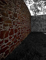
Imposingby krnodilComment: I like the lines and angles in this shot. Would have liked it more without the tree, but I guess you didn't bring your axe with you, eh? ;>P |
| Photographer found comment helpful. |
| 05/25/2007 12:38:22 AM |
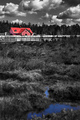
GoldenEyeby chip_kComment: Ha ha ha .. you looking for a spot on our team? lol. Nice shot and good use of selective desat, but not sure I like the feet and wings cropped off. |
| Photographer found comment helpful. |
| 05/24/2007 09:47:26 AM |
Tricoleurby xianartComment: Nice idea, but to carry off the two color desat I think you needed to stop down more so that the foreground is in focus too. Nice contrast and tones in the sky and clouds. |
| Photographer found comment helpful. |
| 05/22/2007 07:07:42 PM |
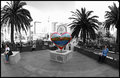
I Left My Heart in San Franciscoby EstimatedEyesComment: Originally posted by kawhona:
I like the use of desat here ... nice shot. Does the desat make the highlights brighter ? |
Thanks. Actually the background was pretty blown out because the subjects were all in shadows and the buildings in the distance were in full sun, and I bumped the exposure up by at least a couple of stops to expose for the foreground (I rarely shoot in RAW, and almost never on a walkabout). The desat helped because it made the background less noticeable and less distracting.
Still not the greatest shot technically, but I really liked the juxtaposition of the two lonely characters with the bright heart spanning the gap between them. |
| 05/20/2007 02:24:41 PM |
|
| Photographer found comment helpful. |
| 05/20/2007 02:24:09 PM |
Deep Purple Lullabiesby xtianComment: Nice image, and good processing choice for an album cover. looks more like a line drawing than a photograph, but works for me. 7 |
| Photographer found comment helpful. |
Home -
Challenges -
Community -
League -
Photos -
Cameras -
Lenses -
Learn -
Help -
Terms of Use -
Privacy -
Top ^
DPChallenge, and website content and design, Copyright © 2001-2025 Challenging Technologies, LLC.
All digital photo copyrights belong to the photographers and may not be used without permission.
Current Server Time: 08/11/2025 04:07:33 AM EDT.