| Image |
Comment |
| 03/07/2008 10:15:05 PM |
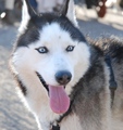
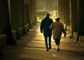
Bright Eyesby ZwieselDaveComment: From the Critique Club:
For your first entry I think you did pretty good. The quality of this image is above a 4.85.
You did a number of things right. The eyes are sharp and are almost on the thirds line which is good. You caught a good expression. And the background is very nicely out of focus.
I think the one thing that would really improve this photo is the cropping. The almost square crop takes away. The out of focus part of his back on the right does not add much so you could crop it out and make a more rectangular image.
The overall image needs to be sharpened. In post processing it could probably also use some contrast and levels adjustments and some work on the eyes to make them 'pop'. Congratulations on your new camera. Keep up the good work.
alexzen |
 Photographer found comment helpful. Photographer found comment helpful. |
| 03/07/2008 10:06:37 PM |
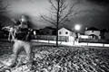
Snowy Dog Daysby AllanaComment: From the Critique Club:
Very creative photo. I am trying to figure out where his body is. Good color, great idea, good use of wide angle distortion.
Composition: I think the tight crop at the top detracts from the photo. Showing his full face would have helped alot.
Focus: The eyes are in focus which is very important. But the nose is not in focus and that takes away.
Background. The white background makes for an interesting composition, but I think the image needs some more breathing room all the way around. A very simple (brown?) border would have helped frame the background and complete the photo.
But still, a very creative photo.
alexzen |
| Photographer found comment helpful. |
| 03/07/2008 09:58:27 PM |
Relaxing In The Snowby EssAreDubyaComment: From the Critique Club:
Wonderful photo. I imagine it would have scored higher if it had not been amongst dozens of other dog photos. Hard to stand out in this challenge.
Composition: Excellent. The very first place my eyes went were to your dog's eyes and I was able to take in the entire image and emotion of the photo immediately.
Processing: I appreciate that you did not over sharpen. His/her face is very nicely sharpened while the rest of the body fades into softer focus. Nothing is competing for attention. Color and levels are very good.
Distractions: I would have to say that the harshness of the background (or lack thereof) detracts a bit. Ideally you could have a had a softer background to work with.
This is a good portrait of your dog. However, I think that in order to score up in the mid-6's or higher you would really have to move to a more creative pose; something other than a centered pose. But I think you accomplished what you set out to do. Congratulations.
alexzen |
| Photographer found comment helpful. |
| 03/02/2008 11:09:22 AM |
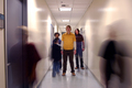
Y O U T Hby FellSevenLeavesComment: From the Critique Club:
Great shot. In regards to subject matter, I do agree that the concept is implied rather than depicted. Once has to understand youth being misunderstood in order to get the message. The photo does not clearly convey that outside the context of this challenge.
But let's examine this strictly photographically.
Excellent use of perspective and time exposure. There is balance with the moving bodies on either side of the foreground. There is balance with the three boys in the mid-ground. The only thing I notice is that I think it would be better without the moving body on the left center - that takes away from the main subjects a bit. That is the one thing I would change.
You seem to have done a good job with exposure. Your main subjects are correctly exposed and in focus and you have controlled the lights in the ceiling from being blown out. The horizon is straight - as matched to the ceiling tiles.
I think as a photo this could have scored higher, but I imagine the vagueness of its connection to the challenge topic may have hurt the score a bit. |
| Photographer found comment helpful. |
| 03/02/2008 10:58:38 AM |
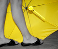
Rainy day Summer dayby nlghttrainComment: From the Critique Club.
Le me start by saying you have a great idea and have used selective desaturation in a great way. This did not score too high so let's explore things that could have made this better.
Composition. My eye is drawn to the center of the umbrella, yet that center is in an awkward place. Putting that umbrella on the thirds line would have strengthened this image. My eye wants it to be over on the right thirds line above half way down. The very bright butt end of the handle and the strap are the brightest part of the image, but it took me awhile to figure out what they were.
I think the biggest detractor is the fact that the legs are not in focus. That is the very first thing I notice about the photo. A smaller aperture is needed to give you more DOF. I also think having more distance between the legs and the umbrella would give the photo more depth. It appears a bit two dimensional.
Your title does not clearly propose a misunderstanding. I did not get it at first.
However, having said all that, I think you picked a great subject, you made good use of selective desaturation and with a bit more attention to focus and composition you could have a had a score in the mid to upper 5's.
|
| Photographer found comment helpful. |
| 03/02/2008 10:46:32 AM |
Watering canby booboo_goonComment: Greetings from the Critique Club.
You used an original idea and you picked a very difficult set of objects to photograph. Let me explore some ways in which you could have improved this.
Composition. I think that the faucet needs a bit more headroom - the crop may be a bit tight at the top. I think I would have used the rule of thirds here and put either the faucet or the can on the thirds yet composed the image such that the whole image is not centered.
Stainless steel and water are very hard to photograph. This image would require the use of levels and curves and some selections to make the faucet jump away from its background. You are basically using tones, and not colors, to make all your distinctions. That is difficult. It appears that your highlights may be blown out - top of faucet and edge of sink. Close attention to your histogram while shooting and while editing is critical to controlling this.
Likewise there are too many parts of this photo where you have lost detail in the darks. In post processing there are number of tools that can help you here. If you shoot in RAW and have PS CS2 or CS3, the tools in ACR can do wonders. Shadow/highlite help immensely. And to a lesser degree levels and curves. If you really want to control the extreme ends of the spectrum you can try HDR.
But assuming you do not have those tools available to you, you did a good job with a difficult subject.
(I finally learned to stay away from reflective surfaces for challenges because the highlights are so hard to control.)
|
| Photographer found comment helpful. |
| 03/02/2008 10:27:31 AM |
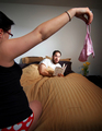
WHO'S PANTIES ARE THESE !!!?!?by Pipe_DreamComment: Greetings from the Critique Club.
What fun to get to critique this photo. I will start by saying that this is a very successful photo. Good composition, good theme, good lighting. So I will focus my critique on things that may have improved it. I appreciate how hard it is to be your own model and get all the details perfect....
The first thing that struck me during voting was that the panties are not as in focus as I would like them to be. There is a powerful line between your eyes and the panties and I am looking for the panties to be as crisp as your face. F5 probably gave you too shallow a DOF. But you were already down to 1/60th and ISO 200 so not sure you have too much more headroom.
Some compositional observations: The flowers are competing with the panties. Perhaps moving or removing them would have given then panties more focus.
In terms of making this a great photo I think if I were editing this photo I would work to reduce the degree to which my eye is drawn to your wife and her arm at the expense of focusing on the two main subjects - you and the panties. One approach would have been to crop her out a bit more. Another would be to use burning and dodging to reduce the brightness of her arm and increase the lighting on the panties.
You have a great photo here. Congratulations on your placement |
| Photographer found comment helpful. |
| 12/28/2007 05:31:28 PM |
Beautiful foreverby choppersComment: Sorry for the DQ. Regardless of the DQ, and the somewhat bullshit discussion regarding having their permission (I would have done the same thing), this a great photo and the voters think so too. I would be proud if I had taken this. |
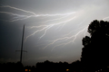
| 12/25/2007 07:43:26 PM |
Static Skyby CarpeLumenComment: Excellent. I think a crop to make the mast straight up and down would help the composition. It was the first thing I noticed. Good capture. |
| 12/25/2007 07:42:24 PM |
|
| Photographer found comment helpful. |
Home -
Challenges -
Community -
League -
Photos -
Cameras -
Lenses -
Learn -
Help -
Terms of Use -
Privacy -
Top ^
DPChallenge, and website content and design, Copyright © 2001-2025 Challenging Technologies, LLC.
All digital photo copyrights belong to the photographers and may not be used without permission.
Current Server Time: 08/25/2025 11:38:43 AM EDT.