| Image |
Comment |
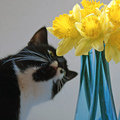
| 03/07/2006 02:12:26 PM |
Mine!by quiet_observationComment: I think we need the cat also in focus; without that, there doesn't seem to be a connection between the two elements. i quite like the framing, cropping both elements to crowd the image slightly. |
 Photographer found comment helpful. Photographer found comment helpful. |
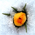
| 03/07/2006 02:10:55 PM |
Emergenceby toffleComment: Good tones and colour, and an interesting sense of season. Falls down a bit on the indistinctness of the snow, and slightly overdone highlights - some of which are in focus, some of which aren't. |
| Photographer found comment helpful. |
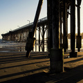
| 03/07/2006 02:09:18 PM |
Pier at Sundownby RolandBComment: Enromously high contrast possibly lets this down a little - it would have been great to see atouch more detail in those nearer legs. Alternatively, to really make use of those shadows a wider field of view ... I think this perhaps falls between two approaches. |
| Photographer found comment helpful. |
| 03/07/2006 03:31:22 AM |
Study in thought...by marklovellComment: from the Critique Club
As I've been going through some of these duotones results, the variation in scores is truly remarkable - I really can't seen anything to justify this image scoring way down here where it has. I'm not suggesting it's ribbon material, but really, 4.8?
I think the comments re the pose were right - she does look slightly discomforted, and a large part of portrait photography is the process of getting a natural look, be that knowing whihc poses will work as an image, or knowing when the discomfort starts to show, or simply being able to see through your lens what you may not see otherwise. As this is your girlfriend, it may simply be that you know here too well, and what we're all seeing as discomfort is simply the way she looks. Whatever it is, there is just enough of a sense of tension around the neck and angle of the head to put that feel into the shot.
Your lighting is also a slight let-down. The image-left side of her face is so very evenly lit and exposed that to me all sense of definition there is lost - the tone has become the same as that of the background, and there is a sense of shininess around her forehead and nose, so there's a feeling that you've gone for a high-key shot but not quite pulled it off.
I'm unsure about any of these points - I'm no portrait photographer, and no fan of the genre either - but just trying to explain why I think this scored so very badly. Undeservedly so to my mind.
Difficult to say on a large resolution screen, and therefore with a small image, but I wonder if you could have had more detail. In my experience of this place, I find that the voters like things a touch sharper than I think is 'real' - a final pass of Unsharp mask with settings of 0.6, 70%, clipping 5 makes a useful finalising step after re-sizing, in my experience, for here.
Hope that's helpful
Ed |
| Photographer found comment helpful. |
| 03/06/2006 06:48:32 PM |
Two Bee or Not Two Beeby gliphixComment: Lack of complete focus doesn't seem to work for this shot - such a very graphic composition (whilst right for the square crop) really demands full focus, I think. Would love to see the colour a bit more punchy too - just has that slight washed-out over-exposed/underprocessed feel to it. Lacks a slight sense of extreme detail too. |
| 03/06/2006 06:46:42 PM |
Stylized Sunriseby ajschelComment: v interesting - somehow could almost be Gursky. I'm sure it'll be slated, but it's a fascinating approach. The weight across the frame works well for this crop, and the tonality is marvellous. |
| Photographer found comment helpful. |
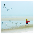
| 03/06/2006 06:43:57 PM |
Chasing Fun by CutterComment: Very nice work. Strong understanding of the demands of the format, great tonality, good detail and good action. The most interesting shot so far, for me. |
| Photographer found comment helpful. |
| 03/06/2006 06:42:59 PM |
Partition of the Squareby rioloboComment: Good textures, I just wonder iof the overall tonality isn't slightly too narrow. I just feel there could be more punch to this. Works well in the square, though. Once could image a certain level of depth of tone coming from the shades of colour of the wood, and that just isn't there in black and white, which is why I would suggest pushing the contrast a touch further. |
| Photographer found comment helpful. |
| 03/06/2006 06:38:54 PM |
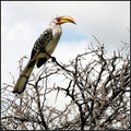
Vigilantby TerramarComment: A strange, almost painterly feel to the colour definition around that beak and head. - presumably because that's where all the colour is in this shot. An interesting effect. Well handled in the square crop, too. Nice work indeed, |
| 03/06/2006 06:03:31 PM |
Chopinby nards656Comment: In such a very clean graphic composition (and it's nice that you've understood the comkpositional demands of the crop), a bit of cleaning of your subject would go a long way - the fingermarks and dust are a shame, and easily dealt with in advanced editing. Lacks the real fizz of good soft lighting to give the shot impact, I think. |
| Photographer found comment helpful. |
Home -
Challenges -
Community -
League -
Photos -
Cameras -
Lenses -
Learn -
Help -
Terms of Use -
Privacy -
Top ^
DPChallenge, and website content and design, Copyright © 2001-2025 Challenging Technologies, LLC.
All digital photo copyrights belong to the photographers and may not be used without permission.
Current Server Time: 08/17/2025 05:38:12 PM EDT.