| Image |
Comment |
| 04/18/2006 05:47:36 AM |
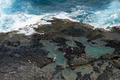
The Royalsby airaticComment: A decent wildlife shot, though one would naturally presume its a zoo shot, which is let down by processing i think: colour temperature seems all wrong, colour saturation is almost non-existent and yet it hasn't the feeling of being effectively de-saturated at all - just looks like it needs more work. Composition doesn't do a lot for me - that rock image right and its closeness ot the female, the half0dead tree image left ... |
| 04/18/2006 05:37:47 AM |
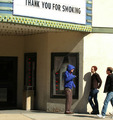
Smokingby drake217Comment: Image size is an issue here - impossible to know what screen res you are using, but on a high-res screeen it's a very tiny image, and that makes it difficult to assess. An interesting composition though, but the guys walking into frame ... I don't see how they add to the image, especially cropped off like they are. |
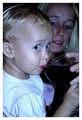
| 04/13/2006 10:38:19 AM |
|
| 04/13/2006 10:28:10 AM |
|
 Photographer found comment helpful. Photographer found comment helpful. |
| 04/13/2006 10:27:24 AM |
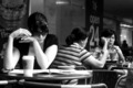
coffee and the paperby TJComment: Like the high contrast, but I think you've los a little control here slightly - those blown highlights on the arms and hands, and the extent of the shadow areas would have repaid a touch more control of processing I think. |
| Photographer found comment helpful. |
| 04/13/2006 10:25:46 AM |
Hope it hits the bugger!by MistyMuckyComment: Despite the title, and a slight sense of this being overly blue in the colour temperature stakes, I really like the moment, your framing, and the dynamic. This is being so often missed in this challenge, which seems to be reverting to a simple portrait collection - the preciousness of the moment, the action, rather than the simple page of the face. |
| Photographer found comment helpful. |
| 04/13/2006 10:22:15 AM |
Beautiful Poserby Apollo2077Comment: Even if it were likely to get past the candid police (and I agree with the human thing), the overe-xposure and lack of depth to the colour of this would hurt your score anyhow I think. The reeds and twigs in front also cause problems - they aren't thick enough to add a strong sense of location, in fact just look messy. |
| 04/13/2006 10:18:51 AM |
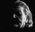
candid darknessby anatolio25Comment: Like this - though the over-exposure of the side of the face is a pity - ina shot with little enough visible, it's a pity to lose that shaping and information. |
| Photographer found comment helpful. |
| 04/13/2006 10:15:54 AM |
|
| Photographer found comment helpful. |
| 04/13/2006 10:13:03 AM |
Eyes On The Prizeby PhotonurdComment: Clever shooting, though the partial de-sat always provokes a sense of being patronised in me - I might actually have looked long enough to notice the ribbon, anyhow. It serves more point than in most such shots, obviously - and abviously the blue thing is relevant here, so I like the cleverness there. |
Home -
Challenges -
Community -
League -
Photos -
Cameras -
Lenses -
Learn -
Help -
Terms of Use -
Privacy -
Top ^
DPChallenge, and website content and design, Copyright © 2001-2025 Challenging Technologies, LLC.
All digital photo copyrights belong to the photographers and may not be used without permission.
Current Server Time: 08/16/2025 10:34:13 AM EDT.