|
|
|
Showing 811 - 820 of ~3604 |
| Image |
Comment |
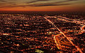
| 05/11/2006 04:39:43 PM | Dusky Pulsating Cityby DigiFotoBuddyComment: My feeling is that for this kind of panoramic overview shot, you need a stronger - much stronger - sense of the fine detail; aside from that, your composition is strong - those highways or whatever really lead the eye through the image, and there's a nice sense of increasing complexity towards the horizon. |  Photographer found comment helpful. Photographer found comment helpful. |
| 05/03/2006 05:16:14 PM | Absolute dedication by LalliSigComment: Good shot. I could see this, although cropped more imaginitively, gracing a front page for sure. Your chosen crop lets it down though - I can see the point pof keeping the splash all in, but it kills the immediacy of the image, which requires a stronger placing of the athlete's face I think. The splash gets you after some study - the face gets you straight away. | | Photographer found comment helpful. |
| 05/03/2006 05:14:02 PM | E-71 wins again the World Championship of Windsurfby alexgarciaComment: A fairly straightforward windusrfing shot - though the repetition of those shapes adds an element of interest. I would think a news shot would need more immediacy, basically to get closer, and this is a bit too available to everyone. | | Photographer found comment helpful. |
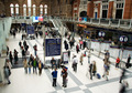
| 05/03/2006 05:11:36 PM | London rush hourby bob_bobskiComment: There's something entrancing about this view of Liverpool Street - with one reservation, which is that it looks more like a quiet sunday afternoon than the rush - I've photographed it during rush hour and you can't see the floor. I like the dynamic of it. | | Photographer found comment helpful. |
| 04/27/2006 05:15:14 PM | Serenityby alexgarciaComment: from the Critique Club
Ha! Get a new lens with a 1.8 capability and its almost predictable that your first go with it is going to involve that f/1.8 aperture, isn't it? It is a gresat lens, even if I think it's an odd focal length for an APS-sized sensor, but in this instance the shallow DOF hasn't served you well. had there been eye-contact here that extreme would have worked well to isolate that look, but without it you are dependent on the shape and your lighting's moulding of her face for your imapact - and that v shallow DOF has removed a deal of that impact from this image. the primary point fo focis appears to be the end of her nose, which is anunusual choice to say the least.
The light is just lovely though - honest, revealing, not too overtly flattering, and presenting us with na honest, genuine portrait; infinitely preferable to the plasticated nonsense that seems ot have appealed to most voters in this challenge. | | Photographer found comment helpful. |
| 04/27/2006 05:10:20 PM | Claudiaby aKiwiComment: from the Critique Club
You must read this with the understanding that I neither understand nor appreciate the art of the 'studio portrait' in any sense ...
She looks shockingly like an old girlfriend of mine - now, that's scary enough in tis own right. I've no idea what's supposed to be wrong with this shot - usually those that score in this range have a few obvious drawbacks, but here - well, it seems an honest, accurate, relaxed, even perceptive representation to me. What's to criticise, or for that matter critique? There's an amusement about this face, a sense of wit and alertness that I find quite approachable - but that's about the model rather than the photograph - and as a photograph it's just a technicaly assured piece of competence - but then, in what sense is not all studio portraiture exactly that? I think you did a good job with the lighting - but I was once a lighting designer, and all that stuff seems second nature to me, and therefore by definition not praiseworthy: because oit serves a purpose, and is not an end in itself. |
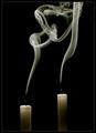
| 04/27/2006 04:35:17 PM | "When All Candles Be Out ..."by e301Comment: Originally posted by jaz1:
Excellent Composition...
For some reason, this made me think of the World Trade Towers (9/11). I think because of the different hights. But the beauty of it being the smoke's representation of the ascent to heaven.
Thanks for showing what the 5400 can do. |
Jeez - given the date it's always surprised me that no-one twigged that. |
| 04/27/2006 04:30:59 PM | Enjoying the viewby JudiComment: I like this; My own shot plays wth the idea of the two worlds of the refelected and the transmitted light, as does this. You've achieved more with the graphic relationship of that reflected world to the direct one though. One thing: I would wish for a more involved treatment of it. This comes across as very much a real world thing; perhaps taking this into the black and white world would emphasise those overlaid views a touch more - in effect, make the photograph be about those conjunctions, rather than the tendency of this to make it more of a portrait. I just neither likie nor understand the idea of the photographic portrait, you understand - it may be, to those who appreciate them, that this is a great one.
There's a temporariness about the bed here too - no valance, the shaping of the edge of that 'mattress' almost makes one think of a sofa-bed, or a guest room. I like that transience - and the complexity of those reflections just add to the absorption of the whole scene. Top work. | | Photographer found comment helpful. |
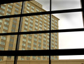
| 04/27/2006 04:18:02 PM | Windows Through The Panesby neophyteComment: I think, as far as this place is concerned, images such as this which depend for their effect on the purely graphic are more liked if they have big bright colours. There is something to the relationship of glass and glass here, but perhaps it needs something to emphasise that first layer of glass? Reflections maybe? Just thoughts ... | | Photographer found comment helpful. |
| 04/26/2006 04:22:40 PM | Framed by the Window Dresserby GuGiComment: There is definitely something about mannequins that intrigues, isn't there? This shot doesn't. I'm afraid, add anything to my sense of what that is, but I can't help but sense that its fertaile territory. Photographically, your framing is interesting, but it would perhaps be more relevant to the apparent point of your title if you had included a touch more of the scene? | | Photographer found comment helpful. |
|
Showing 811 - 820 of ~3604 |
Home -
Challenges -
Community -
League -
Photos -
Cameras -
Lenses -
Learn -
Help -
Terms of Use -
Privacy -
Top ^
DPChallenge, and website content and design, Copyright © 2001-2025 Challenging Technologies, LLC.
All digital photo copyrights belong to the photographers and may not be used without permission.
Current Server Time: 08/15/2025 09:43:57 PM EDT.
|