|
|
|
Showing 731 - 740 of ~3604 |
| Image |
Comment |
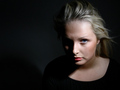
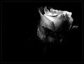
| 06/05/2006 04:25:51 PM | In the darkness of liesby TUBORGComment: I'm no fan of such portentous titles, especially when accompanying a portrait, but let that pass. I have a real problem with that small section of her right cheekbone showing - it's a between-two-stools moment, I think; I get your point, to emphasise the bone structure, but you've not completed the job really. Good detail and so on, but that should be a given I think, and the more nebulous and complex elements of an intriguing image aren't here, for me - almost, perhaps, but that small problem can make a large difference. |  Photographer found comment helpful. Photographer found comment helpful. |
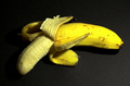
| 06/05/2006 03:24:30 PM | Yellow mellowby alpharichComment: Culturally, I think the inevitable priapic comparison is begged here; i'm not sure i want to go into that though. However technically, there's the sense of slight channel clipping in some of the solid yellow areas, and of a fake element to the light intensity to image left. That channel clipping is what gives the more solid yellow areas a sense of missing detail, when the focus is definitely spot-on. | | Photographer found comment helpful. |
| 06/05/2006 03:16:29 PM | Skeletal Uprisingby alternaruleComment: Cunning, but not cunning enough? Given the light source you've shown us, I'm intrigued as to how the left side of that skull is more brightly lit than the right. But whatever. I do think,. however,m that you have the basis of a nice shot here - only there's perhaps too much shadow, really, and your placing of that light source in frame is uncomfortable - not the fact that it's there, but that it interrupts the lines of the skeleton so much, rather than seeming remote from it, like illumination should be - alongside the head like this, it looks like something you just couldn't get out of frame, which carries an implication of laziness, rather than of artistic choice. Had you placed that light top right, and even reduced the size of the skeleton part of the image, which would have allowed you to brighten it a touch more, make it a touch less violently high-contrast, I think you'd generate more of an impression of the bones actually being lit by that light. | | Photographer found comment helpful. |
| 06/05/2006 03:11:26 PM | Glowby BeeCeeComment: The highlights certainly give a sense of shininess, but are perhaps too disparate to make for a clean enough image to suit the simplicity of the composition, making for a visual paradox which detracts from the impact of this image. This kind of abstraction was never up my street, so I may not be your best judge, but I think it at least needs a stronger sense of texture, otherwise it may as well be simple design. | | Photographer found comment helpful. |
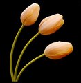
| 06/05/2006 03:09:03 PM | Tulipsby kari1Comment: Intriguing; very strong graphically, although i wonder about the black border - useful at the top of frame, perhaps, but the un-exoected cut-off at the bottom is perhaps more intrusive than i think you intended. There's also a graininess - a very fine graininness, but nevertheless present - which to my eye doesn't quite fit with the highly-controlled set-up here. It might just be a black--point theshold thing - the descent into pure black from the mid-tones seems very sudden, looking carefully at the stems of the blooms, and that makes the tonal graduations of the more shaded areas of the flowers lack that sense of smoothness. | | Photographer found comment helpful. |
| 06/05/2006 03:05:40 PM | Approaching the Front Linesby djtj1980Comment: There seems to be a resurgence of the glass chess-set shot here - it went away fro a year or so. I wonder if you were trying for a kind of 'Leica Glow' around that highlighted King - but what has happened here just makes it seem over-exposed rather than luminous; it's one of those areas where digital, I think, really loses out to film - over-exposure almost always just looks like a mistake. |
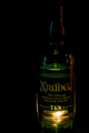
| 06/05/2006 03:02:22 PM | Scotchby spydrComment: A simple photograph of a bottle of whisky - I don't understand why this is ever going to be very interesting. Those blue and red reflections speak obviously of ambient light in a room, and suggest another light source than that bright glare on the lower part of the bottle, so arguably this doesn't even fit the challenge instruction. I'm sorry to be harsh, but I don't even see what you thought the apeal of this image might be. | | Photographer found comment helpful. |
| 06/05/2006 01:08:13 PM | Defined Eleganceby radioeffectComment: Almost a beautifully exposed image - well, it may well actually be, but you've allowed so much negative space that the full area of interest of the image is reduced to a very small dimension. There is certainly something to be said for some bretahing-space in the framing of any object, but that raft of black seems unneccesarily much to me - and it has a down-side: with more flower, we'd see more of what gives the impression of being a finely detailed controlled exposure, worthy of a longer look. Also, here, the real eye-catcher of the frame is that brighter, higher contrast part of the bloom, and that is, perhaps, just a touch too centre of frame? Or perhaps even just a more diagonal composition would have sat more happily - I'm just finding that composition a bit discomforting. | | Photographer found comment helpful. |
| 06/05/2006 01:04:34 PM | Standbyby GoodEndComment: A very competent product shot, right down to that sheen of soft-light reflection that gives the idea of it being technological and classy. However, I want more than OK technical exercises from photography - and you surely can't be upset if i say that this is no more than that. |
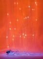
| 06/05/2006 08:45:31 AM | Images of broken light which dance before meby Pug-HComment: Well, at least you've chosen a line which hasn't cropped up twnty times through this voting process; I can't decide about this image at all: I enjoy the tonality of it, but find the glass to be too insignificant a part of it; there doesn't seem to be a real relation between the blue and the red parts of frame, but that is maybe a good point; I'm unsure. | | Photographer found comment helpful. |
|
Showing 731 - 740 of ~3604 |
Home -
Challenges -
Community -
League -
Photos -
Cameras -
Lenses -
Learn -
Help -
Terms of Use -
Privacy -
Top ^
DPChallenge, and website content and design, Copyright © 2001-2025 Challenging Technologies, LLC.
All digital photo copyrights belong to the photographers and may not be used without permission.
Current Server Time: 08/15/2025 11:40:44 AM EDT.
|