|
|
|
Showing 721 - 730 of ~3604 |
| Image |
Comment |
| 06/06/2006 06:33:46 PM | HellYeahby supertaanComment: from the last outpost of the Critique Club
Whilst this was a tricky challenge to meet, this approach (images of celebrations) was one of the few obvious ones; still not easy to actually get the shot, of course, and you've managed that well - but I think there are a couple of things that might have taken your score into even higher reaches.
There are two immediate and quite large distractions - the big blur of red, and the edge of the mortar board of the next person. A simple (and I think obvious) crop would remove the second - the first is trickier. As far as the crop goes, I really can't see why you've left the image whole - apart from those distractions, you've left your main subject absolutely centred in frame in a quite uncomfortable way, and cutting the left side of the image would produce a nicely balanced composition with arm and face that would be streets more effective.
Likewise, to me, it seems obvious that this should be a black and white image - it gains absolutely nothing from being in colour - all his clothes are black or white, his skin isn't any more interestingly toned than it would be in monochrome (in fact it would be loads more interesting in b/w), and the background is definitely far worse in colour: the reds and pinks would disappear, and with a little increase in contrast you'd have atop ten image, I'd say - at least.
All of which is entirely from the challenge perspective, and you may of course have your own reasons for what you did or didn't do: but it's rare to see an image where I'm so very clear about what I would personally have done to it, so I pass that on in the hope it's of some use to you.
Ed Message edited by author 2007-01-10 18:56:15. |
| 06/06/2006 06:31:39 AM | |  Photographer found comment helpful. Photographer found comment helpful. |
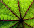
| 06/06/2006 06:21:51 AM | Castor Leafby pointandshootComment: Good tonality, good display of the near-abstract natural world. Colour combination is interesting, but it's not absolutely grabbing me I'm afraid. | | Photographer found comment helpful. |
| 06/06/2006 06:20:22 AM | In the Spotlightby Russell WeissComment: Things have gone so badly wrong here that this is either an attempt to finish last, the result of absolute lack of knowledge about digital imaging, or some kind of joke. |
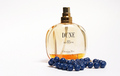
| 06/06/2006 06:18:46 AM | Baby I'd Love You to Want Meby GeneralComment: There's a certain technical achievement to this kind of product shot, which you've achieved pretty well. It would be more seductive, perhaps, if you paid a little more attention to the reflection of your light-source - the most effective of such shots use a big soft-light not only for the diffuse nature of the light, but also for the glossy quality that is lent to the product by the large area of the direct reflection - removing some of the 'cheap'-looking effect of a single spot of light appearing, as here, on those beads for instance. | | Photographer found comment helpful. |
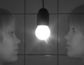
| 06/06/2006 06:15:42 AM | Ghostby ErnirComment: Given the advanced rule-set's lack of restrictions, I think some work to increase the general contrast of this shot might have helped you: the transparency of those faces is made by the lines appearing through them, not the washed-out quality, and anyway the image is just too generally grey for big impact. | | Photographer found comment helpful. |
| 06/06/2006 06:12:27 AM | ~by ArcanistComment: A fine, detailed portrait; everything is as it should be here. The clasped hands, I think, bring s sense of determination to a pose that might have spoken of contemplation or exhaustion without that. | | Photographer found comment helpful. |
| 06/05/2006 04:35:21 PM | CONTACTby mandyturnerComment: This place has never been kind to blurry photographs, however meaningful they might be; when the composition of them is as apparently random as this - given the drift of colour into the bottom right corner, what is the point of the negative space in the rest of the image? - the voters are likely to be harder on you. There is good stuff here, although it may be better in your own eyes than it is a communication with an audience: for instance, again, that (lack of) cropping. Are we certain that this is the best possible way to present this capture? My answer would be 'no'. | | Photographer found comment helpful. |
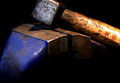
| 06/05/2006 04:31:14 PM | Hammer & G-Clampby carlomuscatComment: There's some stuff that is nocely done here, although your framing/cropping, I'm afraid, really isn't part of that. Why on earth cut off the top part of that hammer? Especialloy when all you have in the lower part of frame is the very extremitiy of that vice? The tonality and light are generally good, although the highlights on the hammer's handle have got out of your control slightly. The feeling that a slightly higher view-point would have solved almost all of those problems is almost unavoidable. |
| 06/05/2006 04:27:57 PM | Light as a Featherby KatmystiryComment: Lacking composition, really, I'm afraid. Has the feel of un-cropped full frame image which badly needs at least a judicious crop. I don't see what the immediate appeal is supposed to be, nor do I feel that my eye is guided through the image, and both those elements, I think, have to be strongly present to make such a simple image work. | | Photographer found comment helpful. |
|
Showing 721 - 730 of ~3604 |
Home -
Challenges -
Community -
League -
Photos -
Cameras -
Lenses -
Learn -
Help -
Terms of Use -
Privacy -
Top ^
DPChallenge, and website content and design, Copyright © 2001-2025 Challenging Technologies, LLC.
All digital photo copyrights belong to the photographers and may not be used without permission.
Current Server Time: 08/14/2025 03:55:53 AM EDT.
|