|
|
|
Showing 581 - 590 of ~3604 |
| Image |
Comment |
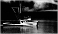
| 10/08/2006 05:29:02 PM | The Championby bryanbrazilComment: A fine documentary shot. Has a feeling reminiscent of the 1950's, or of any period of soot-infested industrial heydays, with their seemingly inherent decline. |  Photographer found comment helpful. Photographer found comment helpful. |
| 10/08/2006 05:27:08 PM | | | Photographer found comment helpful. |
| 10/08/2006 05:22:55 PM | On Airby pepitoidComment: Good image. Shame about the lins on screen, especially with it runniong through your silhouette. Refresh line? It might have been fun to have more apparent interaction between the screen character and the cameraman, which would have leant this an air of the really confusing ... but it remains i think the most interesting image I've seen in this challenge. | | Photographer found comment helpful. |
| 10/08/2006 05:07:01 PM | Emilyby MAKComment: Fabulous detailing and light on a rather uninteresting subject (to me - presumably not to you, else why photograph it?). I'd have done something to smooth the background, if I could (but I'd have never taken this shot!) | | Photographer found comment helpful. |
| 10/08/2006 05:04:37 PM | The One Limeby costinggComment: You see, I can understand the direction, but I can't see this as high-contrast photography. Sure, there's a big black background, but the tonal range of your actual subject is very limited indeed, is it not? You've also gained white line in your editing (I presume), and only used 1/3 of the availble file size, and two-thirds of the available width. the images here are small enough already. there's a tutorial about re-sizing images for the challenges ... might I suggest that to you, with all respect? | | Photographer found comment helpful. |
| 10/08/2006 05:01:38 PM | sunset on an industryby alpharichComment: Nice graduation of tones through the receding countryside, although that forms but a small part of this image. The scattering of birds is messy and indistinct, certainly at the resolution I use (and many others), and perhaps there just isn't enough industrial stuff to make your point. I wonder if a crop in from the right, placing the chimneys more orthodoxly, and allowing you that little bit extra iamge size, relatively, might have worked better for here. I could appreciate that this might make a fine large print - but that's rarely of effect on DPC. | | Photographer found comment helpful. |
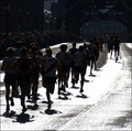
| 10/08/2006 04:58:16 PM | Into the sunby fredandaudComment: Not convinced this is very successful - i think you've attempted too much, really. Keeping sme definition in the corwn, bridge, buildings and runners serves no purpose that I can see, and has forced you to over-expose the road, where the sunlight might have made interesting textures, especially with the shapes of the runners set against it. however, even then there isn't really any separation of the figures, either from each other or from the dark background. You finish with a set of almost distinct figures, clumped together, against an over-exposed background, and that is no recipe for success. |
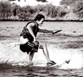
| 10/08/2006 04:54:42 PM | Rushby escapetoozComment: High Contrast often works for action shots, making as it does the form of the situation stand above the simple emotion. I wonder, however, if the curve of thrown-up water isn't more important to this image than the actual figure - and it's that curve that you've chosen to discard in favour of a fairly ordinary body-shape. Good stop action, but perhaps not the most visually arresting moment. | | Photographer found comment helpful. |
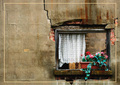
| 10/08/2006 04:52:28 PM | Sunrise Terraceby carloComment: Like the observaqtion of those lines, and the capture of them - and you're right to include the watering can, as it gives reference to it all. The background through the fence probably lets it down - just brings it back to the humdrum too much, amkes the location too obvious, the composition too busy: such rhythmical compositions are often let down by the intrusion of the humdrum. | | Photographer found comment helpful. |
| 10/08/2006 04:50:38 PM | Magni-fiedby babylonComment: So, the dreaded blob of stuff in a basic editing challenge. Crop it out? Levels it out? Or maybe it serves a purpose, huh? Now, try to count how many people actually think there may be a point to that blob of stuff, voters here especially, and see if you run out of fingers. On one hand. But it balances, of course, the blur of the microphone, and gives reason to the negative space, without which this is a simple tight-ctopped portrait.
Still, I'd want more from it - I just don't feel there's enough relativity here: what seems an angry expression, but ... the shades of course, preventing visibility of the eyes, and that emphasises the lack of facial real estate here, and leaves us still searching for some confirmation of intent in this face. |
|
Showing 581 - 590 of ~3604 |
Home -
Challenges -
Community -
League -
Photos -
Cameras -
Lenses -
Learn -
Help -
Terms of Use -
Privacy -
Top ^
DPChallenge, and website content and design, Copyright © 2001-2025 Challenging Technologies, LLC.
All digital photo copyrights belong to the photographers and may not be used without permission.
Current Server Time: 08/12/2025 04:09:40 AM EDT.
|