|
|
|
Showing 3101 - 3110 of ~3604 |
| Image |
Comment |
| 08/19/2003 02:26:55 PM | Abandoned Gas Refineryby fluxnComment: Love the contrast between the refinery towers and the green-ish hillsides. There's a creepy dis-organised composition to this which brings out the feeling of strangeness also. Something doesn't quite put it at the top of my list this week though: I think the impression that you've had to hide too much of the refinery in order to get a clean composition. Excellent work though. |
| 08/18/2003 11:38:29 AM | The Look Fall 2003by OneSweetSinComment: Er - wrote my critique in the usual comments panel - and have to put something here to get another image :-) |
| 08/18/2003 11:37:35 AM | The Look Fall 2003by OneSweetSinComment: Hi Anna - you seem to be my oersonal critique club victim :-)
Didn't vote on this challenge - too tied up in having a shot with a chance to see it all clearly - but I did look through all the entries quite closely; and liked this, a lot.
I can see why it didn't appeal to most voters though: no tricksy composition, no unusual element, nothing very 'arty' about it. But I liked the idea of fake perfection it puts across - even that plastic sheen from the flash comes across well there - like a comment that all our futures are moving inexorably towards this perfection of look as dictated by the magazines and pointless TV shows. Unfortunately the title kind of puts this out of consideration as what you were trying to achieve - but hey, I still see it.
Ed |  Photographer found comment helpful. Photographer found comment helpful. |
| 08/18/2003 11:27:35 AM | A Mother's Loveby BobsterLobsterComment: Hey Bob - just goes to show how much the challenge has to be obviously met in a shot to score: I think this'd have won if you'd had some really close foreground stuff to shoot through or around, or something that was more immediately visible than the foliage there is: it blends in with the rest if the trees etc. too quickly for those voters ruching past it: got to nail 'em quick, mate.
Ed | | Photographer found comment helpful. |
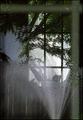
| 08/14/2003 08:56:34 PM | "W"by OneSweetSinComment: Hi again Anna - more critique fun.
Immediate impression - it seems soft-focussed, and feels not quite horizontal. The soft-focus thing is really quite bizarre though: looking at the shadow lines, and the top edge, it seems plenty sharp enought there - so i think it must be the tonality of the panels and the glass that give it. As to the horizontal - I'd have to measure it: on closer inspection sometimes it looks OK, and sometimes off.
Obviously meets the challenge - no issues there.
It doesn't have much impact for me: the way the centre part of the building appears to continue into the relection is pretty effective - approaches timmi's shot that placed 3rd - but isn't emphasised by the composition, or the light. The subject is plainly, and not just because of the title, the line of the top of the building; and whilst it's clear that that is right angles, perhaps it would have been more effective if it had been a genuine right angle on screen: I think that might have looked quite striking.
Still, 5.6 is not a bad finish.
Ed |
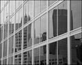
| 08/14/2003 08:39:13 PM | City Wallby muckpondComment: hi Rob - your critique club moment.
My first reaction to this is that the dynamic range seems very narrow - no real whites, no real blacks, but then I wondered why I felt that was a problem. I think I'm a bit too used to this kind of image - possibly only because I live very near a major business district in London, and see this stuff all the time - so the distortion of the reflections has little impact; because of that familiarity I was looking for another element - maybe a double reflection, or some detail of texture, or of light to surprise me a little, and not really finding it. The panels between the glass are uniform, almost textureless. The distortion itself is rather middle-ground to me - not completely wierd, nor very slight: just what I would expect, in short.
It's an entirely competent shot technically, of course - as I'd expect from someone who could take that Corne photo - and obviously meets the challenge well enough. It's just a bit ordinary, I think; a bit lifeless - which is what people are after with the colour and contrast comments, I'd guess.
All the best
Ed
| | Photographer found comment helpful. |
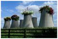
| 08/14/2003 04:54:07 AM | Imagine... by e301Comment: Thanks to everyone, especially the commenters.
I wish i'd kept a version with flowers in all the 'pots' - it was really too many flowers though, it became boring, and those empty ones are useful to make the fact of it's being a power station obvious. I almost entered a version with no flowers in the most leftward tower because of that.
I noticed during the week that the composition actually breaks most of the 'rules', which intrigues me: the most eye-catching flowers are dead centre image, although there is at least a parallel to the line of flowers in the fence (PaulK take note - that's why I used a shot with the fence).
Ed |
| 08/14/2003 04:28:42 AM | |
| 08/14/2003 04:24:54 AM | | | Photographer found comment helpful. |
| 08/13/2003 06:31:06 PM | In Through The Out Doorby ChrisW123Comment: Damn, Chris I meant to leave a comment on this shot and didn't - just spottd it whilst browsing through the full results. I was one of your 8's - and I only rated three photos higher.
I love the colour and depth here - those repeating layers fading a little as they recede, excellently done. I also think that perhaps more than any other shot this REALLY met the challenge - as in 'the strength of the composition' etc. : both the odd foreground blur, and the echo of it in the window-frame really pull they eye in. A difficult trick to pull off, and it's no surprise that most of us went for depictions of right angles rather than employing them as a compositional device.
There's a powerful feeling of mystery in this shot too, of a kind of yearning - it reminds me of books like Le Grande Meaulnes, or HG Wells's green door ... something glimpsed fleetingly and perhaps never to be found again: so a sense of loss also.
Most good work. Overlooked by the audience here, evidently, but yours is not the only lost photo :-)
Ed Message edited by author 2003-08-13 18:32:17. | | Photographer found comment helpful. |
|
Showing 3101 - 3110 of ~3604 |
Home -
Challenges -
Community -
League -
Photos -
Cameras -
Lenses -
Learn -
Help -
Terms of Use -
Privacy -
Top ^
DPChallenge, and website content and design, Copyright © 2001-2025 Challenging Technologies, LLC.
All digital photo copyrights belong to the photographers and may not be used without permission.
Current Server Time: 06/20/2025 06:10:09 PM EDT.
|